The page
Five exercises that treat the comics page as one designed unit: panel shape, panel width, the turn, the eye’s path, and the lettering all set its rhythm.
Mateu-Mestre · FI2 p.106“every two-page spread becomes a visual narrative unit in its own right”
Panel shape per beat
Frame one setup as a square, a vertical and a panorama, each for a different job, then build a calm run of panels and break it at the turn. His soldiers and mercenaries are demos; any setup of yours works.
FI1 p.108–110 (The Panel; panels A, B, C and F; scan pages 107–109) · FI2 p.106–110 (Panel combination as a language; figs 9.1, 9.4–9.7).
What he shows
One setup, many formats (FI1 p.108). He opens by saying that the same basic setup can be framed and displayed in many ways and formats, depending on the narrative needs of the moment. His setup is three soldiers on a Pacific island, looking for an abandoned radio.
The square (p.108). Panel A uses a perfectly square format to present the three characters. It holds just the essentials to show they are soldiers, and you can already see what makes each one different, despite the sketchy drawing. One wears a camouflage helmet that matches his shirt. One wears a helmet and a white T-shirt. The third is bareheaded and smokes a cigarette. Cropping out everything else keeps the focus on the drama and tension of the trio.
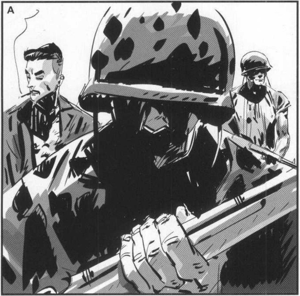
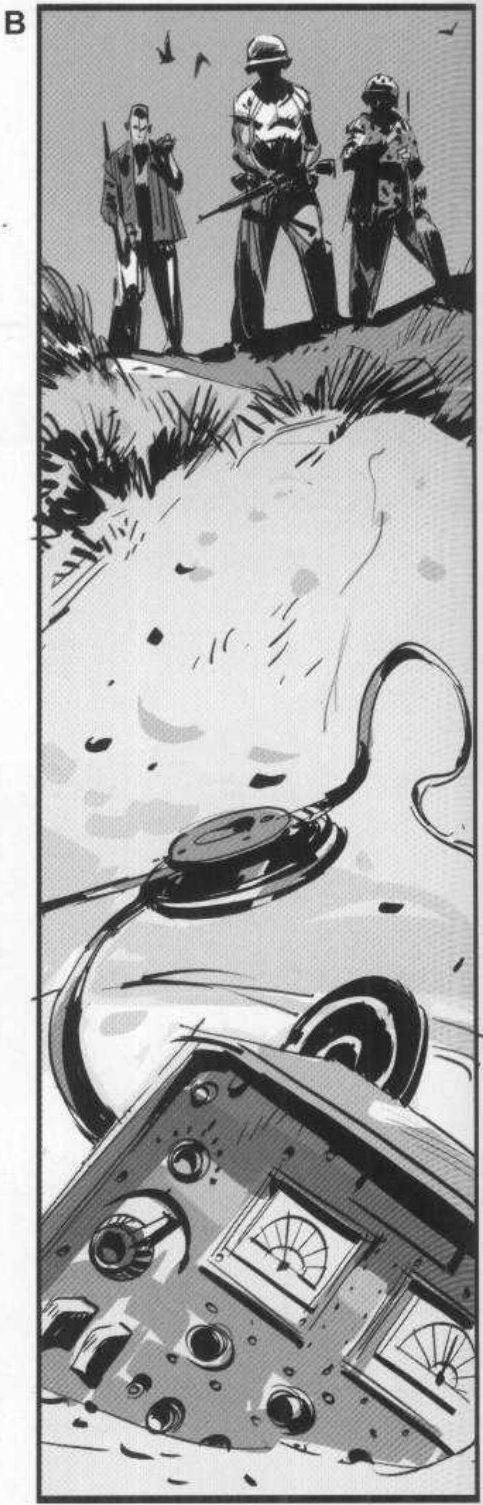
He then frames the same three men in a tall vertical and in a wide panorama, each for its own job. Those two panels are in the key below.
Any shape that serves (p.110). Circles, ovals, triangles, inverted pyramids and the like all work, as long as they serve the story and don’t confuse the page layout. Then he warns against overuse. If spectacular, dynamic devices run through a whole graphic novel, there is nowhere left to go when you need a special moment or the build to the end.
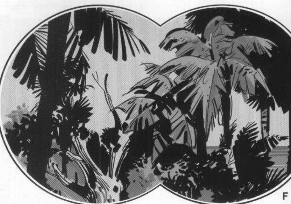
Mateu-Mestre · FI1 p.110“let’s create rhythms and then let’s break them for dramatic effects.”
Formats played against each other (FI2 p.106). A graphic novel can use every frame format in one story and on one page, and can even break the panel border. He pairs shapes with feelings: narrow frames for claustrophobia, open frames for space, regular rectangles or squares for calm or relative calm, and wild irregular shapes for action or stress. You can split a page into many panels, or let one frame run across two pages.
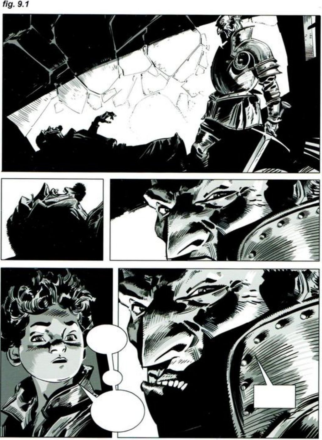
The calm baseline (FI2 p.106–107). Fig. 9.1 is the opening of Trail of Steel 1441 A.D. He calls it slow and full of shadows. There is some variety in panel format and size, but no big changes. The restraint matches the eerie, quiet moment.
Then the break (FI2 p.108–110). He shows three ways to break a calm run, all in the key. In the temple maze, panels turn more and more tall and narrow. After the maze comes the total opposite, an open double-page spread. For a fortress battle, the panels go off at every angle. He stresses that the pages before and after that battle were kept plain on purpose.
Mateu-Mestre · FI2 p.110“Then, suddenly, the serene mood breaks with a more powerful layout as fighting begins.”
His version: open after you've done yours
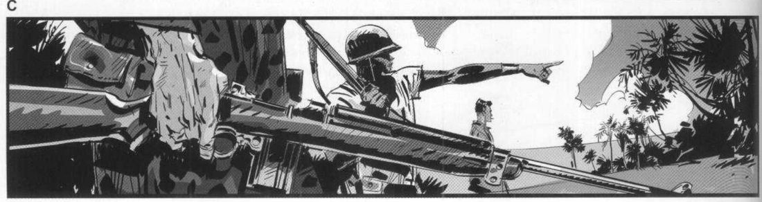
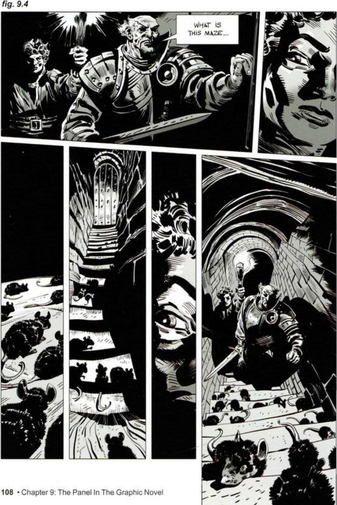
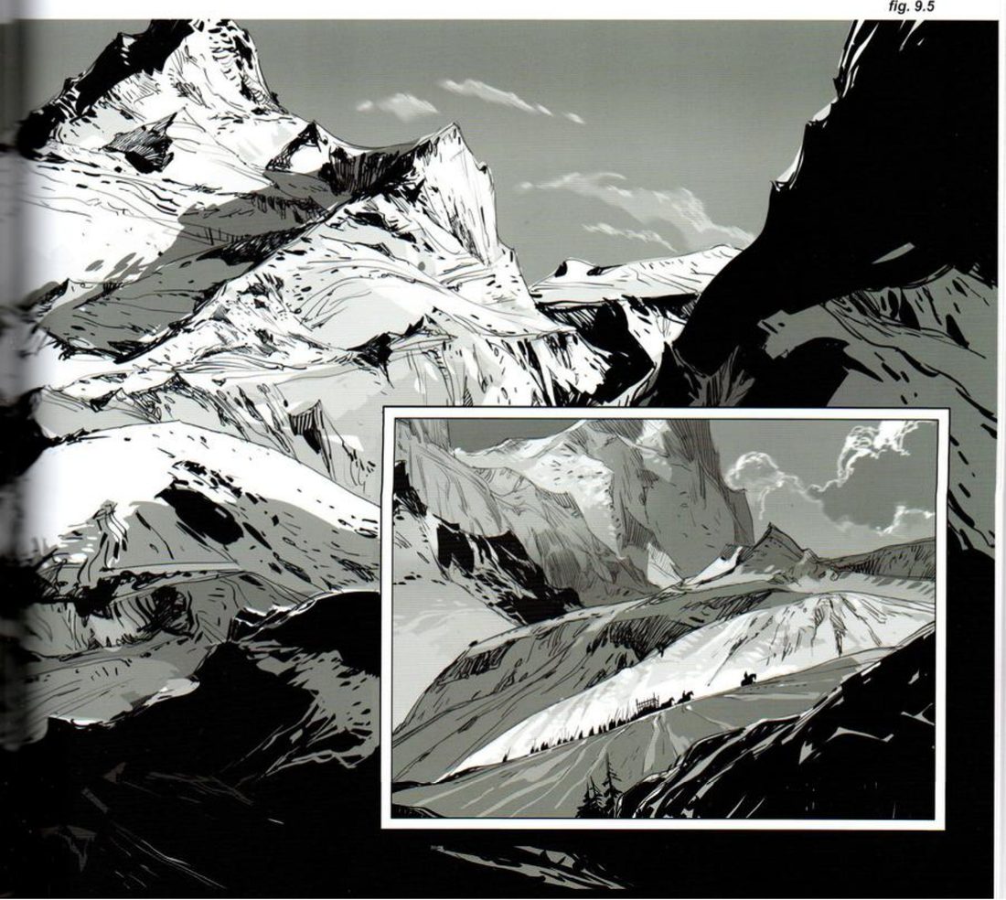
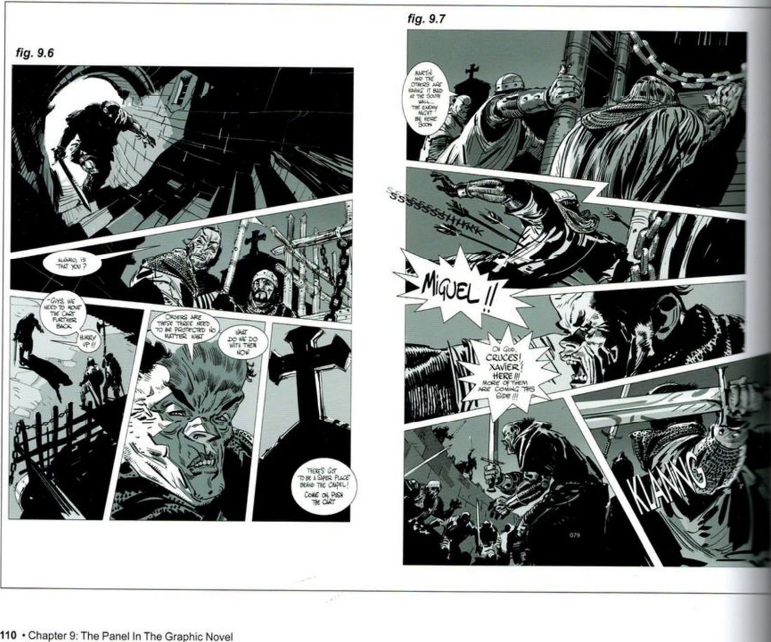
He adds that 9.4 and 9.5 together show how a frame’s aspect ratio, and its size on the page, can reflect how we would feel if we were physically in that place (FI2 p.109).
When you practise
Read once
- Write one line: what should this frame make you feel?
- Pick one setup of your own: a few characters, something they want, and a place.
- Square: thumbnail it to present the characters. Keep only what shows who they are and how each differs. Crop out everything else.
- Vertical: thumbnail the same setup to show the distance between the characters and their goal. Keep only them, the space between, and the goal.
- Panorama: thumbnail it to give the size of the place, with one foreground element that carries the drama.
- For each format, make the two thumbnails before any detail: value masses, then lines of tension.
- Write one line under each: what is this format for?
- Calm, then break: thumbnail a calm page from the same story, with plain vertical and horizontal splits and panels of similar size. Then thumbnail the page where the turn happens and break that rhythm: narrowing verticals, angled panels, or one open frame.
So the format is: square / vertical / panorama / other, because
The calm run is broken by:
CheckHis own test for any shape: does it serve the narrative purpose without becoming a confusing agent in the page layout? (FI1 p.110). For the break: are the pages around it plain enough that it lands? He says the battle reads as powerful partly because the pages before and after keep similar-sized frames and minimal contrast (FI2 p.110). Then the session check: shrink and flip each thumbnail; does it still read as your intent? Compare with his B, C and the three FI2 breaks in the key.
Panel shape per beat
One setup: square, vertical, panorama, each with a job. Then a calm run, and break it at the turn.
Keep asking: what are the narrative needs of this moment?
Tempo by panel width
Use panel width as a heartbeat: in a dark place, the panels narrow as the tension rises, then one wide, lit panel reveals what was there. His palm reader’s office is the demo; any dark place and any fear works.
FI1 p.114 (Fragmenting the Scene; page M; scan page 113). Context: p.109 (sequence D; scan page 108).
What he shows
Width follows motion (p.109). Before the dark room, his sequence D already uses panel width. As a soldier runs downhill, the panels open more and more in the direction he runs. They end by showing his final pose and his two comrades. The diagonal made by the panels’ bottom edges adds to the action and drama.
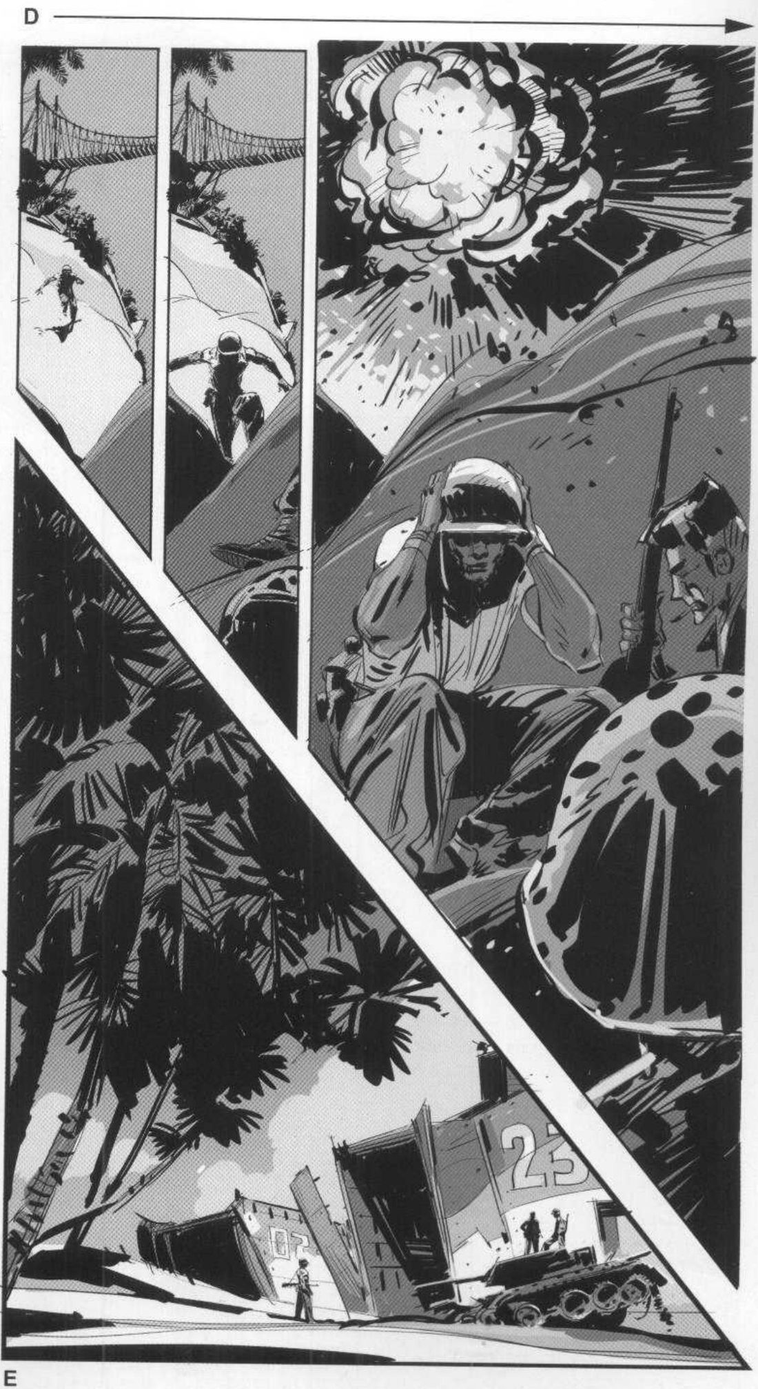
Mateu-Mestre · FI1 p.109“the last panel becomes suddenly wider than the others”
The dark room (p.114). A young investigator has been left alone in a creepy palm reader’s office. She looks at the staircase he just left by, which is the only light. Then she looks to her right, into the dark. The camera is her point of view. She senses someone next to her but can’t see anything. As her eyes adjust, all she can make out are abstract shapes. Her heart beats faster and faster, until another light is switched on and shows what she feared most.
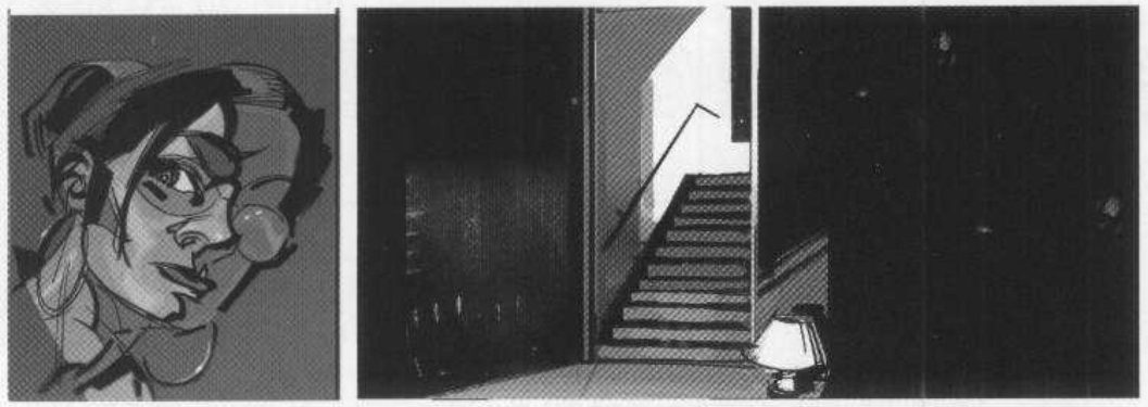
Mateu-Mestre · FI1 p.114“as the panels get narrower and narrower, accelerating the rhythm”
His version: open after you've done yours
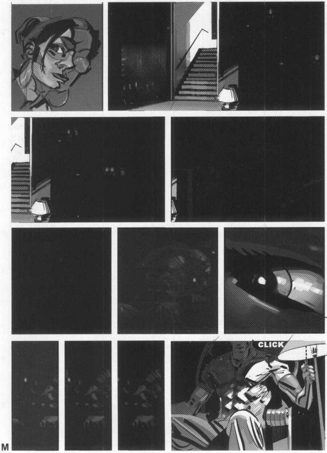
When you practise
Read once
- Write one line: what should this page make you feel?
- Pick a dark place, a character, and one light source. Make the camera the character’s point of view.
- First tier: the character, the place, and the light source, so the reader knows where the light is.
- Make the value-mass thumbnail for the whole page first. Plan each tier darker than the one before.
- Thumbnail the panels after that as the eyes adjust: only abstract shapes in the dark. Make the panels narrower and narrower as the heartbeat speeds up.
- End on one wide, lit panel that reveals what was there. If a switch causes it, letter the sound.
- Work in black and one grey. Leave out detail. The dark carries the page.
CheckHe states no check. The session check: shrink and flip the page. Does the run read as speeding up, and does the wide panel land as the release? Compare with his page M in the key.
Tempo by panel width
POV, one light, darker and narrower, then one wide lit reveal.
Keep asking: is the heart beating faster?
Four-change turn
Hold a quiet run on one stage, then mark the story turn by changing four things at once: the setup, the panel format, the main element and the lighting tone. His detective is the demo; any discovery beat works.
FI1 p.114 (text for page N; scan page 113) · p.115 (page N; scan page 114).
What he shows
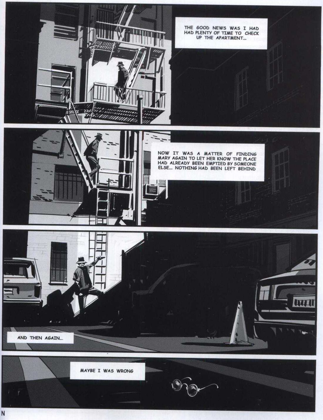
The quiet stage (p.114). Page N uses the layout and its panels to move the reader through the moment easily, following the character and his thoughts. The camera doesn’t need to change position from shot to shot. At first nothing intense happens and the detective’s emotions don’t change. He is quietly putting his thoughts together until he finds a mysterious object on the pavement. So the first panels share a similar, quiet rhythm, with basically the same elements and setup.
Mateu-Mestre · FI1 p.114“Wandering around the same “stage” is a particularly effective and theatrical approach”
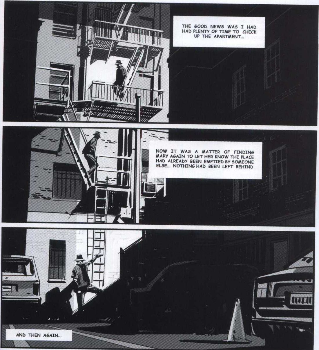
The turn (p.114). When the special thing happens, the one that changes the course of his investigation, he changes four things together:
- the setup;
- the size and format of the panel (narrower);
- the main element in the panel (from the man to the glasses);
- the overall lighting tone (from the man dark on light to the glasses light on dark).
His version: open after you've done yours
When you practise
Read once
- Write one line: what should the turn make you feel?
- Pick a beat where a character on one stage finds something that changes the story.
- Thumbnail the quiet run: a few panels on the same stage, with the same elements and a similar rhythm. Don’t move the camera relationship.
- Make a value thumbnail of each quiet panel. Decide the lighting tone: is the character dark on light, or light on dark?
- Thumbnail the turn panel and change all four together: the setup, the panel size and format, the main element (the character gives way to the object), and the lighting tone, flipped from the quiet run.
- Use placeholder text for captions if you need them.
Turn panel: setup · format · main element · tone on
CheckHe states no check as such. Tick his four changes from p.114 against your turn panel: setup, panel size and format, main element, lighting tone. Then the session check: shrink and flip the page; does the turn still jump out as your intent? Compare with his page N in the key.
Four-change turn
Quiet run on one stage. At the turn: setup, format, main element, light tone, all at once.
Keep asking: did all four change together?
Path overlays
Draw the structure under a page as an overlay: a line through the eye centres or along an object’s path, eye levels locked across panels, or one vanishing point shared by every panel. His pages are demos; the overlays work on any page.
FI1 p.112–113 (Choreographing the page; H, I, J, K, L; scan pages 111–112) · FI2 p.106–107 (figs 9.1–9.2) · p.110–111 (fig. 9.8).
What he shows
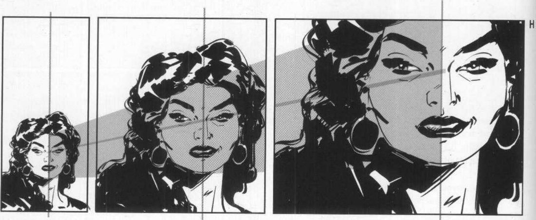
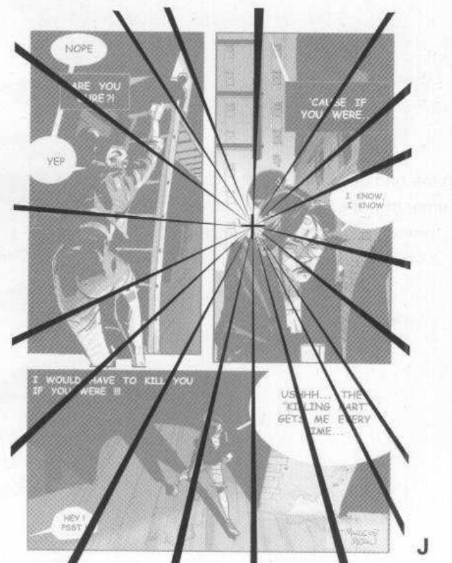
A main line (FI1 p.112). When a run of panels repeats one element, he places that element’s main point along a main line in every frame. That helps fast reading and gives a smooth, “cinematic” move. In H the main point is the centre of her eyes; in D (p.109) it was the running soldier’s whole head.
Mateu-Mestre · FI1 p.112“it should follow a predetermined and harmonious path”
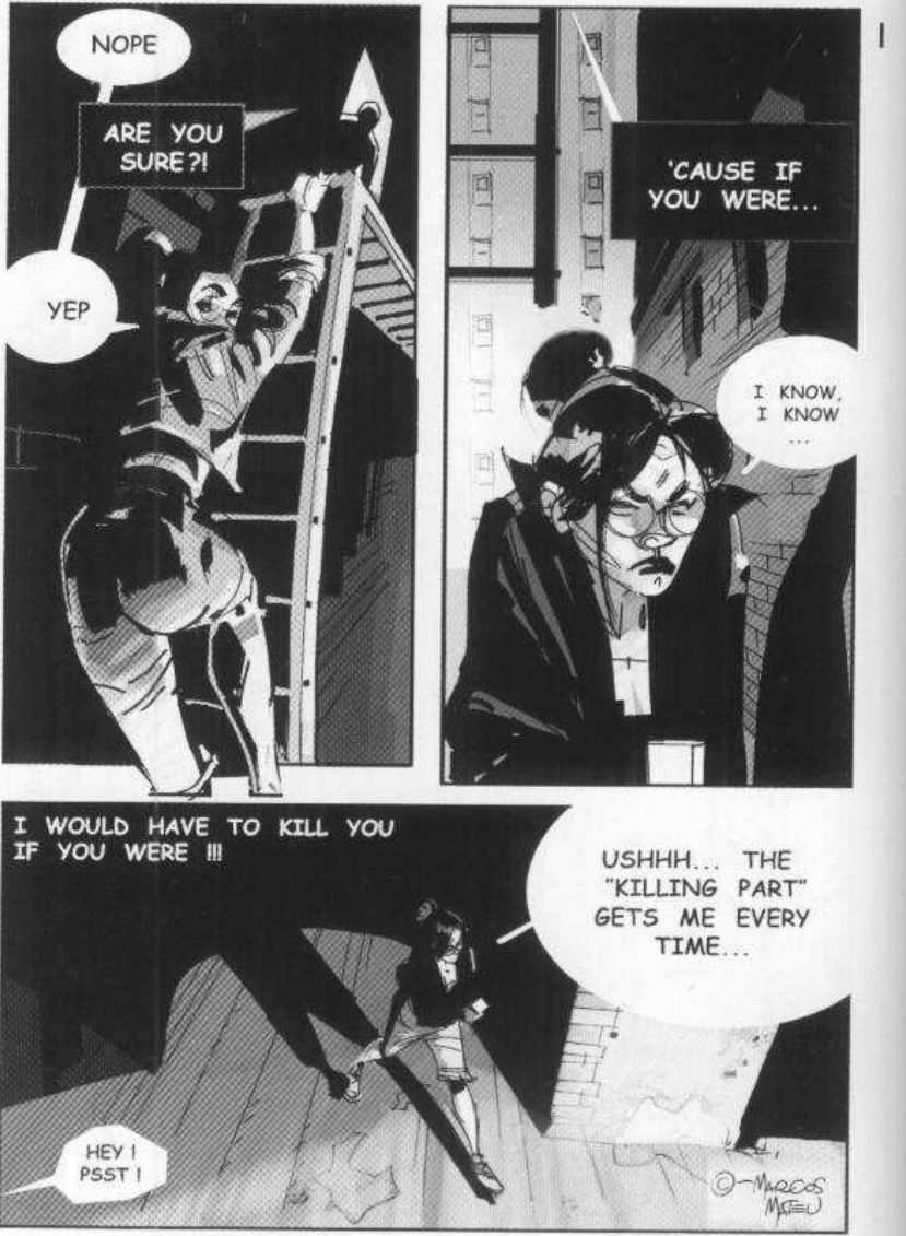
One vanishing point (p.112). The same idea applies to whole pages and action sequences. On page I, every panel is in structural harmony with the others, because all their perspective lines meet at one single vanishing point.
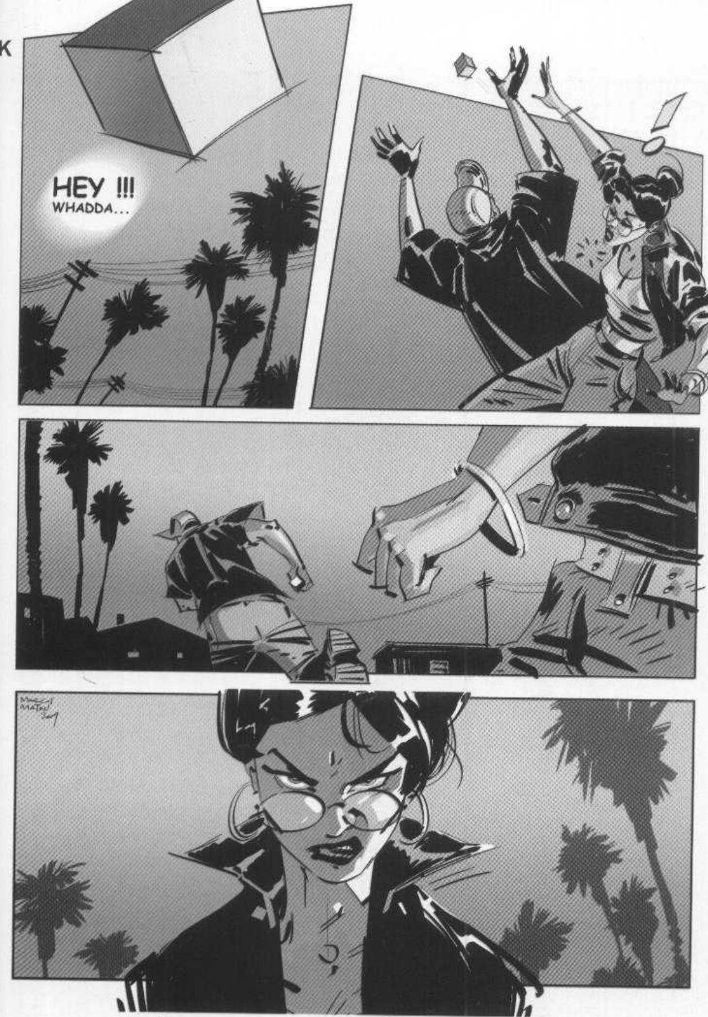
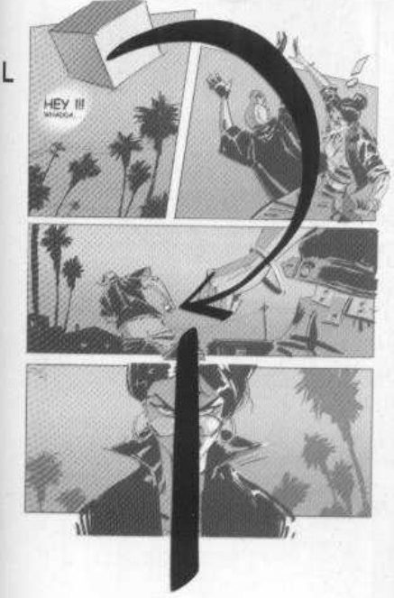
The object’s path (p.113). Page K is choreographed around a small box, the characters’ “object of desire”. It is thrown up in a struggle; the guy in the cap shoves the girl aside, grabs it and runs. He lists the devices panel by panel:
- Panel 1. A tilted upshot, so you feel part of the struggle and off balance. The background is pure silhouette so it doesn’t distract, and the irregular panel shape does the same job.
- Panel 2. The two bodies make two opposing diagonals.
- Panel 3. After two constrained panels of fast action, the panel opens out sideways to give the thief room to run. Her arm points the eye in the established direction, to the left.
- Panel 4. A tense pause before the next action: a “neutral camera shot” straight on her face. After this, he keeps the screen direction left for the rest of the chase.
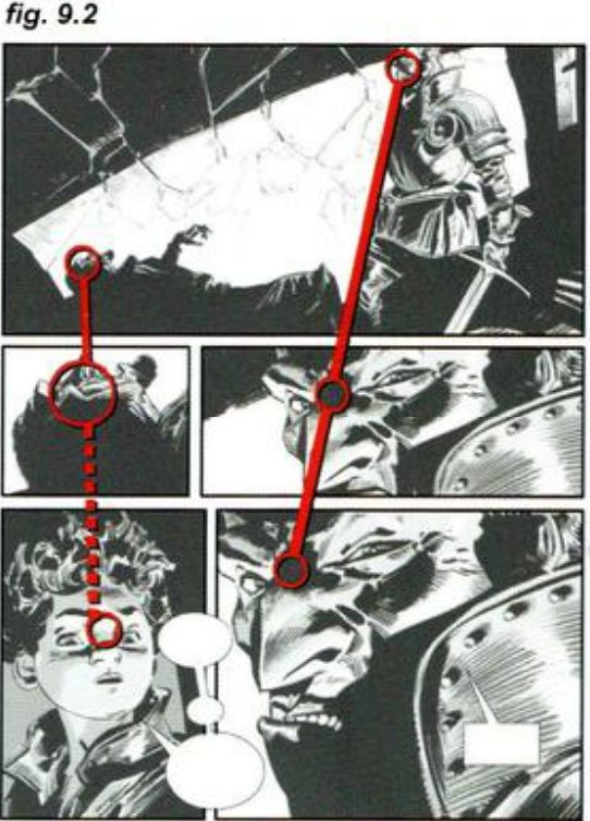
Characters on fixed lines (FI2 p.107). In fig. 9.1 (shown in exercise 1), the two mercenaries and the boy are always placed along the exact same lines throughout the page. He says this keeps the page’s quiet, smooth flow.
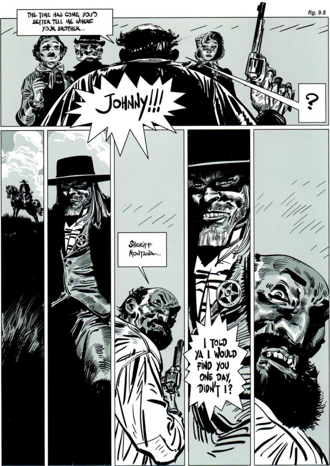
Eye levels locked (FI2 p.110). Fig. 9.8 revisits the extreme vertical panels of the maze, this time for power. Sheriff Montana has finally caught the outlaw Johnny Robber, and stands over him on a hill. The power comes from the height difference between the two men’s eye levels on the page. The narrow panels also strip away everything around the characters, so the page is about their expressions.
Mateu-Mestre · FI2 p.110“Montana’s eyes are at the exact same height in all his panels”
His version: open after you've done yours
When you practise
Part 1 · Read his pages
- Copy page I, page K or fig. 9.1 from above onto a layer.
- Draw the overlay you think holds it together. For I, find the perspective lines and where they meet. For K, link the box’s position in each panel. For 9.1, circle each character’s head and join the circles across the panels.
- Open the key and compare.
Part 2 · Build your own · read once
- Write one line: what should this run of panels make you feel?
- Pick the overlay that fits your page: a line through the eye centres of a push-in on one face; a curve through a moving object’s positions; two eye-level lines for a dominant and a weaker character; or one vanishing point for a whole page.
- Draw the overlay first, on the empty panel borders: the straight or curved line, the eye-level guides, or the vanishing point and its lines.
- Thumbnail the panels onto it. Keep each main point on its line, each character’s eyes on their guide, or every panel’s perspective on the shared point.
- For a power beat, swap the two eye levels to show the reversal.
CheckHis tests: does the main point of the repeated element sit along one main line, straight or curved, so the reader doesn’t lose the flow of the moment? (FI1 p.112). For a page: do all the panels’ perspective lines meet at one vanishing point? (p.112). For eye levels: are each character’s eyes at the exact same height in all their panels? (FI2 p.110). A ruler settles all three. Then the session check: shrink and flip it; does it still read as your intent? Compare with H, J, L, 9.2 and 9.8 in the key.
Path overlays
Draw the line, the eye levels or the vanishing point first. Then put the panels on it.
Keep asking: does the reader lose the flow of the moment?
Balloons and sound
Plan the lettering with the layout: give each speaker a balloon of their own, and let one sound effect grow until it becomes the image. His palm-reader scene and dripping tap are demos; any crowded exchange and any repeated sound works.
FI1 p.116–117 (Balloons and Onomatopoeias; O, P, Q, R; scan pages 115–116).
What he shows
Plan them with the rough (p.116). As soon as you plan a page’s rough layout, you have to think about where balloons and sound effects go. Like the art, they must serve a purpose, clarify and help the action, and never be senseless or confusing. So the order and shape they appear in need careful thought.
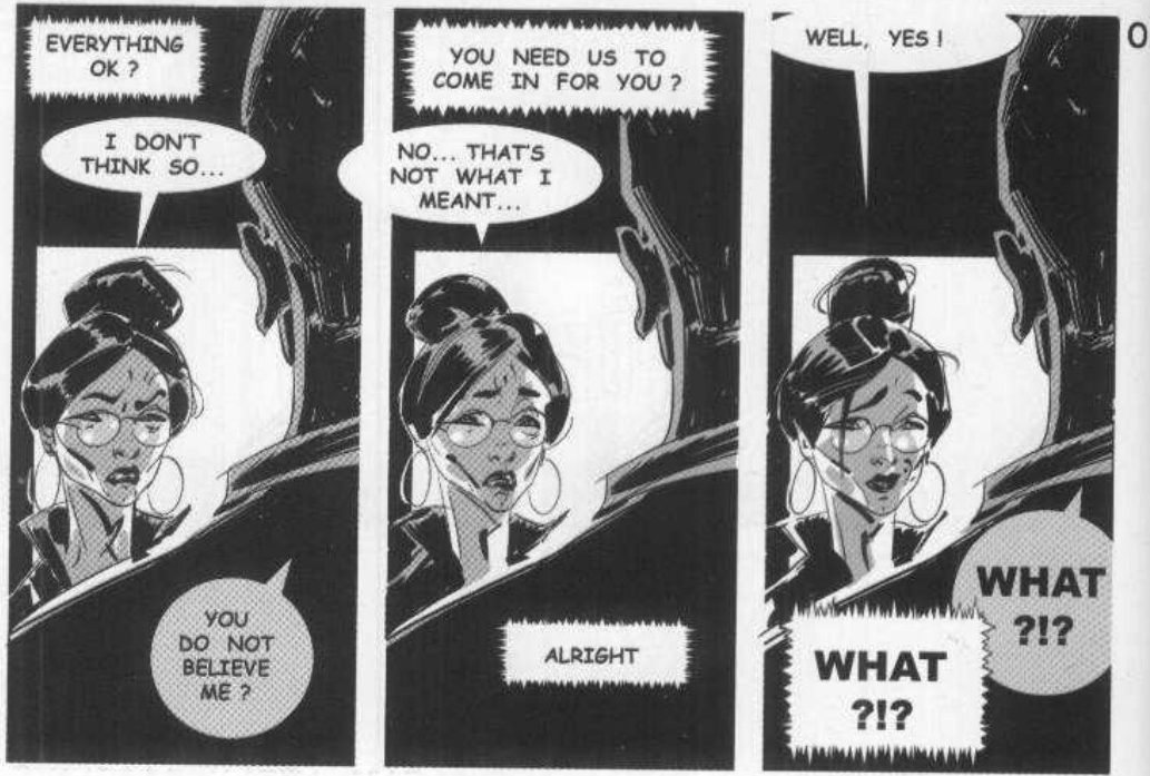
Three people at once (p.116). In O, the investigator is inside the palm reader’s office. The secret agents who sent her are outside, in touch through an earpiece. The bad guy and the agents both keep talking to her while she tries to answer both. Each side thinks her words are meant for them. He calls it a very confusing situation.
Mateu-Mestre · FI1 p.116“the distinctive shape and color of each balloon, representing each one of the characters.”
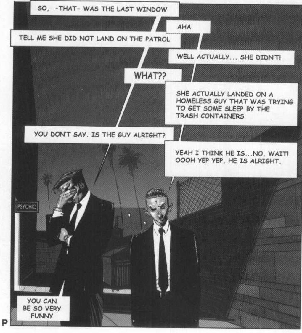
Two people, kept simple (p.116). P shows how to economise and simplify a conversation between the two agents when nothing more complicated is needed.
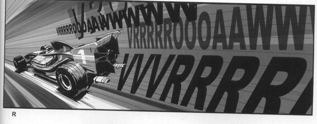
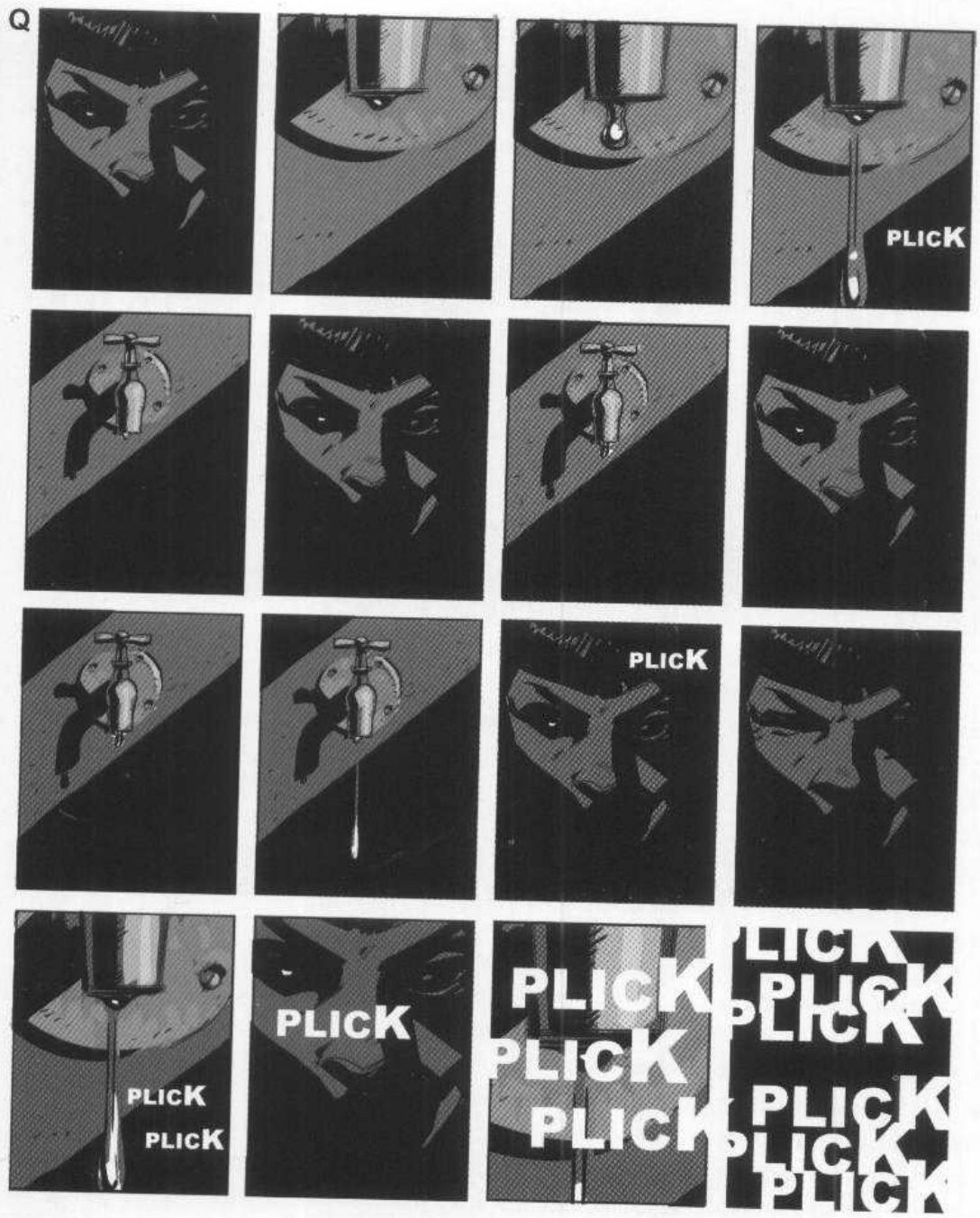
Sound as part of the picture (p.117). Used well, sound effects enrich and complete the visuals, and create rhythm, pacing and graphic effects unique to the graphic novel. Like balloons, they need the right places and sizes the moment you sketch the page. They are the comics version of a film’s sound effects. In Q, the sound can take over the visuals completely and turn the panel abstract.
Mateu-Mestre · FI1 p.117“they will substitute the onomatopoeias with the actual sounds they are trying to recreate.”
In R, the lettering also strengthens the frame’s perspective.
His version: open after you've done yours
When you practise
Part 1 · Balloons · read once
- Write one line: what should this exchange make you feel?
- Pick a scene where three people talk at once, with at least one off-panel: an earpiece, a phone, a voice from another room.
- Rough the panels and the balloons together, before any art.
- Give each speaker a distinct balloon shape and tone.
- Number every balloon in the order it should be read.
Part 2 · Sound · read once
- Pick a repeated sound and two things to cut between: the sound’s source and someone reacting to it.
- Lay out a grid of small equal panels that alternates the two.
- Place the sound effect at sketch stage, with its size. Start it small, let it repeat, then let it grow and multiply until one panel is only the sound.
- Make the value-mass thumbnail of the grid, so you can see where the lettering starts to take over.
- Optional: letter one sound on the scene’s perspective, as in R.
CheckHis test: is any balloon or sound senseless or confusing, and is the order clear? (FI1 p.116). Cover any names: can you tell who is speaking from the balloon alone? Then the session check: shrink and flip the grid; does the sound still read as taking over? Compare with his O and Q in the key.
Balloons and sound
Letter with the rough. One balloon style per speaker. One sound that grows into the picture.
Keep asking: is any of it senseless or confusing?