Light tells the story
Three exercises that hold the set, the head or the cast fixed and change only the light, so you can see the light carry the story on its own.
Mateu-Mestre · FI1 p.19“Lighting is the first answer.”
Same set, change only the light
Keep one location and one camera, change only the light, and make the place tell two different stories. His room, valley and street are demos; any set you can draw from one fixed camera works.
FI1 p.19 (Lighting) · p.50 (Landscape as a character) · p.54 (Daytime / nighttime; scan page 55, as the scan swaps 54 and 55). No figure numbers printed.
What he shows
The two-films room (p.19). He imagines shooting two films on one budget, in one location: a room with a table, four chairs and two windows. The first film is a sweet children’s tale. The second is the most upsetting horror film ever made. You can’t move a single chair. He asks how you would make two completely different worlds. His answer is lighting: lighter or darker, showing more or less, clearer or more ambiguous.
He gives the two ends of the scale. Every light on and the windows open: you see every detail, little is left to imagine, and you feel confident and relaxed. Windows shut and lights off: none of the furniture exists, at least visually.
Mateu-Mestre · FI1 p.19“Is the audience going to buy into it?”
He doesn’t draw the room. The only picture on the page is this strip.
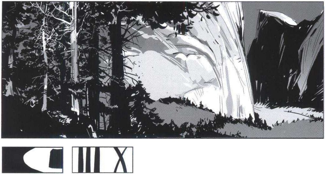
The valley (p.50). Two versions of one valley with the camera in exactly the same place. By day you can see almost every detail, so it feels fairly reassuring. He says the light picks out lots of vertical shapes, which gives depth without the more disturbing effect of diagonals. Each version has his two thumbnails: value masses and lines of tension.
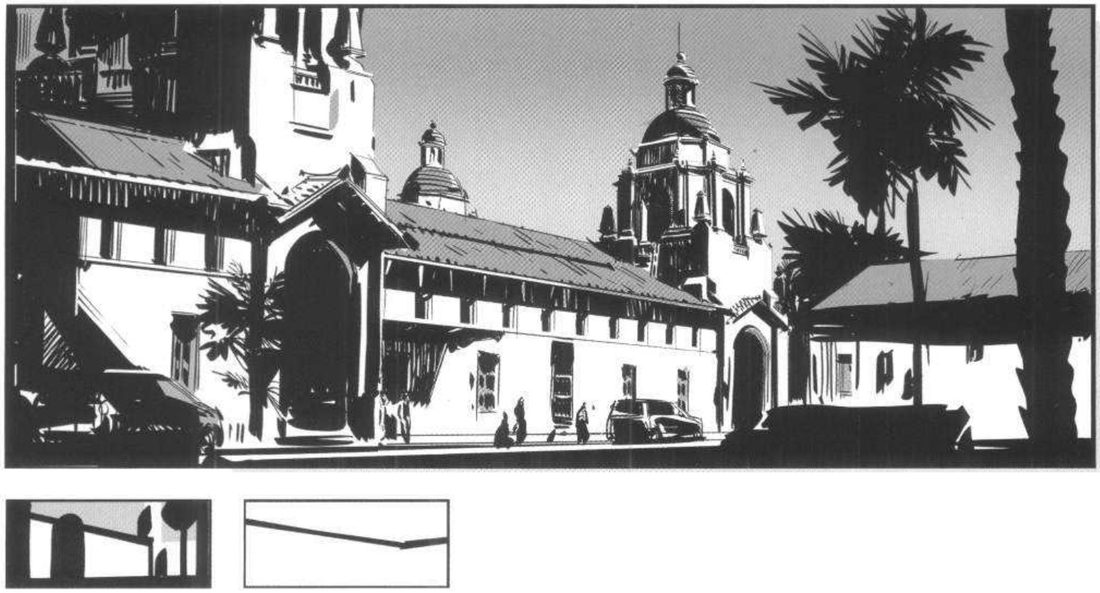
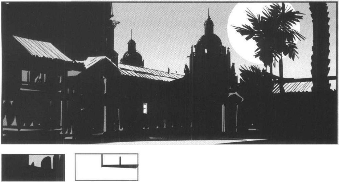
The street (p.54). One mission-style street, same framing, day and night. He names two things to think about for time of day: the light source, and how that light reflects on the things in the scene. His priority is the second one. He also holds the sky at one value in both versions.
Mateu-Mestre · FI1 p.54“the skies have the same exact value (alright, except for the moon!)”
By day he shows mostly lit areas, with reflected light painted into the shadows, so light is the main thing in the shot. At night he flattens the location almost to a black graphic shape. He adds that he could have gone further.
His version: open after you've done yours
The p.19 room has no drawn version, so there is nothing to compare it with.
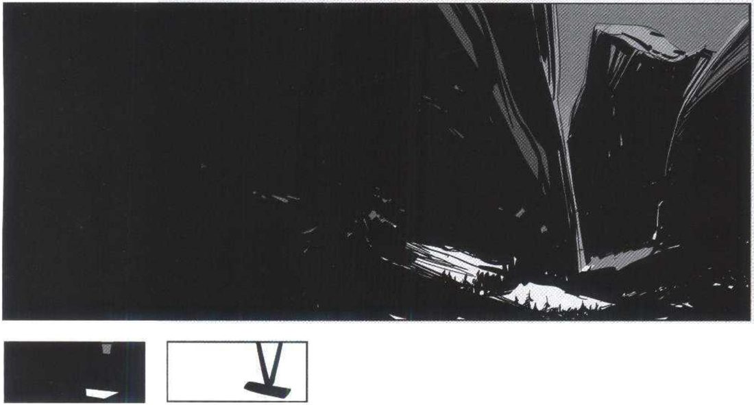
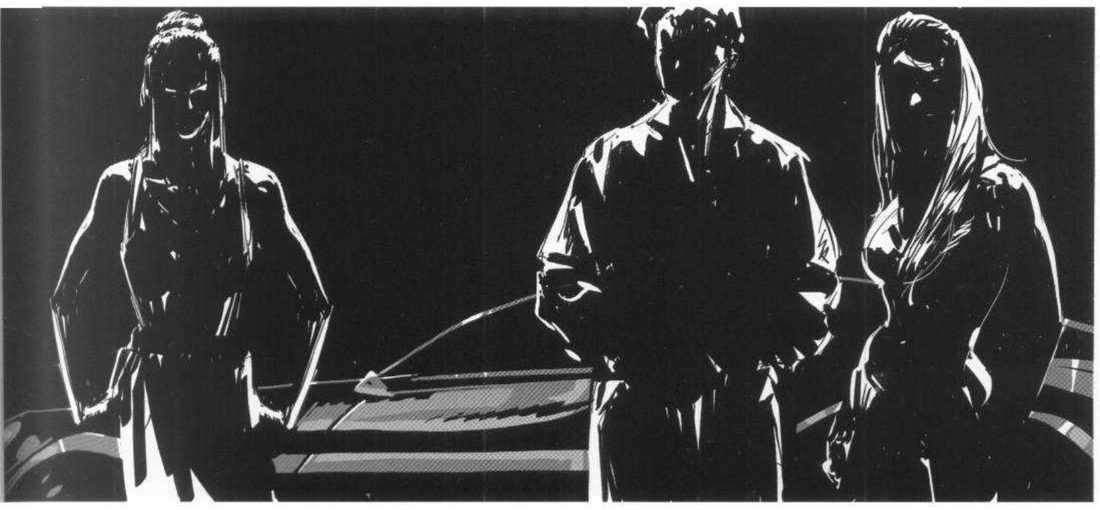
He says most of the earlier shapes simply disappear, and the uncertainty is sharp. The main gap between the mountains now sits far to the side, which adds distress. He lists three kinds of action this frame invites: no action at all, for the eerie feeling; action where the light concentrates, for a fast read; or a surprise movement close to camera in the foreground left (p.50).
When you practise
Read once
- Write one line for each version: what should this frame make you feel?
- Choose a set you can draw from one fixed camera: his room with a table, four chairs and two windows; a landscape; or a street.
- Draw the set once in line. Copy it for each version. From here on, nothing moves: no chair, no prop, no camera.
- For each version, make the two thumbnails first: value masses, then lines of tension.
- Light the first version. For the room, try his fully lit end: windows open, every lamp on, everything visible.
- Light the second version. Decide which few shapes still get light and let the rest stop existing.
- For a street, keep the sky the same value in both. Change only how the surfaces take the light. Day: mostly lit, with reflected light inside the shadows. Night: flatten it towards a black graphic shape.
- For a dark landscape, look at the finished frame and ask which of his three actions it invites: none, where the light gathers, or a surprise close to camera.
Version A should feel:
Version B should feel:
The only thing that changes is the light.
CheckFor the room, his own test is his question: will the audience buy into it, so that the two versions read as two different worlds? (p.19). For the street: flattening every detail towards a black shape is what gives the fast read of night (p.54), so does your night read instantly? For the valley he states no check. Then the session check for all of them: shrink and flip each one; does it still read as your one-line intent? Compare the valley and street with his versions above.
Same set, change only the light
Lock the set and the camera. Two thumbnails per version. Change only the light.
Keep asking: is the audience going to buy into it?
Lighting grid around a neutral head
One neutral line head in the centre and eight lit versions around it, running from relaxed to nightmare. Use your own character; his sitters are demos.
FI1 p.18 (Atmosphere) · p.20 (Drawing in chiaroscuro) · p.21 (Studying reality as it appears in front of us) · the two grid pages after it, unnumbered (scan pages 22 and 23). No figure numbers printed.
What he shows
The filter (p.18, 21). On p.18 he warns against copying every detail as a photograph would. If you transfer a portrait with a square grid, you make no choices, and every feature ends up looking equally important. That isn’t how we see a person. His alternative: sit in front of the model, squint, and see what stands out and what the first quick read of the face and expression is.
On p.21 he imagines arriving from another planet, not knowing what a person or a tree looks like. You would have to go by impression alone, and that impression depends on the conditions of the moment as much as on the objects. His example is a painter who knows exactly how many daisies are in the pot and paints every one, though only some are lit. Under that light, only part of the scene exists to the eye at all.
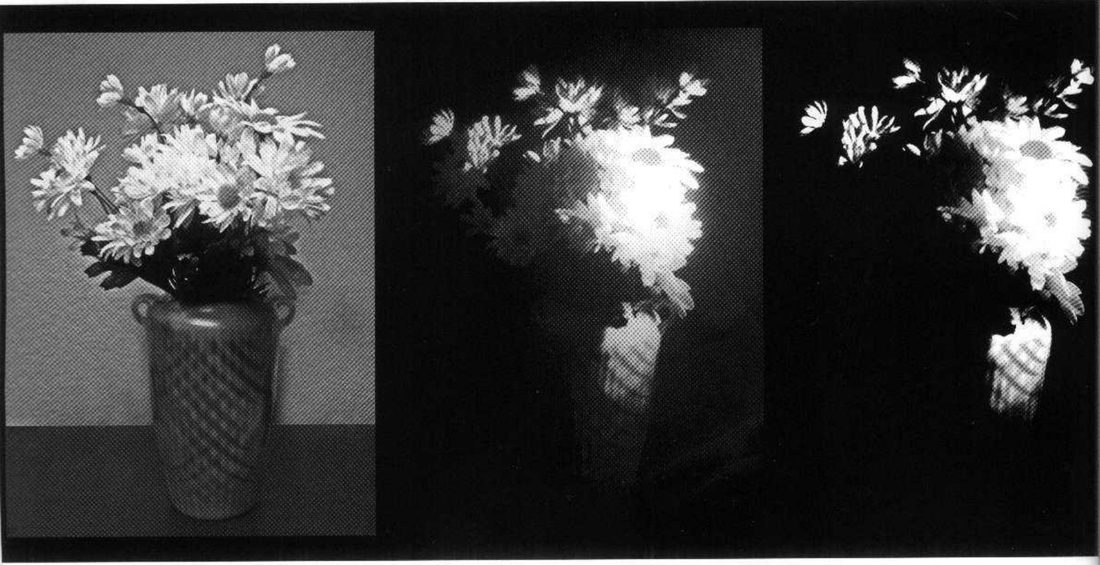
Mateu-Mestre · FI1 p.21“try squinting our eyes, skipping the visually nonexistent details, the unimportant, the unnecessary”
The neutral head (p.21). Then he turns to a head, something we all know the look and volume of.
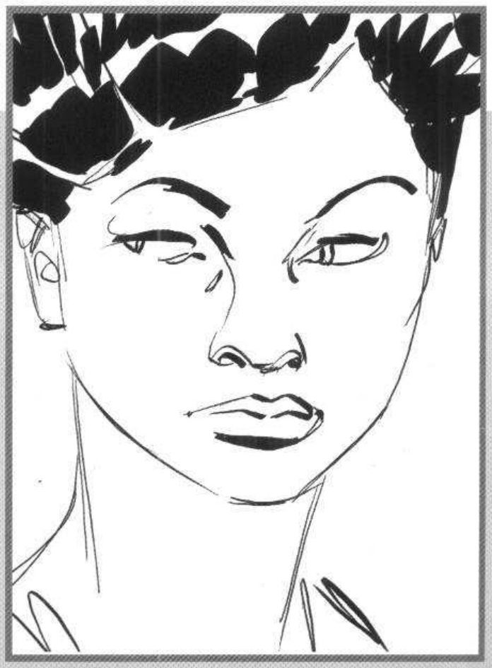
Mateu-Mestre · FI1 p.21“How many different stories will the same head be able to tell us?”
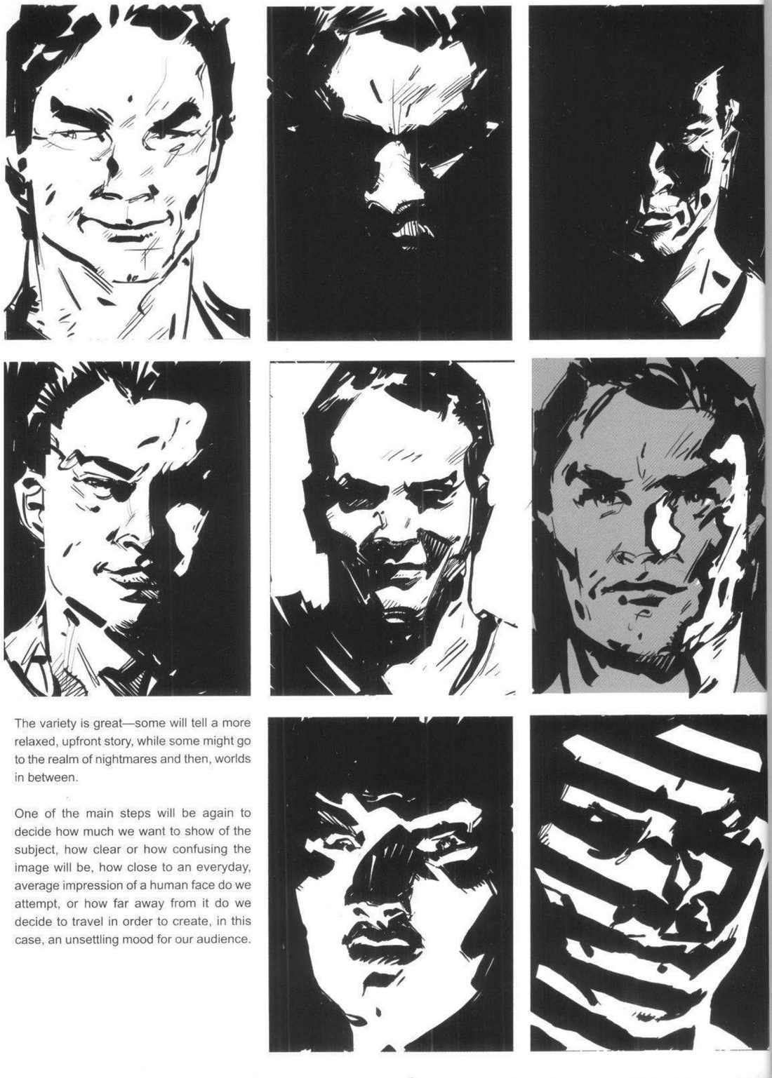
The three decisions (p.22). On the grid page he says the variety runs from a relaxed, upfront story to the realm of nightmares, with worlds in between. He names the main decisions: how much of the subject to show; how clear or how confusing the image will be; and how close to an everyday face you stay, or how far you travel from it to unsettle the audience.
He prints two grids. The first is eight lit versions of a man’s head. The second is a woman’s head, with the p.21 neutral drawing as the centre cell and eight lit versions around it. That second layout is the one this exercise copies.
His version: open after you've done yours
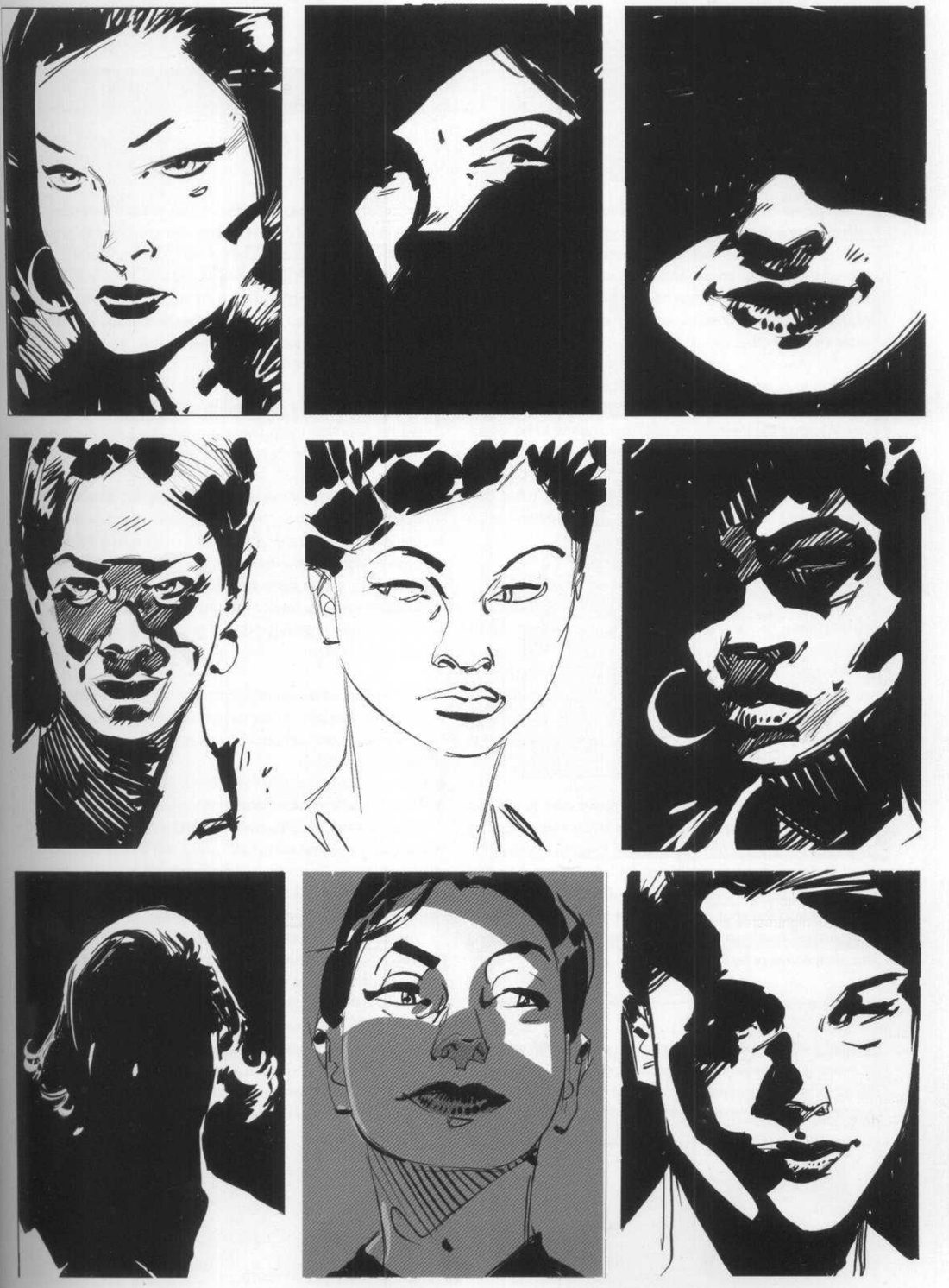
When you practise
Read once
- Write one line for the sheet: which end of his range, relaxed to nightmare, do you want to reach?
- Draw a neutral head in line: frontal, almost no fill, like his p.21.
- Lay out a 3×3 grid with the neutral head in the centre. Copy the line head into the other eight cells.
- Before each cell, write one line: what should this face make you feel?
- Make his three decisions for that cell: how much to show, how clear or confusing, how far from an everyday face.
- Fill in the masses of light and dark. Squint, and leave out whatever doesn’t visually exist under that light. Each cell is its own value-mass thumbnail.
- Spread the eight across the range, relaxed and upfront through to nightmare, with some in between.
Show how much: · Clear or confusing:
How far from an everyday face:
CheckHis filter on p.21 is the test: skip whatever isn’t contributing to the visual impression, so does every mark in the cell earn its place? His p.18 failure is the opposite: every feature looking equally important. He gives no criterion for each cell. Then the session check: shrink and flip the sheet; does each cell still read as its one-line intent? Compare your sheet with his two grids.
Lighting grid around a neutral head
Neutral head in the centre, eight lights around it. Squint and skip what isn’t there.
Keep asking: how many different stories will the same head be able to tell us?
Four-way table matrix
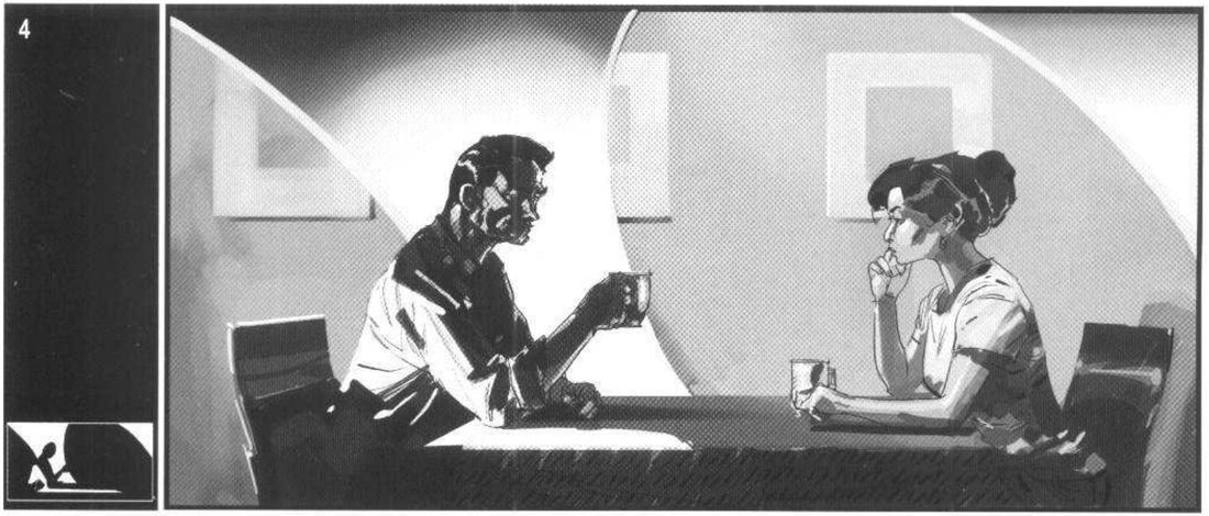
The same two people at a table, four times, changing one thing each time: the obstacle between them, the background split, who is lit, and who has the most contrast. His restaurant couple is a demo; any two characters sharing a space work.
FI1 p.36–37 · The restaurant (a general case) · panels numbered 1–4 on the page.
What he shows
This opens his chapter of analysed examples. Two people share a table. Without dialogue we may not know what is going on between them.
Mateu-Mestre · FI1 p.36“the visuals will be there to tell us a lot about it.”
He draws the same man, woman and table four times. Only the light, the background and the space between them change. Each panel has one value-mass thumbnail and no lines thumbnail. His four rules (p.37, paraphrased):
- If the space between them is clear of obstacles, their communication reads as fluent and positive. If both are equally lit, the sense of balance between them is stronger.
- Put visually heavy things between them and the visual dialogue is somehow broken. Give them different backgrounds and it gets worse, as if they sat in different spaces.
- If one is lit and the other stays in shadow, the lit one might seem to have better intentions.
- If one is lit with a bigger tonal contrast than the other, the eye goes straight to that person. In his example it’s the man.
Mateu-Mestre · FI1 p.37“our eye will go straight to that person”
His first panel is the open, balanced baseline.
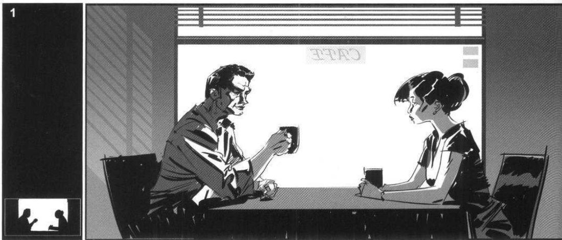
His version: open after you've done yours
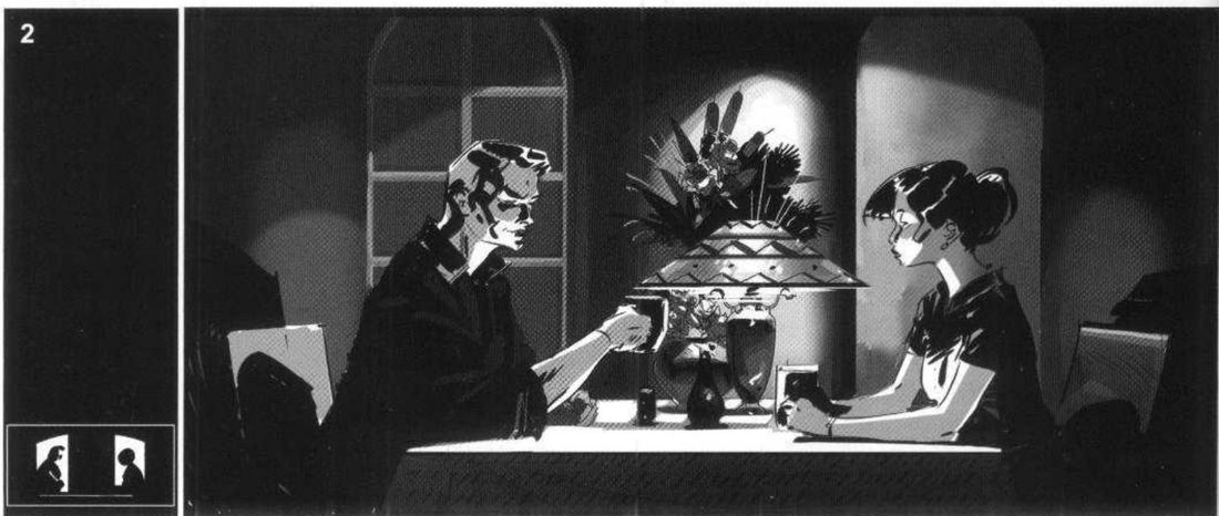
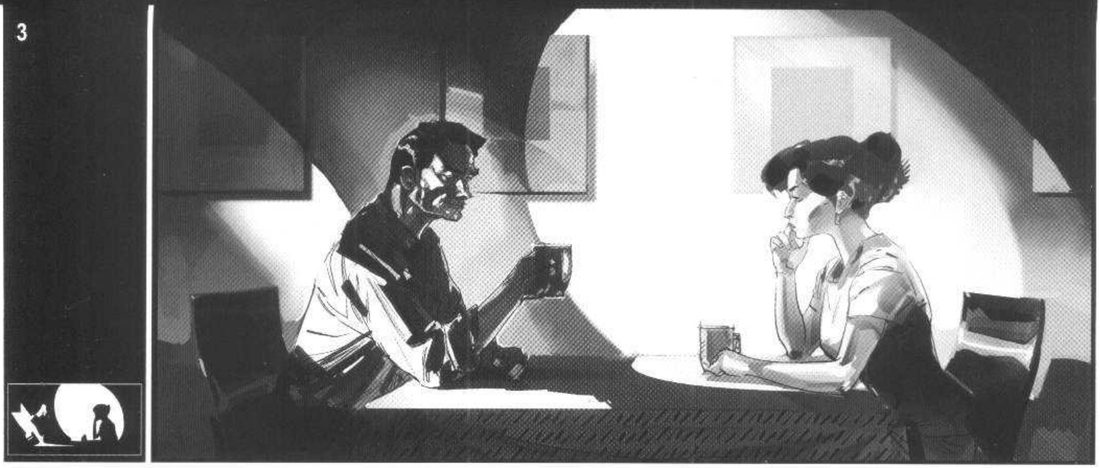
When you practise
Read once
- Write one line for each of the four variants: what should this frame make you feel about these two?
- Draw two seated people at a table once, in line. Copy it four times. Poses and camera stay the same.
- For each variant, make the value-mass thumbnail first. Keep it flat: black, white and grey. Add a lines-of-tension thumbnail if it helps.
- Variant 1: clear space between them, both lit equally.
- Variant 2: something visually heavy between them, then a different background behind each.
- Variant 3: one lit, the other in shadow.
- Variant 4: one person with much bigger tonal contrast than the other.
Should feel:
The eye should land first on:
CheckRule 4 is the one he phrases as something you can see: the eye goes straight to the person with the bigger tonal contrast (p.37). Look at variant 4 fresh: where does your eye land first? For variants 1–3, does each give the impression his rule predicts? He hedges those: the lit one only might seem better-intentioned. Then the session check: shrink and flip each; does it still read as your intent? Compare with his panels 2–4.
Four-way table matrix
Same two people, four copies, one rule each: obstacle, background split, who’s lit, most contrast.
Keep asking: where does the eye go first?