Formats: one scene, different frames
Five exercises in taking one moment into a new frame shape and re-staging it so the frame still carries the feeling.
Mateu-Mestre · FI2 p.11“one must understand the intent of the shot, story point or story moment”
One premise across formats, tension up and down
Take one story moment through a safe version, a stretched version and a relaxed version, in more than one frame shape, choosing the tension each time.
Mateu-Mestre · Lightbox Expo 2020 talk 08:01–14:31, 20:10 · FI2 p.11 · FI2 pp.17–18, figs 1.22–1.28
What he shows
The talk: safe first (08:01). In a horizontal frame he says we’re often tempted to go safe and compose by thirds. He sketches a man on horseback on the horizon and a sun, or a vulture, above. He calls it a convincing, balanced, technically well-built composition. Then he undoes it.
Stretch (08:31–09:30). He wants the shot to say how tough the desert is and how tense the moment. He puts the rider lower, off the thirds crossing, and moves the sun further away to counterbalance. He says it’s now about the two elements in relation to each other and to the frame. The line of tension between them is stretched. In the thirds version they sat closer, so the tension was weaker.
The rubber band (10:00). He imagines a rubber band stretched between his fingers. Bring the fingers closer and the band relaxes. Pull them apart and it tightens. Add fingers and it becomes a triangle or a rectangle. Pushing point A away from B changes the distance between them, so it changes the whole composition.
Same intent, vertical frame (11:31–12:30). He recomposes the shot in a tall frame with the same philosophy. If he puts the sun right by the rider there, the tension drops and the rest of the space risks doing nothing.
Relax (13:00–14:31). To tone the tension down he adds an in-between element, such as distant mountains, which turns the line into a triangle. Or he brings rider and sun together and lowers the camera to show more ground. He says this one is even a thirds composition and it’s good. The tension is just lower. He adds that thirds or fourths are simply different ways to compose, with no fixed amount of tension of their own.
Mateu-Mestre · 2020 talk · 20:10 · auto-captions“think about what kind of a tension or lack of tension”
He says to ask that in place of asking how to compose a vertical. The tension you want decides the layout, whatever the format.
The book: feeling first (p.11). His closing advice for all formats: keep the first steps simple and abstract. Use thumbnails of primary lines, volumes and proportions to set the shot’s dynamics and energy. The goal is that rider’s moment in the story: joy or drama, quiet or tension, being lost or achieving something. The horse and rider become just the physical support for it.
The same rider, tall then wide (pp.17–18). He starts with a raw, energetic rough. A slight diagonal sets pressure on the bottom against a much bigger release area above. Then he decides what that release space means.
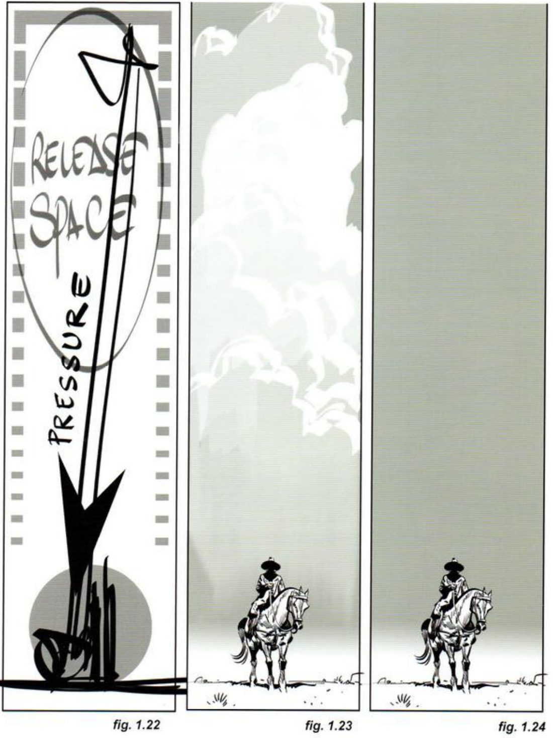
Mateu-Mestre · FI2 p.17“each element in the panel must have a purpose”
In 1.23 the clouds become an imposing force overwhelming a lone figure, which he calls a different feeling from “clouds and a cowboy”. For the empty sky in 1.24 he asks: what if his best friend just died and he’s looking to the night sky? Or he’s waiting for his falcon? Then the void has a story purpose. He tells you to know the shot’s subtext. How do you want the audience to react? What does this moment mean to the characters?
On p.18 he rotates the same 4.30:1 ratio into a panorama. The rider is jammed against the right side, the big mountain on the left is the release zone. He says it reads as a character up against tall challenges, the same flow as 1.23.
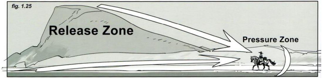
Then he plays it differently. To make it easier on the rider he keeps the rider’s position and the ground, and changes only the background. Two opposed funnel shapes flow past each other while each keeps its own territory. Swapping the hill for clouds gives the same shapes again.
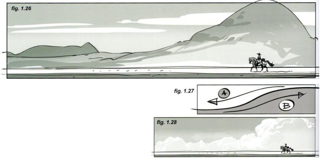
His demo subject is a rider. The method is the safe, stretch and relax sequence, and it works on any premise.
When you practise
Read once
- Pick one premise: a character or two key elements, and one moment. Any subject. Write one line: what should this frame make you feel?
- Safe. In a horizontal frame, place the key points by thirds. Make the two thumbnails: value masses, and lines of tension joining the key points.
- Stretch. Same premise, same frame. Push the key points apart and towards the edges until the line of tension reads harsher.
- Same intent, new format. Recompose the stretched version in a vertical frame. Re-stage it from scratch. Don’t crop the horizontal one.
- Relax. Bring the points closer, or add an in-between element so the line becomes a triangle, or move the camera to change how much ground or sky shows.
- Under each version, answer his two questions in a few words: how should the audience react, and what does this moment mean to the character?
- Optional: take one version into a square frame. He does this in the talk too (17:30–21:00).
CheckHis rule of thumb (p.18, close paraphrase): if every element and area has its own function and meaning, and they interact properly, you’re on the right path. In the talk his test is whether the version gets the job done and puts the pressure where you wanted it (20:28). Then shrink and flip each version: does it still read as the tension you chose? The book prints no key for your premise.
One premise, many frames
Safe, then stretch, then the new format, then relax.
Keep asking: what kind of tension, or lack of tension, do I want here?
Repair a weak layout
Build a two-element layout that goes dead in the middle, say why, then repair it in each way the format allows.
Mateu-Mestre · FI2 pp.22–24 (The case of the farmer vs. the barrels) · figs 1.49–1.67
What he shows
He notes that most compositions in this chapter use extreme placement of the main character, which can make a convincing layout hard to find. His case is a farmer with a pitchfork and a group of barrels by a wall, in a wide frame.
The weak version (fig. 1.52). Use the full width and push the barrels all the way right. The middle is left empty, which he shows striped in 1.53. The barrels are so cornered they feel too secondary to mean anything, and the shot loses its focus.
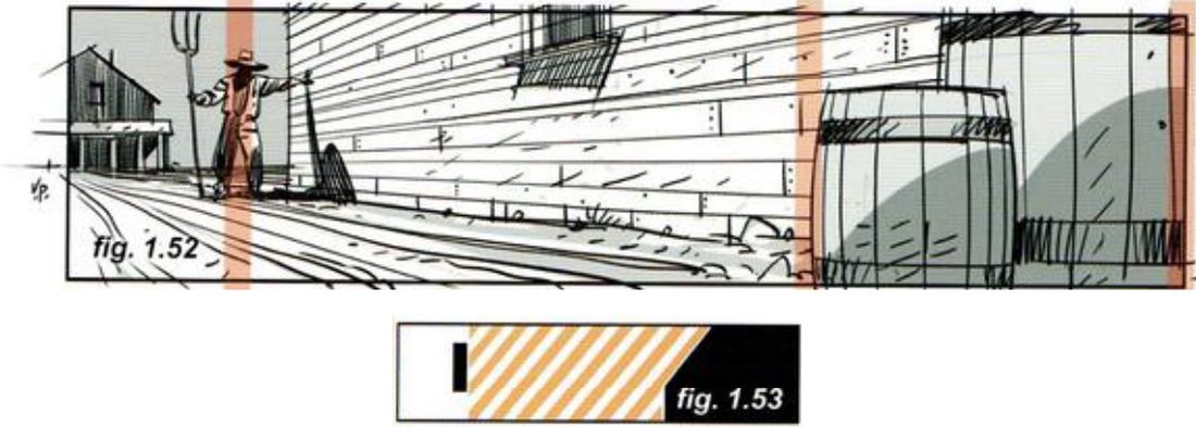
Mateu-Mestre · FI2 p.22“purposeless blank real estate in the middle”
He then repairs it three ways, and each one depends on what the format allows. Two keep the frame. One needs a frame that can change shape, as a graphic-novel panel can and a fixed screen can’t. After the wide frame he takes the same farmer and barrels into a tall frame (p.23) and a square (p.24). The figures are in the key.
His subjects are a farmer and barrels. Any two elements that should be in a dialogue will do.
His version: open after you’ve done yours
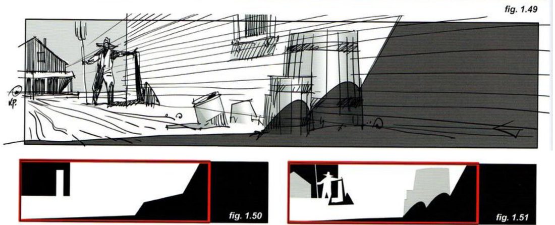
Repair 1: crop with shadow, keep the frame (figs 1.49–1.51). Strong cast shadows or similar devices shrink the focus area to a smaller part of the frame. That effectively crops the image. The red boxes mark the effective frame.
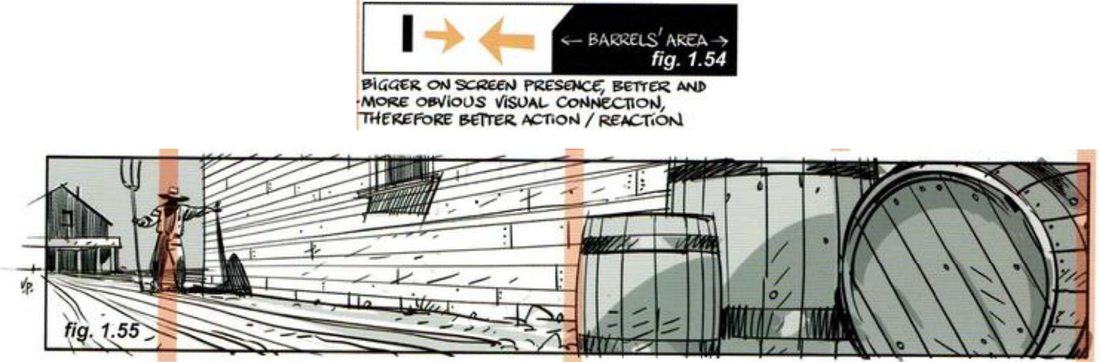
Repair 2: widen the frame (figs 1.54–1.55). Only if the frame can change. Add more drums so they push into the empty middle and gain weight. His handwritten note on 1.54 says this gives the drums a bigger on-screen presence and a more obvious visual connection, so better action and reaction.
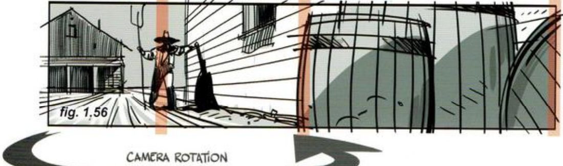
Repair 3: move and rotate the camera, keep the frame (fig. 1.56). The barrels now fill the right half and sit closer to the farmer, in better line with our line of sight. He points out that the vanishing point is now inside the frame.
The same pair in a tall frame (p.23). He says there must still be action and reaction between the two. In 1.57 the barrels and the side wall make an S that moves toward the farmer, like a window letting a breeze flow in. In the over-the-head shot (1.60) the farmer’s big foreground shape and the barrels cornered at the end of the perspective make a power struggle. The barrel tops form a semicircle (1.59) that sends the eye back into the scene. He kept almost the whole hat in shot so its silhouette reads.
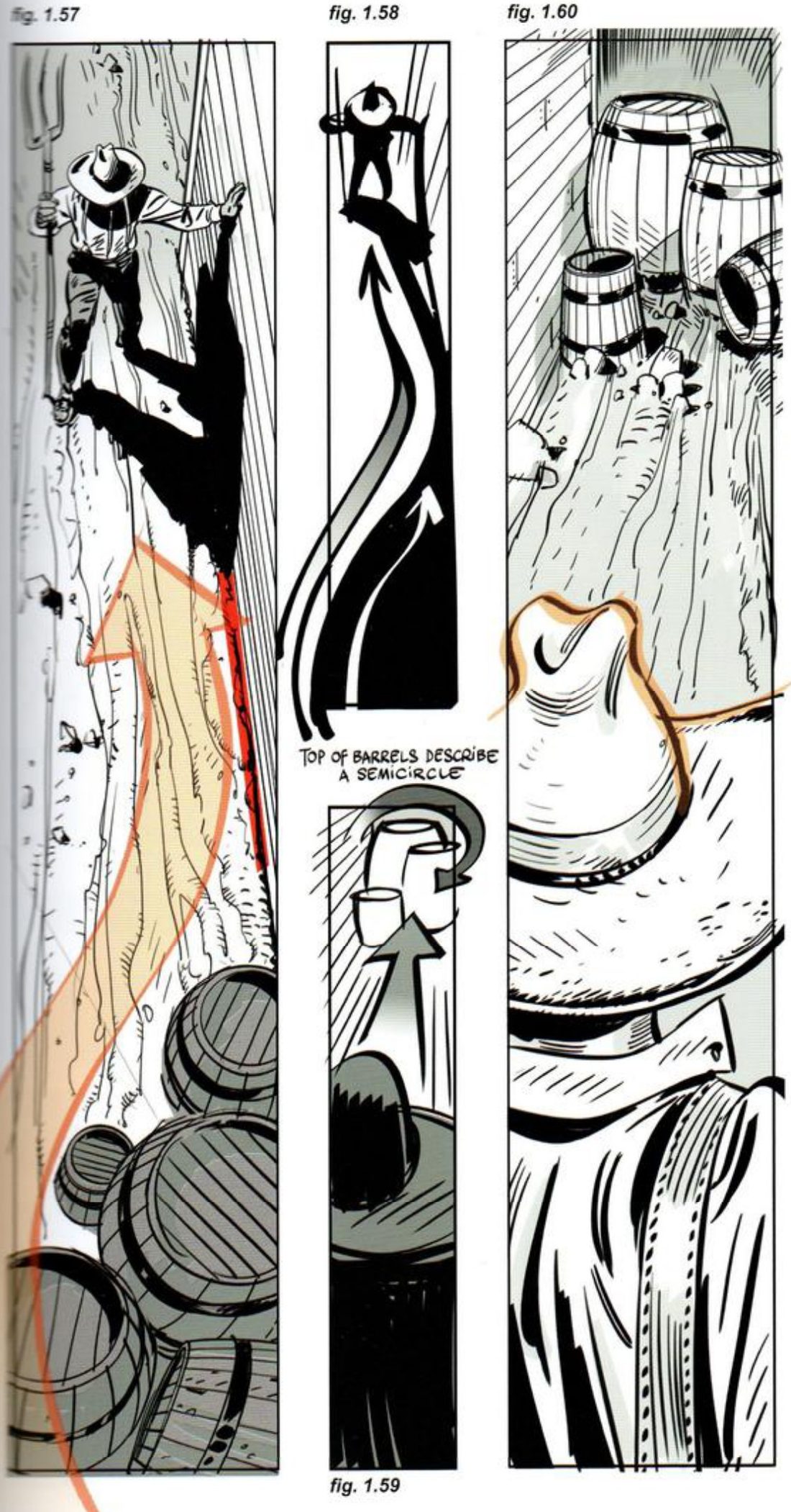
Mateu-Mestre · FI2 p.23“The more we crop off an unusual shape like this, the less recognizable it becomes”
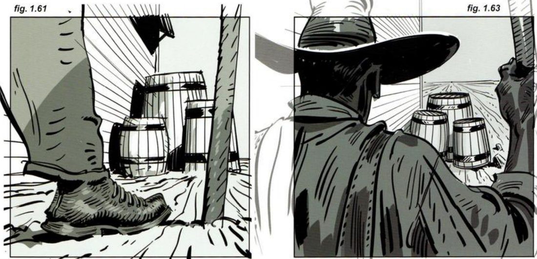
The same pair in a square (p.24). A concentric layout: the leg, boot and pitchfork frame the barrels in the centre (1.61). Raising the camera gives an over-the-shoulder version framed by head, shoulder and arm (1.63). He draws the farmer past the frame edge in grey so that what shows makes sense in proportion and anatomy. The page also has a reverse angle from behind the barrels (1.66) and thirds grids for each.
When you practise
Read once
- Write one line: what should the connection between these two elements make you feel?
- Pick two elements that should be in a dialogue: a character and an object, two characters, a creature and a doorway. Any subject.
- Thumbnail the weak version on purpose: wide frame, one element at each end.
- Reduce it to flat shapes, as in his 1.53. Stripe any area that has no job.
- Repair 1. Keep the frame. Use a strong cast shadow or a similar dark device to shrink the focus area. Box the effective frame.
- Repair 2. Widen the frame and add more of the weaker element so it moves into the middle.
- Repair 3. Keep the frame. Move and rotate the camera so both elements sit closer and line up with the line of sight.
- Optional: take the same pair into a tall frame and a square.
- Open his version and compare.
CheckHis two diagnostics (p.22, close paraphrase): is there blank space with no purpose between the two elements? Is the weaker element so cornered it feels too secondary to matter? Each repair should answer both. Then shrink and flip, and compare with figs 1.49–1.56.
Repair a weak layout
Weak on purpose. Stripe the dead middle. Shadow, widen, rotate.
Keep asking: is any space here doing nothing?
One drawing, many windows
Slide or reshape a frame over one drawing, and write one sentence each time on what the story is now about.
Mateu-Mestre · FI2 pp.56–64 (ch.5, The subtle step between 1.85:1 and 2.35:1) · figs 5.1–5.29
What he shows
Three ways to change ratio (p.56). A change in aspect ratio usually means rethinking the composition, the camera, even what to show. Between 1.85:1 and 2.35:1, he says, it’s mostly a slight reframing. There are three ways: keep the width and change the height, keep the height and change the width, or find a compromise.
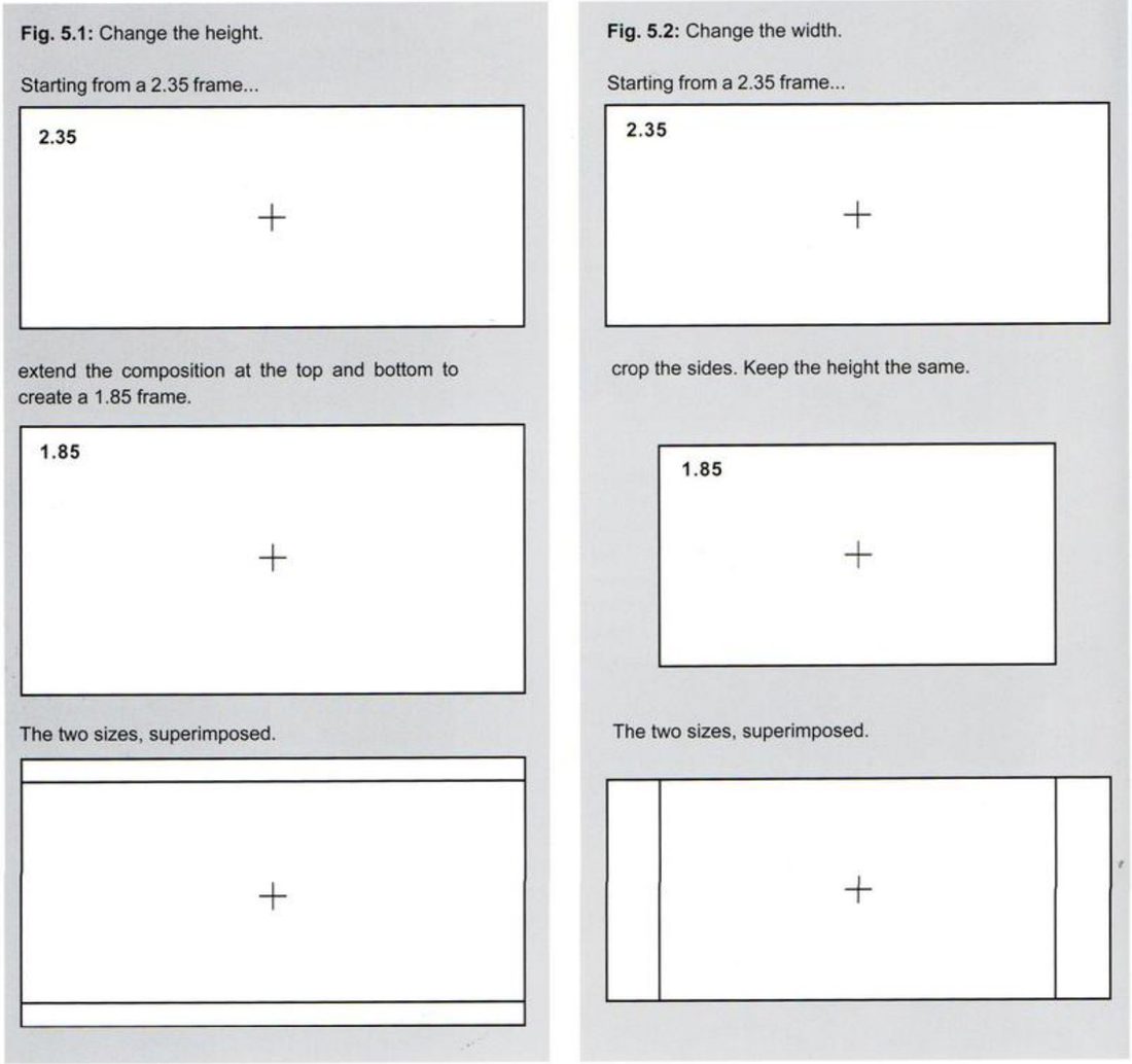
Ask first (p.57). Before you translate a scene, ask which part of the frame adds the best visual information. Is it near the top and bottom, or at the sides? Then change the dimension that protects the story.
Mateu-Mestre · FI2 p.57“what information in it is most valuable?”
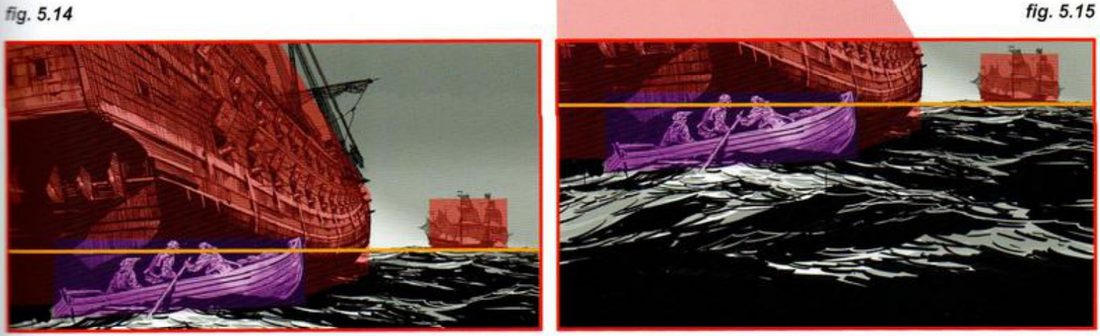
The rowboat, cropped at the sides (p.57). He names the essentials in one sentence: three pirates in a rowboat moving from one galleon to another on high seas. The 2.35 holds them all. More galleon, sky or ocean wouldn’t add to the moment. So for 1.85 he keeps the height and crops the sides, unequally. More comes off the right, which had more air, but some of the distant galleon stays as the pirates’ destination. A little comes off the left, a part of the foreground galleon that isn’t crucial.
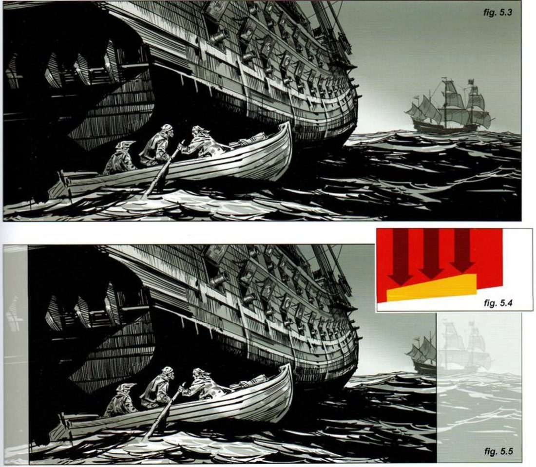
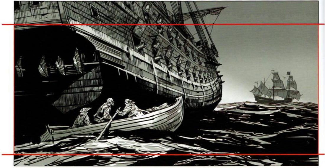
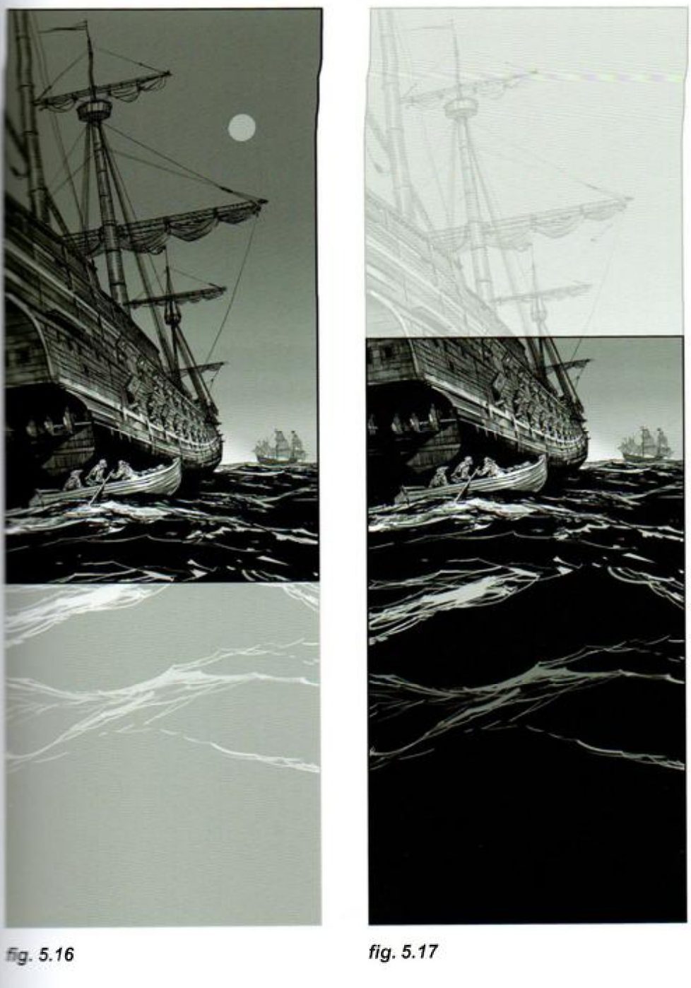
The rowboat, extended in height (p.60). Same width, more height. He extends mostly at the top, because that part shows the vessel’s imposing size against the little boat. He adds a little ocean below to balance it.
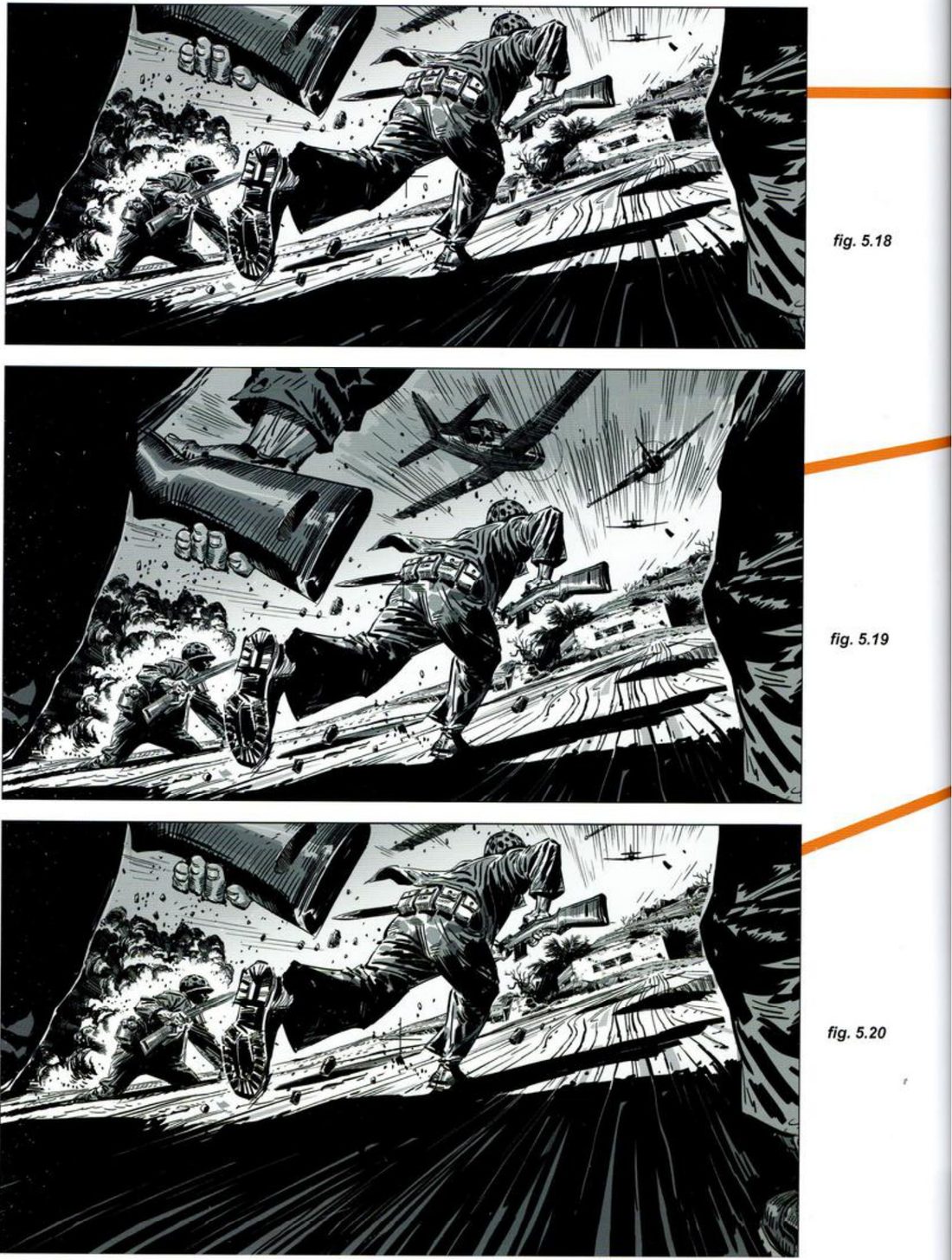
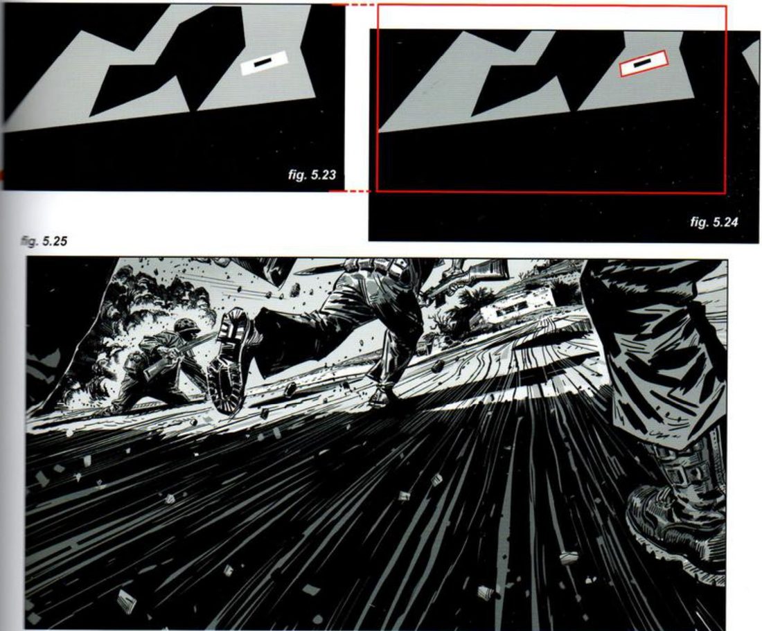
His windows. Then he pushes the rowboat further (p.61) and slides a frame over a bunker assault (p.62). On p.58 he sets up the bunker: Marines running uphill at a fortification with Navy planes for cover, the bunker kept against the right edge. Below are his windows without his sentences. Before opening the key, write one sentence for each on what the story is now about.
Splitting the difference (p.64). He also shows how to change both height and width. Superimpose both formats as one camera guide. Find the point the energy comes from or converges on, here the vanishing point of the line of planes. Draw lines from it through the corners of one frame and beyond, then pick the new corners along those lines. He calls it an exercise, and says starting every variation from that point keeps the dynamics consistent.
His drawings are pirates and Marines. The windows work over any drawing with room around the action.
His version: open after you’ve done yours
Rowboat (p.61). 5.14 puts all the added space at the top to show even more galleon. He says it works if the vessel’s scale is what the moment is about. 5.15 adds a lot of ocean below. Now the first thing we measure the boat against is the water, which stresses how precarious the three men are. He says the threat now is nature, in place of the ship and whatever might come from it. In the verticals, sliding the frame changes the tone even more: either the galleon at night (5.16) or the ocean (5.17) becomes overwhelming.
Bunker (p.63). 5.18 centres the main Marine who sets up the action, with the bunker pressed into the corner and figure shapes framing both sides. 5.19 crops a little from the bottom and adds the top to include the planes.
Mateu-Mestre · FI2 p.63“The Marines are not alone.”
5.20 slides the 1.85 down and loses most of the planes. Now it’s about the men on the ground and how hard it is to advance on that terrain. His thumbnails 5.21–5.23 sum up the three.
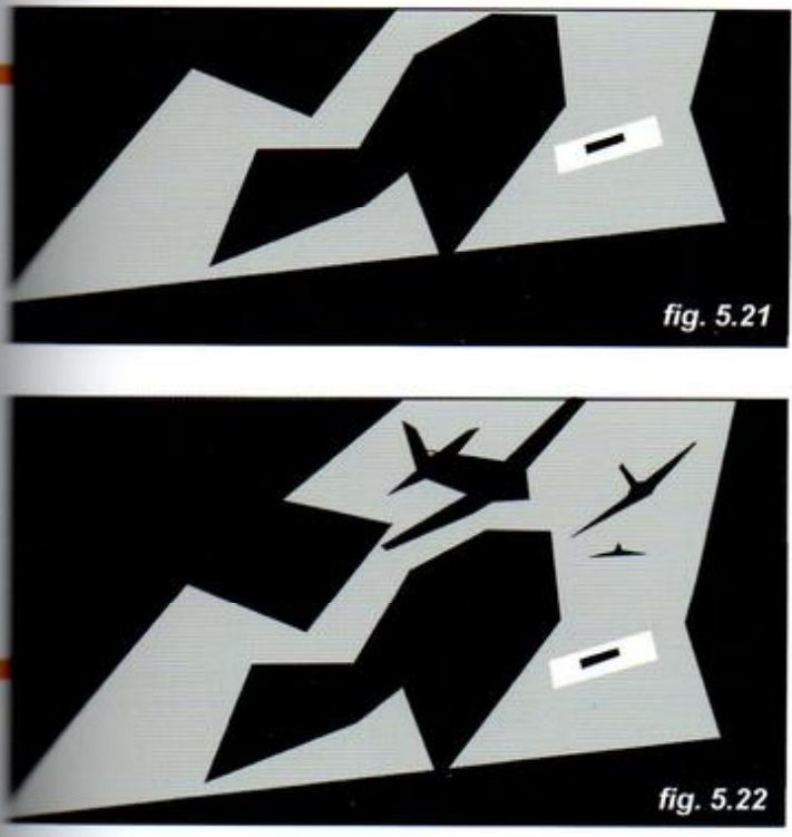
Then he pushes the frame further down while keeping the bunker in shot (5.24, 5.25). The story is now told from one Marine’s view, head down, bullets passing, his comrades’ boots coming in and out of shot. He also widened the frame to fit more legs.
When you practise
Read once
- Write one line: what should this drawing make you feel?
- Optional warm-up: write your sentence for each of his windows above, then open the key and compare.
- Pick one drawing with room around the action: a finished piece of yours, or a quick wide rough made for this. Any subject.
- Write the essentials in one sentence, as he does for the rowboat. Then ask his question: which information is most valuable, and is it near the top and bottom or at the sides?
- Make a frame in your target ratio: a layer rectangle or a paper window.
- Move it. Slide it up, down, left and right. Extend it taller, then wider. Keep one anchor element in every window, as he keeps the bunker.
- At each stop, write one sentence: what is the story about now?
- For the window you’d use, make the two thumbnails, value masses and lines of tension.
- Optional: try his p.64 construction to combine two ratios around the energy point.
CheckHis after-crop test (p.58, close paraphrase): is the action still clear, and is the off-balance, pressure-release dynamic intact? And from p.57: is the story element you need, like the destination, still in shot? Then shrink and flip the window you chose, and compare your sentences with his.
One drawing, many windows
Name the essentials. Move the window. One sentence per stop.
Keep asking: what information in it is most valuable?
Against the grain
Show height in a wide frame and width in a tall frame, turning the clash with the format into the design.
Mateu-Mestre · FI2 pp.66–71 (ch.6, Against the grain) · figs 6.1–6.22
What he shows
The problem (p.66). Sometimes the frame is horizontal and the scene needs verticality. Sometimes the frame is vertical and the scene calls for a horizontal spread. He says there are still several options for getting the most from what you’re given.
Height by contrast (figs 6.1–6.2). Giant skyscrapers against tiny houses and palm trees at the bottom. He says the towers play out like the legs of massive giants. In his mechanics thumbnail, their weight pushes down on the suburb and spreads it thin along the bottom of the frame.
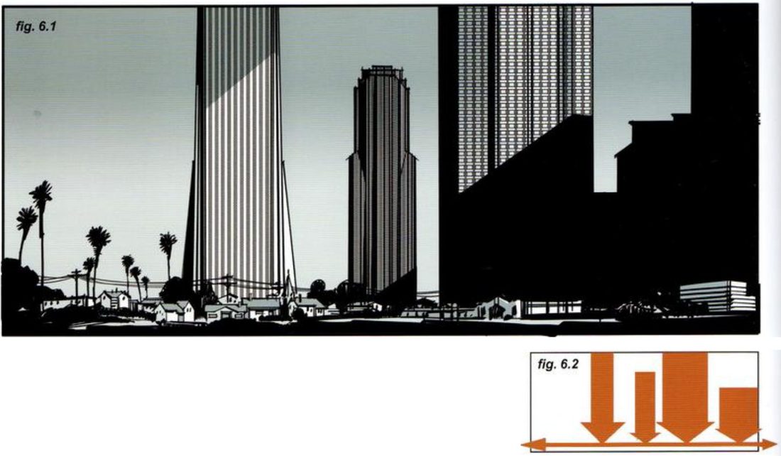
He gives four more ways to show height in a wide frame (pp.66–68). Then he turns to the reverse case: a horizontal theme in a vertical frame, where he says to emphasise the horizontal in as many ways as possible (pp.69–71). Every render comes with a flat orange thumbnail of the shot’s mechanics.
Mateu-Mestre · FI2 p.69“what we purposefully and selectively leave out of it”
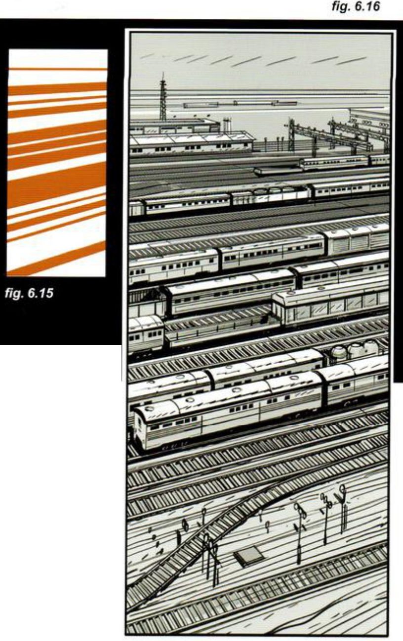
That’s from his point about the vertical train yard. On a real set, the camera would have to be placed so its view excludes every vertical in the area. Composing is about what you leave out as well as what you put in.
His subjects are cities, trains and a house. The question works for any tall or wide subject: a tree, a giant, a queue, a coastline.
His version: open after you’ve done yours
Height by proxy (6.3–6.4). Throw the shadow of a very tall subject over much smaller ones. You never see its body, but the shadow shows the disproportion.
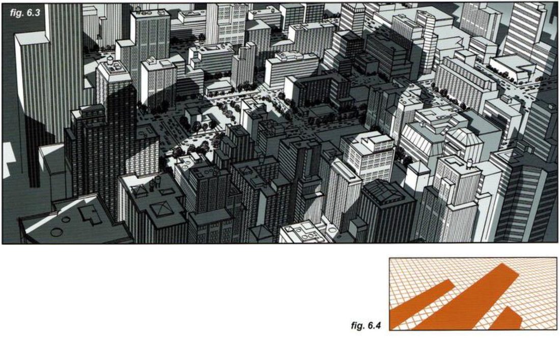
Extreme down shot and extreme upshot (6.5–6.8). His reasoning for the down shot: the next best thing to verticality is a strong sense of depth. The same holds for the upshot in reverse.
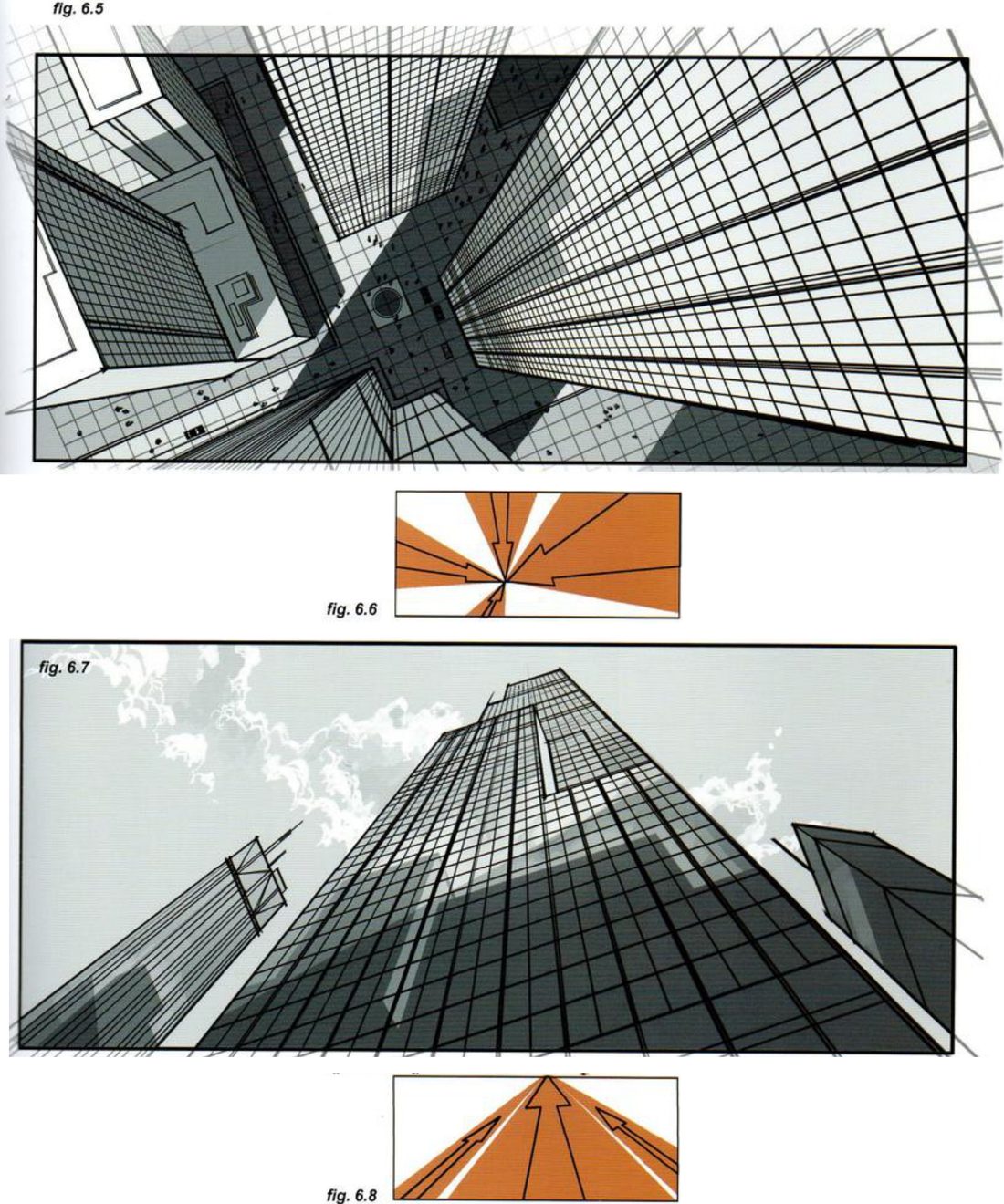
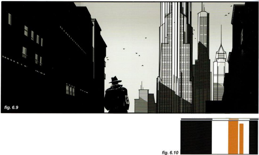
Dark side masses (6.9–6.10). Solid dark shapes visually crop the sides. The frame seems narrower than it is, so the lit space between reads as a taller ratio. On p.68 he adds that the side buildings work best when they feel like vertical frame edges. True parallel rooflines share one vanishing point, and their slopes grab too much attention. He cheats: each roof gets its own vanishing point on a lower horizon, which feels less angular and more like a long lens.
Vertical frame, no verticals (6.15–6.16). The train yard is all horizontals. The only vertical is a very distant antenna, over a clean, unbroken horizon.
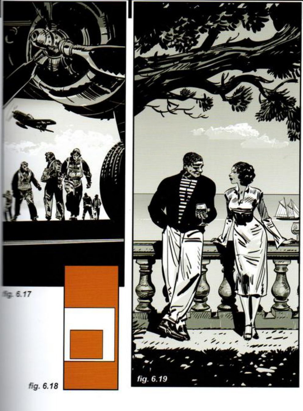
Frame within the frame, and devices that stretch sideways (6.17–6.19). The plane’s wing above, its landing gear at right and the ground below shrink the field to a square. In 6.19 the tree above and its shadow below, a cloud, the stone railing and a ship’s wake reframe the shot and stretch it sideways, reducing its verticality.
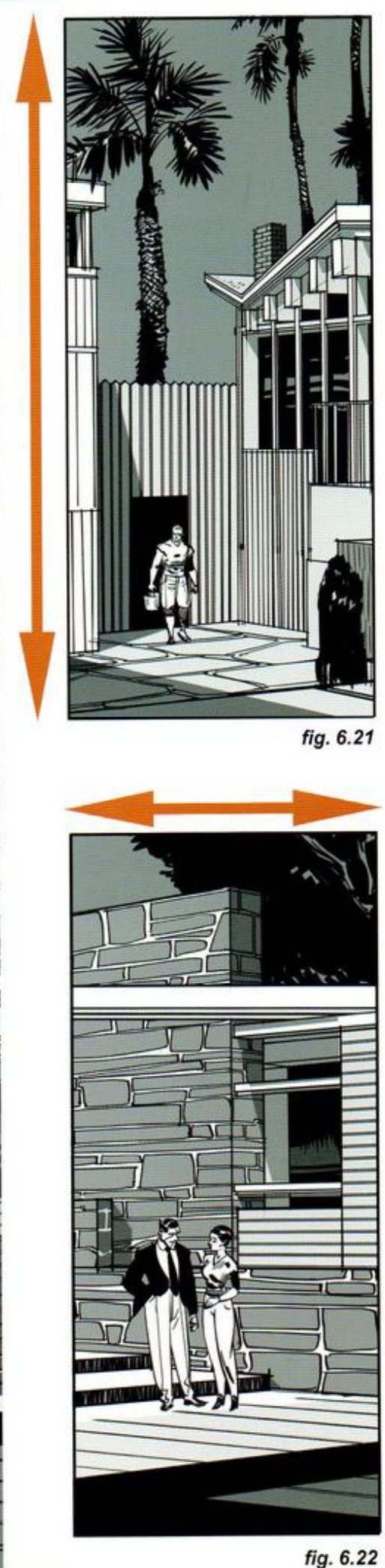
One location, two directions (6.20–6.22). Most locations hold several pattern directions, and any of them can lead. The house is horizontal overall but has areas that tell a different visual story. Two tall crops of it, one vertical, one horizontal, give very different readings of the characters’ moment. He says it’s all about where we focus the camera. He doesn’t spell out what each reading is.
A book slip worth knowing: on p.68 the caption for fig. 6.12 describes the two-vanishing-point cheat, but the 6.12 diagram is labelled “Common VP for both buildings”. The cheat is drawn in 6.11 and 6.13.
When you practise
Read once
- Write one line: what should this subject’s size or spread make you feel?
- Pick a tall subject. Thumbnail it in a wide frame in as many different ways as you can find to make its height felt. He shows one above and four more in the key.
- Pair each with a flat two-colour mechanics thumbnail, like his orange ones.
- Pick a wide subject. Thumbnail it in a tall frame with no verticals, or only one small distant one. Decide where the camera must stand to leave them out.
- Optional: take one location, drawn or a photo of your own. Make two tall crops of the same ratio, one led by verticals and one by horizontals. Write what each says about the character’s moment.
- Open his version and compare.
CheckFor the tall frame he states one: no verticals present, bar one distant exception (p.69). For the wide frame he states no check beyond each strategy’s effect. Shrink and flip each thumbnail: does it still read as tall, or as wide? Then compare with figs 6.1–6.22.
Against the grain
Tall in a wide frame: find the ways. Wide in a tall frame: leave the verticals out.
Keep asking: what am I leaving out?
The entrance test
Stretch a panel to wider formats by adding only at the sides, find what the subject lost, then rethink the frame so it carries the moment again.
Mateu-Mestre · FI2 pp.98–99 (ch.8, Same scene, different formats) · figs 8.28–8.36
What he shows
Chapter 8 builds the key shots of a short marina story in 1.85:1, then remakes them in other formats. Shot 1 is the entrance. On p.96 he puts the camera behind a woman walking towards a yacht, so the entrance rests on elegance, fashion and mystery.
The mechanical stretch (p.98). He converts the same composition to 2.35:1 and 4:1 only by extending both sides. The subjects keep the same size and screen position, marked by the orange lines. He says the new side material is arbitrary. No thought process chose it to change the meaning.
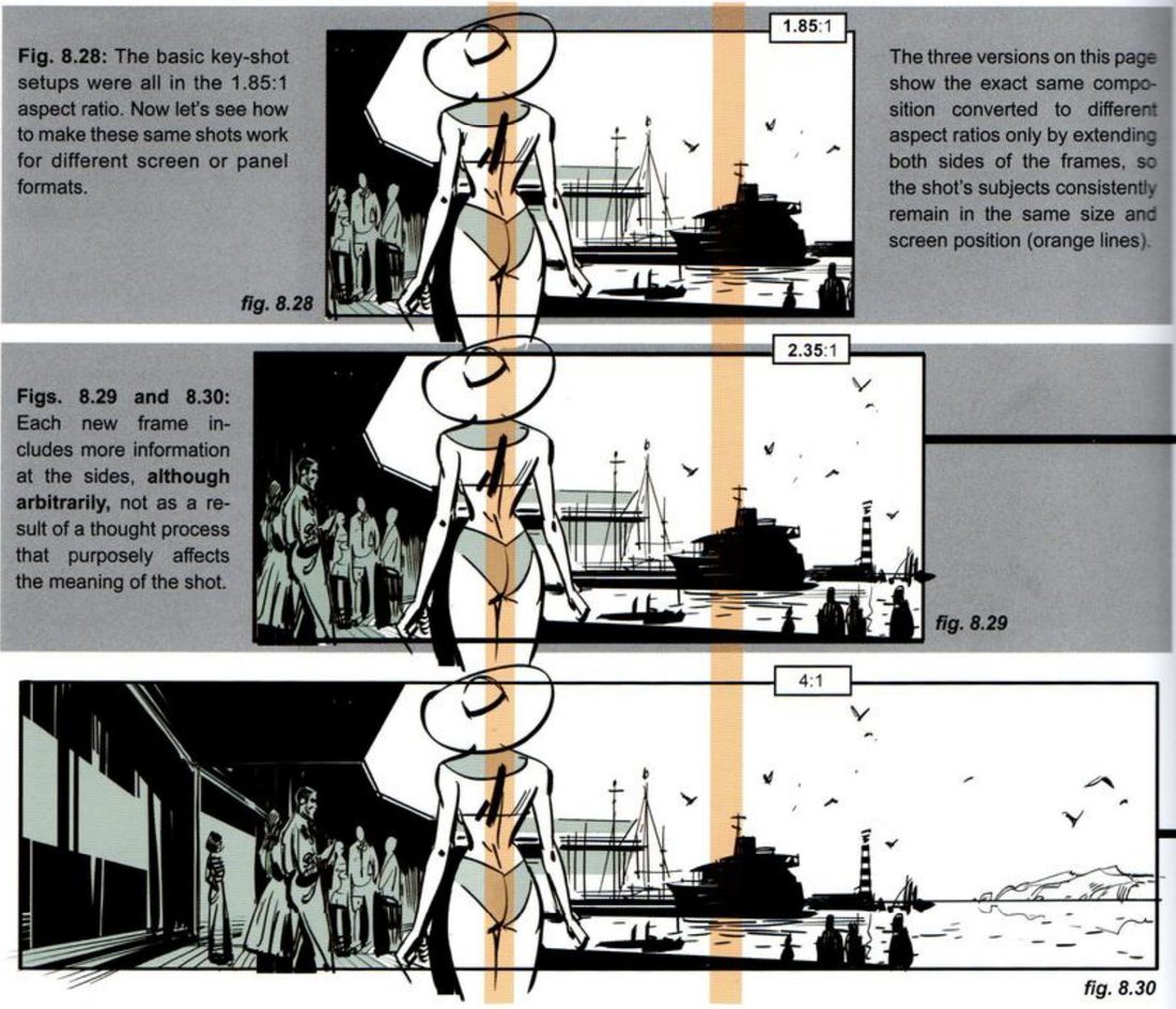
Before you open the key, look at 8.30 and write one line on what the 4:1 has lost. Then he rethinks both wider versions.
His subject is a woman at a marina. The test works on any panel with a clear main subject.
His version: open after you’ve done yours
Diagnosis (8.31–8.33). The 1.85 is balanced, roughly in thirds by the woman and the yacht, with the yacht pushed right to give her a bit more prominence. The 2.35 shows more of the setting and breathes more, and the figures at left are kept in shadow so they don’t pull focus. The 4:1 holds so much information that, at the same size and position, her visual importance is watered down.
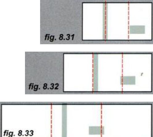
Mateu-Mestre · FI2 p.98“She doesn’t make much of an entrance anymore”
Rethink (8.34–8.36). In 2.35 she’s proportionally smaller than in 1.85, so she has to be made bigger, either closer to camera or with a wider lens that exaggerates the distance to the background. Only she grows. Everything else keeps its size. The 4:1 is fully rethought: she’s bigger still, the camera is very close on the tattoos on her back, and the background is cropped tighter, dropping the peripheral areas of 8.30.
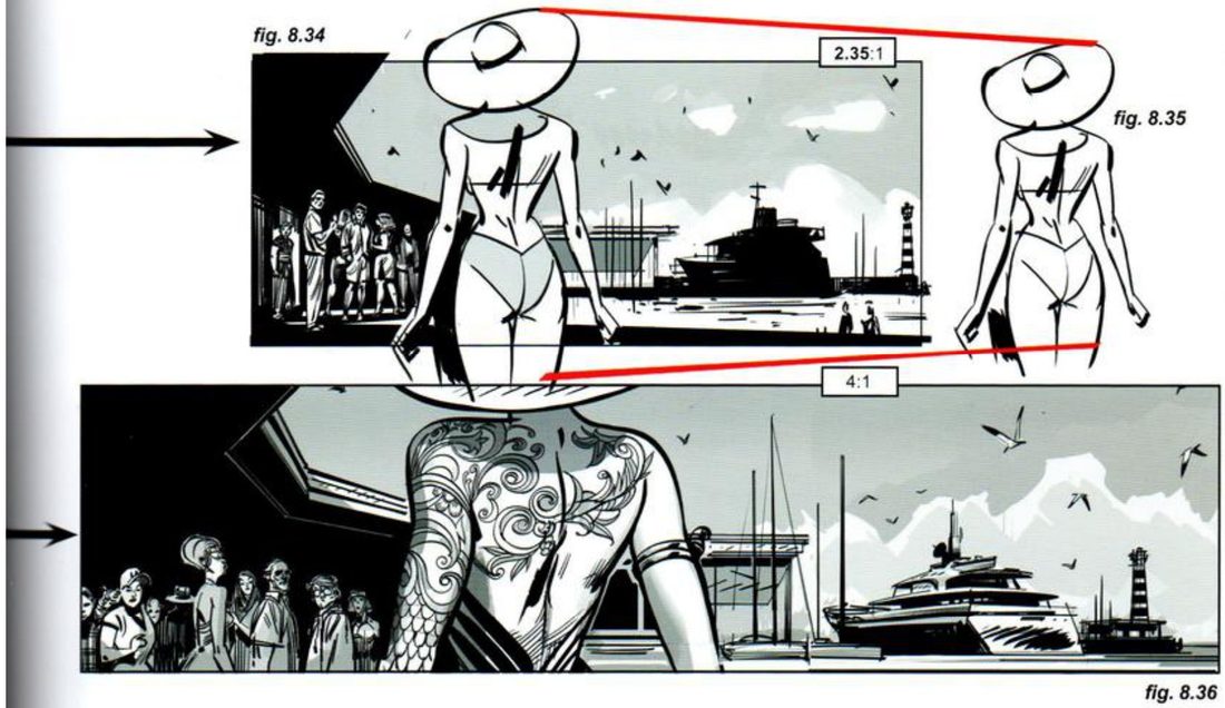
Mateu-Mestre · FI2 p.99“Always remember what the point of the scene is.”
He restates the point of this moment: a mystery woman makes an entrance in front of everyone at the marina, while walking towards the yacht. If she gets everyone’s attention in the shot, she has to get ours too. He lists three ways: the real estate she takes up in the frame, a special use of light that makes her pop, a distinctive feature like the tattoos, or all of them (p.99).
When you practise
Read once
- Write one line: what should this frame make you feel?
- Pick one of your own panels with a clear main subject. Any subject, any genre. Write a second line: what is the point of this moment, beyond what physically happens?
- Extend. Keep the height, and keep the subject’s size and screen position. Extend both sides to 2.35:1, then to 4:1. Fill the new sides roughly with what the setting would hold. Don’t rethink yet.
- Diagnose. On each width, mark the subject and the main secondary element, as he does in 8.31–8.33. Write one line per width on what the subject gained or lost.
- Rethink the 2.35. Make the subject, and only the subject, bigger: move the camera closer or use a wider lens.
- Rethink the 4:1 from scratch. Make the subject win by space, by light, by a distinctive feature, or all three. Crop the background tighter and drop the edges that add nothing.
- Make the two thumbnails for the rethought 4:1, value masses and lines of tension.
- Open his version and compare.
CheckHis test (pp.98–99): does the subject still make an entrance? If the subject draws everyone’s attention in the scene, does it draw ours? Run it on the mechanical 4:1, then on your rethink. Then shrink and flip the rethink, and compare with fig. 8.36.
The entrance test
Extend the sides. Diagnose. Rethink so the subject wins.
Keep asking: does it still make an entrance?