The frame: pressure and release
Five exercises in treating the frame as a game field: where the subject sits, where the air is squeezed or let go, and which line the energy rides.
Mateu-Mestre · FI2 p.14“The interaction between the frame and the elements within it helps to tell the story.”
Moving square
Move one black square around frames of equal area and see where the air gets squeezed and where it opens up, then let a real scene follow the same pressure.
Mateu-Mestre · FI2 pp.13–16 · figs 1.1–1.21
What he shows
Two thumbnails (p.13). He opens by recalling the two little thumbnails from the first book: one a pure abstraction of the lights and darks, the other the simplest drawing of the lines of tension. Tension lines can be physical, like a ridge, a hard light/shadow border or a tall building’s edge. They can also be imaginary, like a line of cars or a line joining the main characters’ heads.
The frames and the square (p.13). Take a surface of 36 square inches and reshape it: 12 × 3 and 3 × 12 (4:1), 8.5 × 4.25 and 4.25 × 8.5 (2:1), and 6 × 6 (1:1). A single black square stands for the subject. You move it around each format and look at what happens.
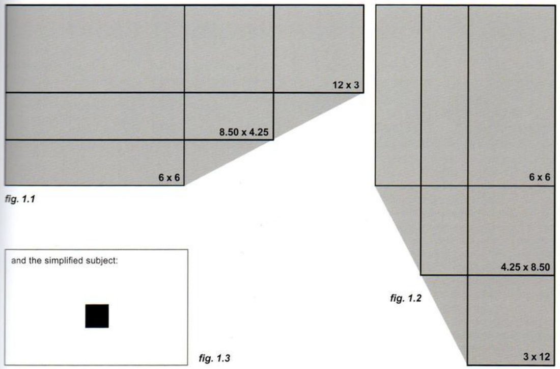
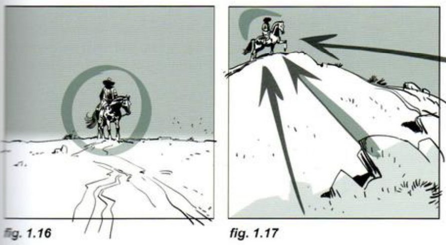
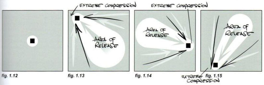
Moving it (p.14). In the 2:1 frame he moves the square from the centre to left of centre, to the upper left, then to the lower right. He calls the frame the game field. Actions and reactions adapt to it the way a gas or a fluid fills a container. He stresses that the exercise is about the square, the space around it, and how that relationship shifts the focus with every move.

Centred, the space is equal all round, which reads as balanced and resolved. Push it towards a side and the air compresses on that side and opens on the other. He calls this the disproportion that makes you want to resolve it.
Mateu-Mestre · FI2 p.14“an instinctive need for resolution within the field. That is, drama.”
He compares it to an elastic band stretched between your fingers: every point is connected, so moving one changes the whole shape. He says this holds for any aspect ratio.
The void as subject (p.15). The open side doesn’t have to be filled with a second object to balance the picture.
Mateu-Mestre · FI2 p.15“The void, or negative space, can sometimes become a subject in and of itself.”
His example is described and not drawn. A small skydiver falls fast from a plane we can’t see, with nothing around her: no cloud, no bird, only flat blue sky. That emptiness is what tells us how dangerous her situation is and how small she is against it. He adds that even dead-centre balance is an action of its own, and that a subject only looks “extreme” against an edge or corner because of the frame. Without the frame its position would mean nothing. Odd placements work if you know how to play the tensions and the story moment calls for them.
A rider in the desert (p.15). The desert is overexposed and bleached so it reads as one bulky mass. That mass can support the horseman and relax the scene, or push him and add tension.
Rider with cloud, rider with sun (p.16), and his method. He pushes the rider far into a corner twice. Once, cloud shapes fill the open area and balance him. Once, a pale sun sets up a dialogue with him. Under each finished frame sits a tiny inset: one brush stroke and a dot. Those insets are in the key below. Then he states his working method. Know the elements and the emotional tone of the moment. Begin by laying down the paths of energy at a very abstract level. While he sketches this he ignores detail and doesn’t even watch the tip of the brush; he is setting the balance of the whole screen. He jokes that he draws like a chameleon looks, one eye on the mark and the other over the whole surface. His three steps:
- Set up the game of spaces and tension lines for the shot, in an abstract way.
- Set up dialogues and currents of energy that mean something, and make sure they create the rhythm that beat of the story needs.
- Have the drawing follow their path and lead, without losing the original raw energy.
His version: open after you’ve done yours

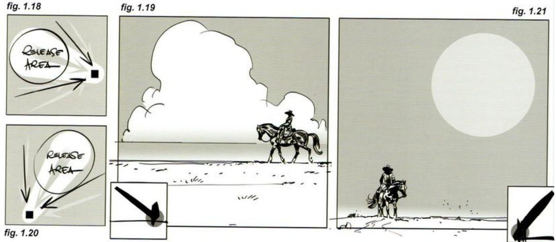
His captions: the clouds balance the rider without taking away his prominence; they serve as his background and make him stand out by contrast. With the sun, the contrast on the cowboy is pushed and the sun is faded, so he stays the main feature. He shows the schematic only for 2:1 and 1:1. The 4:1 frames and the vertical frames are set up on p.13 and not diagrammed, and the skydiver is never drawn.
When you practise
Read once
- Write one line: what should a frame with one lonely subject make you feel?
- Draw his frame set at any scale, keeping the area equal: 12 × 3, 3 × 12, 8.5 × 4.25, 4.25 × 8.5 and 6 × 6.
- In the 2:1 frame, put the square in his four positions: centre, left of centre, upper left, lower right. Do the same in the square frame: centre, top-left corner, right edge, bottom-left corner.
- Over each one, mark the air in his notation: a white bubble round the square, arrows on the squeezed side, and a teardrop of release opening away from it. Write one word beside each for how it feels.
- Do the same in the 4:1 frames and the two verticals. He doesn’t show these.
- Now a scene. Choose a subject, a moment, and one big mass (desert, sea, sky, a wall). Make the two thumbnails first: value masses, and lines of tension. Then do two squares: one where the mass supports the subject, one where it pushes.
- Push the subject into a corner. Make the one-stroke inset first. Then fill the open area so it frames the subject without competing (his clouds), or answer the subject with a second faded shape (his sun).
- Thumbnail his skydiver: a small figure and nothing else. Let the empty space carry the danger.
- Open his version and compare.
CheckHis p.16 test: are all the elements connected and pushing the same idea? His p.15 condition for an extreme placement: you know how you are playing the tension, and the moment calls for it. For the cloud or sun frame (p.16): does the filler stay behind the subject, so the subject stands out by contrast? Then shrink and flip each one: does it still read as your intent? Compare with figs 1.8–1.21. The skydiver and the 4:1 and vertical frames have no key.
Moving square
Move the square, mark the air, then let a scene follow one abstract stroke.
Keep asking: where is the air squeezed, and where does it open?
Action glyph → three scenes
Act out a movement you can feel, trace its path as one glyph, find where it turns, and build three unrelated scenes on that one line.
Mateu-Mestre · FI2 pp.34–37 · figs 3.1–3.10 · variants pp.38–41 · figs 3.11–3.25
What he shows
Choreography (p.34). He says the most important thing in a new composition is to find a way to inject meaning.
Mateu-Mestre · FI2 p.34“One must understand and believe in the choices.”
He compares it to dance. A choreographer can give a mechanical instruction: stretch your arm up and twirl your wrist. Or a purposeful one: reach for a fruit on a tree, grab it and bring it down gracefully to a basket. The movement is the same, but now there is a story. Lifting your wrist in front of your face is different from glancing at your watch and realising you’re late. Once you know what dynamics a shot needs, he says, link them to something you understand and feel connected to. A dramatic reading comes easier when you know the purpose, and a flow that follows the physics of an emotional moment carries the scene.
Catching a baseball (p.34). His example move: (A) follow the ball, (B) grab it, (C) carry on in the same circular motion down to thigh level, (D) stretch the arm the other way and throw it away fast. In mid-air that path reads like the number 2, so he bases the next compositions on a 2.
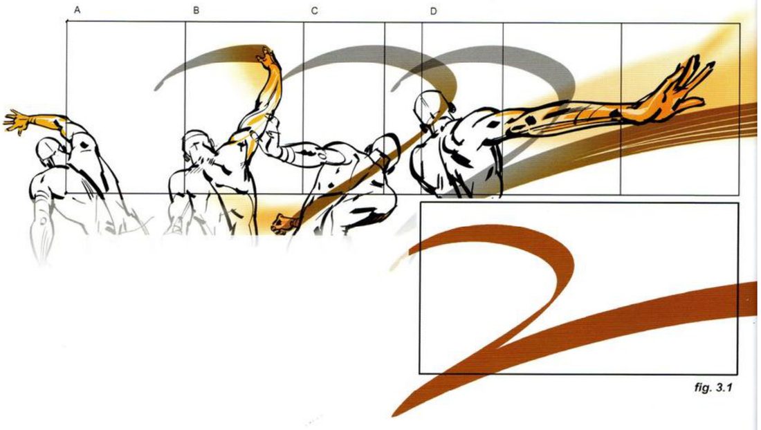
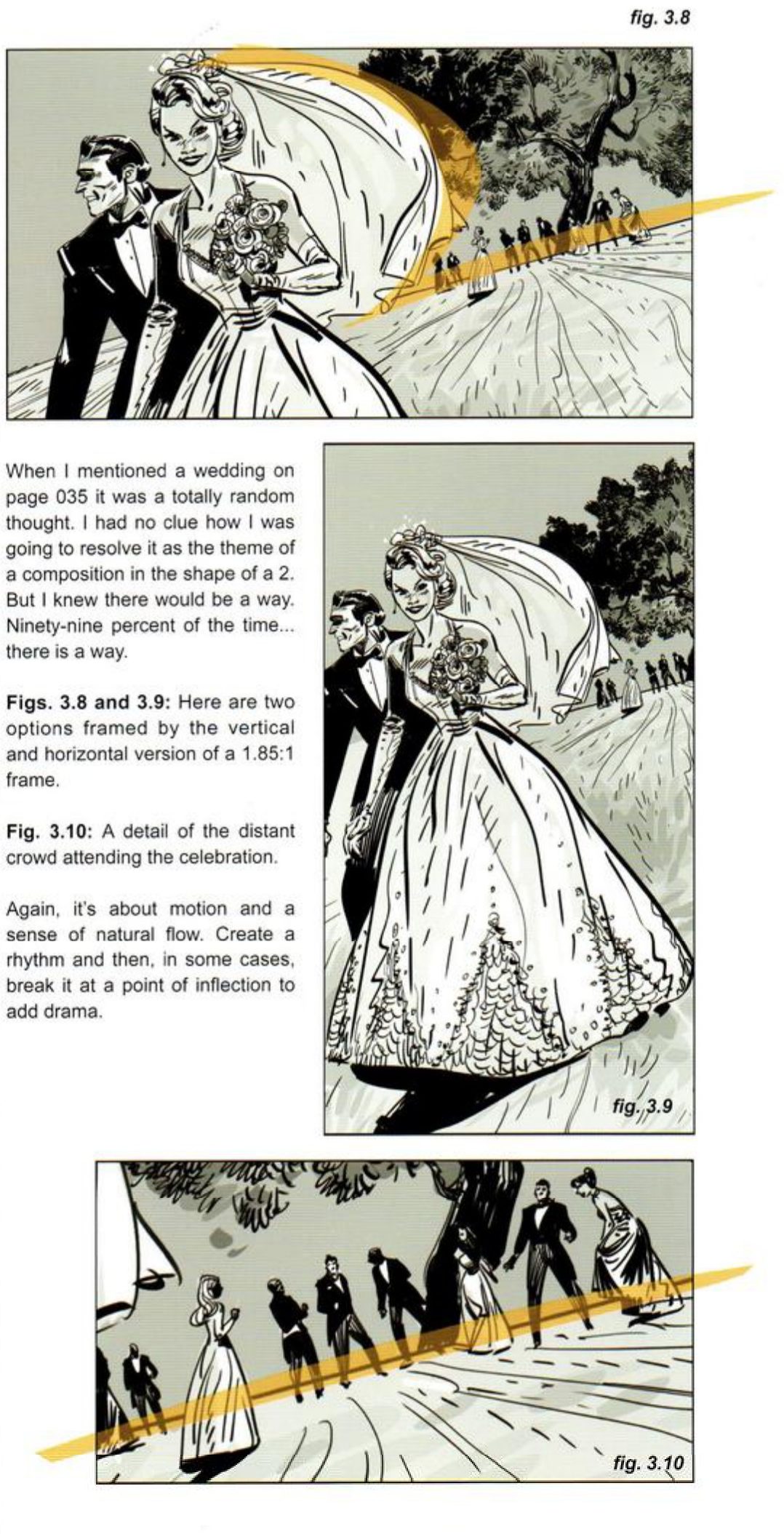
The point of inflection (p.35). The drama is the twist in the middle, where the path changes type: from a semicircle travelling top to bottom into a nearly straight diagonal going up and to the right. One plausible real-life gesture still links it all. He asks whether this can work for a western landscape, an urban car chase and a moment at a wedding, in more than one format. He uses 1.85:1, horizontal and vertical. In the desert, the effort of an uphill ride is carried by the inflection between the line of action and the line of reaction.
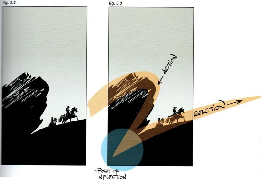
Mateu-Mestre · FI2 p.35“Remember, change equals drama.”
The car chase and the wedding (pp.36–37). The other scenes are in the key. Two things he says about them matter for the practice. When the vertical car shot left the top two-thirds as dead space, he gave it a purpose caused by the action itself: papers and trash thrown up by the car’s speed, curving out from the point of inflection. And he admits that when he named a wedding on p.35 it was a random thought. He had no idea how he would solve it as a 2, only a belief that there would be a way. He closes the chapter by saying: create a rhythm, then sometimes break it at a point of inflection to add drama.
His version: open after you’ve done yours
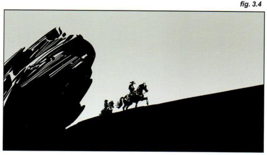
His caption: the cowboys ride away from the claustrophobia of the oppressive rock, towards open space, to get the most energy from the shot.
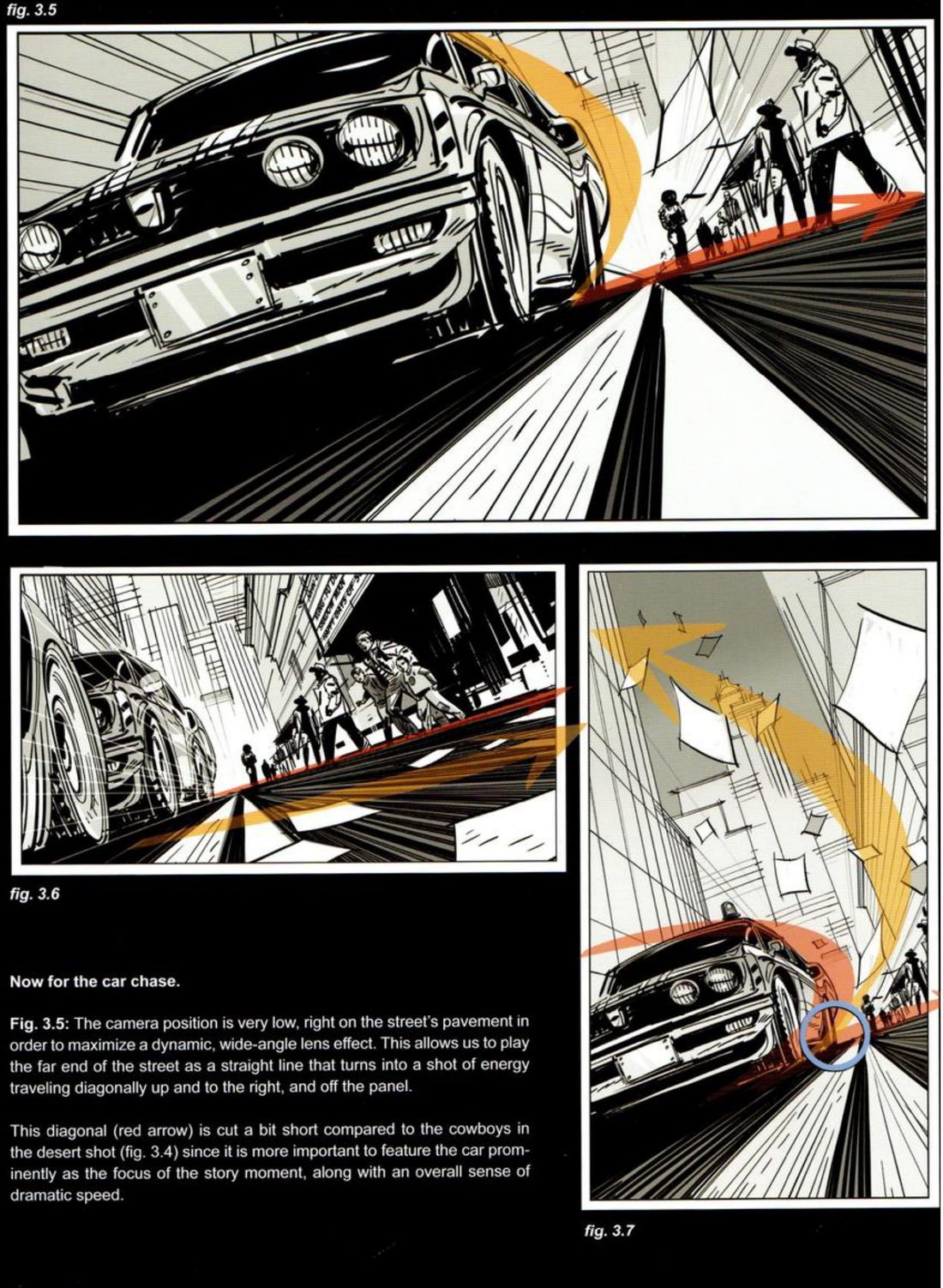
His captions: the very low camera gives a wide-angle effect, and the far end of the street becomes a straight shot of energy up and off the panel. The red diagonal is kept shorter than in the desert, because the car and its speed are the focus. Moving the frame right (3.6) makes the shot about the crowd’s reaction more than the chase. In the vertical, centring the car would kill the dynamism, so he put it low and filled the dead top with flying trash.
When you practise
Read once
- Write one line for each scene you’ll do: what should this frame make you feel?
- Pick a physical action with a purpose, something you’ve done and can feel: catching and throwing, reaching for something high, a sudden look at your watch. Do it for real, slowly.
- Trace the path of the moving hand as one brush stroke. Label the phases A, B, C… as he does.
- Circle the point of inflection: where the path changes from one kind of movement to another.
- Pick three unrelated scenes. His were a western landscape, a car chase and a wedding. Choose your own, or use his and compare directly.
- For each scene, draw two 1.85:1 frames, horizontal and vertical. Lay the glyph in first. Then make the value-mass and tension-line thumbnails on it, and fit the subject to the line.
- Where a format leaves dead space, fill it with something the action causes, starting from the point of inflection.
- If one scene won’t fit, commit to it anyway and keep searching. He admits he didn’t know how the wedding would work.
- Open his version and compare.
CheckHis p.35 rule, change equals drama: is there a visible change of direction at the point of inflection, in every frame? His p.37 test: is any area dead space that draws attention and offers nothing to the moment? And if you shifted a frame, did it change what the shot is about, as his 3.6 did? Then shrink and flip each frame: does it still read as your intent? Compare with figs 3.2–3.10.
Variant · squirrel zig-zag (pp.38–39)
Mateu-Mestre · FI2 pp.38–39 · figs 3.11–3.17
Here the glyph comes from a squirrel jumping branch to branch and tree to tree. He reads off its rules. It jumps four times, each in a completely new direction, so the line is eventful. Each jump is longer than the last. At every turning point the line is pulled hard downwards before it bounces into the next move. After going downwards all the way from A to D, the conflict resolves in one sudden move up to E, much higher than the start. He applies it to a platoon in the jungle in 2.35:1, horizontal and vertical, and then in a square.
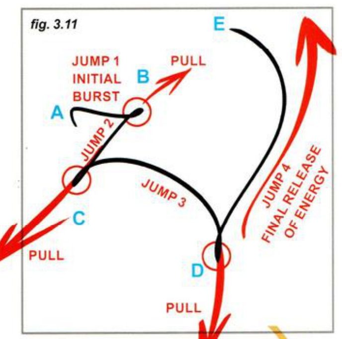
- Copy his line, or make your own from a moving thing you can picture, keeping his rules: new direction each jump, each jump longer, a pull at each turn, a final release higher than the start.
- Fit it to a group moving through a place, in 2.35:1 horizontal, 2.35:1 vertical and a square. Squeeze or stretch the line to fit each.
- Push each turning point down, even past the bottom edge, before the line bounces back.
- Open his version and compare.
His version: open after you’ve done yours
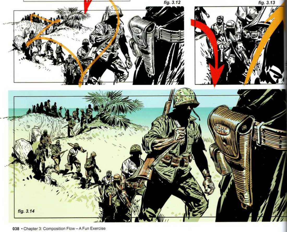
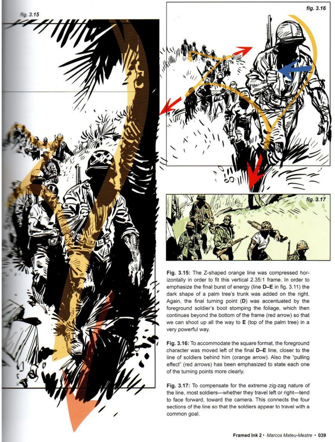
His captions: in the vertical he squeezed the Z sideways and added a dark palm trunk on the right for the final burst. The foreground soldier’s boot stamping the foliage stresses the last turning point and carries past the bottom edge, so the line can shoot up to the palm top. In the square he moved the foreground figure left of the last line and stressed the pulls. Most soldiers face the camera whichever way they travel, so the four sections seem to share one goal.
CheckHis rules on p.38 are the check: is the line eventful, with a new direction at every jump? Does each turn read as a pull? Does the release end higher than the start? And from p.39: do your figures look as if they share one goal?
Variant · waterfall (pp.40–41)
Mateu-Mestre · FI2 pp.40–41 · figs 3.18–3.25
He reuses the platoon’s dynamic, slightly stretched upwards, on a waterfall. The key moment is again the turning point at the lowest part of the line, where everything bounces off the downward direction into an unexpected upward turn. Where it goes depends on the format. In the square and the wide frame, he puts the point of inflection in the bottom half, so there is room above to redirect the energy. In the tall frame it sits at the vertical centre, and the tall shape shows more of the water falling. He simplifies the water’s whole silhouette into one shape, because a scene of falls, rocks and splashes reads best when kept graphic and simple.
- Take a line you have already made, from the squirrel or your own glyph, and put it on a new falling subject: water, hair, cloth, a body falling.
- Draw it in three frames: 2.35:1 tall, 2.35:1 wide and a square.
- Place the point of inflection by his rule: low in the square and the wide frame, central in the tall one.
- Reduce the subject to one simple silhouette.
- Open his version and compare.
His version: open after you’ve done yours
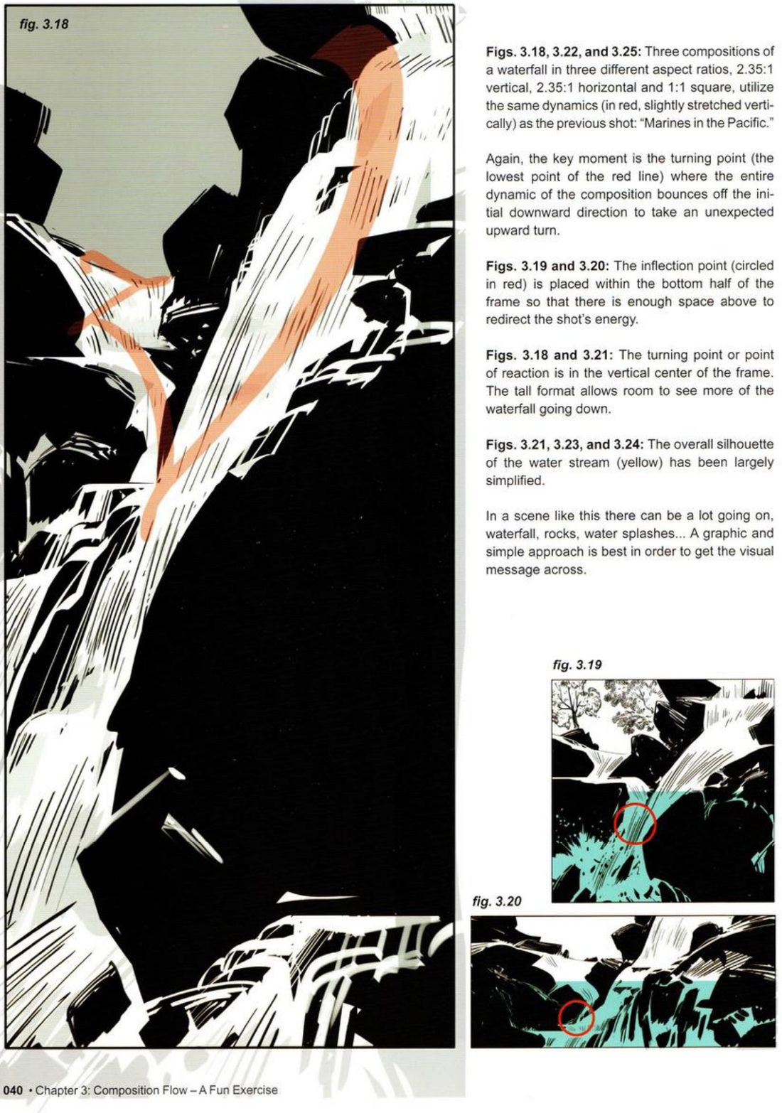
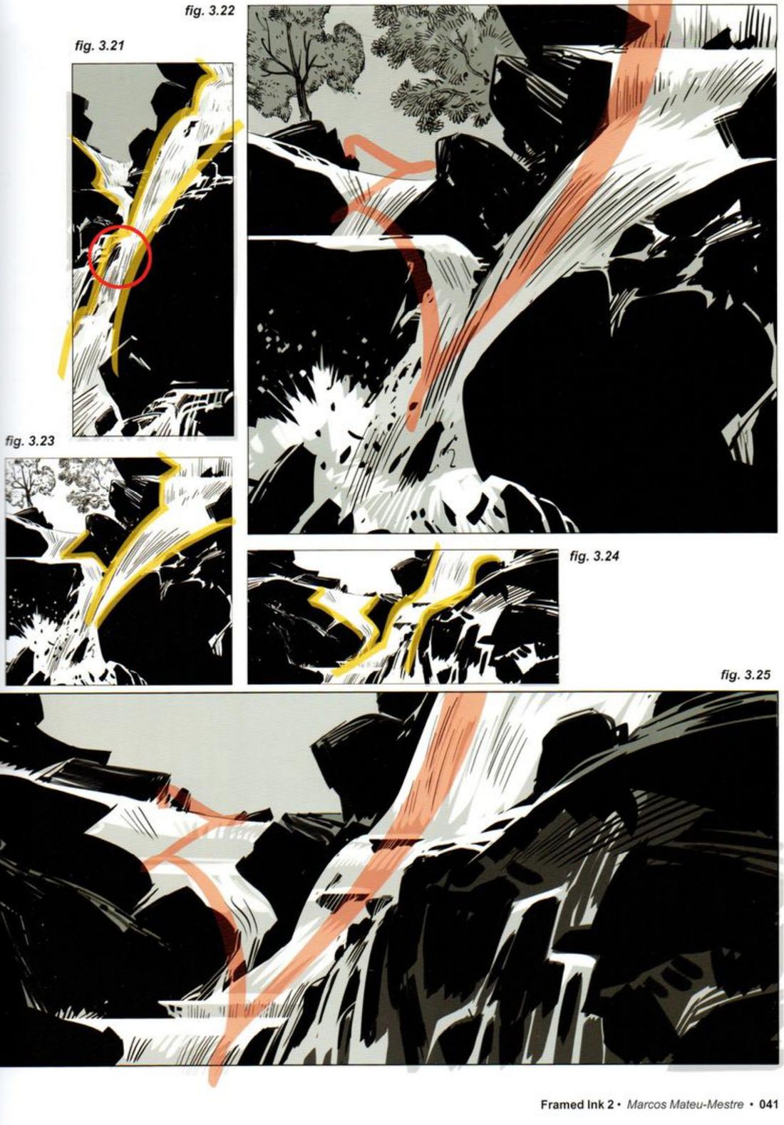
The captions and figures don’t quite match. The p.40 caption names figs 3.18, 3.22 and 3.25 as 2.35:1 vertical, 2.35:1 horizontal and 1:1 square, in that order. As printed on p.41, 3.22 looks nearly square and 3.25 is the wide strip, so the caption may have the last two the other way round. Read the formats from the shapes on the page.
CheckHis p.40 points: is there room after the turning point for the energy to go? Is the silhouette simple enough to read at once? Then shrink and flip.
Action glyph
Act it, trace it, circle the turn, then make three unrelated scenes ride the same line.
Keep asking: where does the flow change direction? (Change equals drama.)
Free-line prompts
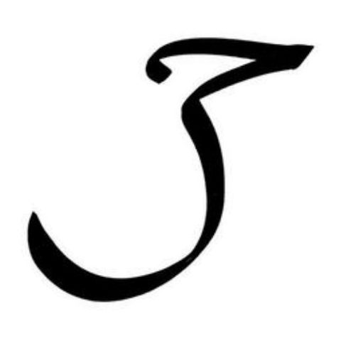
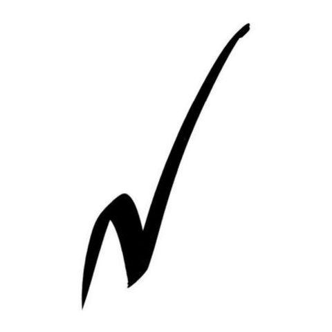
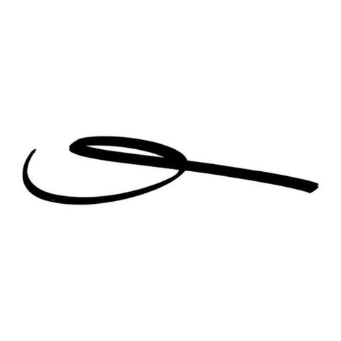
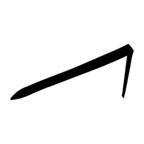
Start from one of his free brush lines and a theme, and find the scene the line wants to be.
Mateu-Mestre · FI2 p.42 · fig. 3.26 · the only exercise he explicitly sets in the two books
What he shows
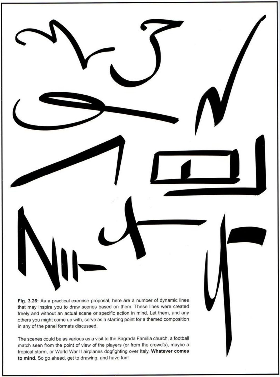
He closes chapter 3 with a page of brush lines and offers them outright as an exercise.
Mateu-Mestre · FI2 p.42“As a practical exercise proposal, here are a number of dynamic lines”
He says he drew them freely, with no scene or action in mind. They, or any lines of your own, can start a themed composition in any of the panel formats in the book. His suggested themes: a visit to the Sagrada Familia, a football match seen by the players or by the crowd, a tropical storm, or Second World War planes dogfighting over Italy. Then he adds that anything goes.
Mateu-Mestre · FI2 p.42“Whatever comes to mind.”
Pick a line
The same nine lines, cut out one by one. The numbers are ours, reading the page from top left.
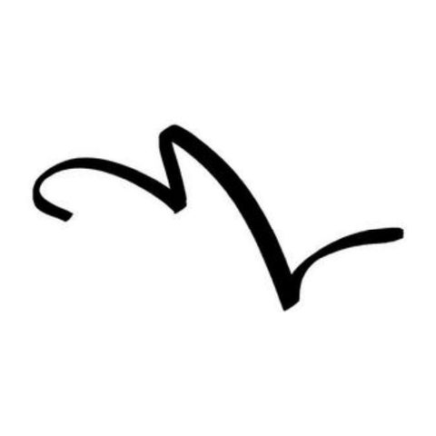
Line 1
Top left · FI2 p.42
Line 2
Top middle · FI2 p.42
Line 3
Top right · FI2 p.42
Line 4
Middle left · FI2 p.42
Line 5
Lower left · FI2 p.42
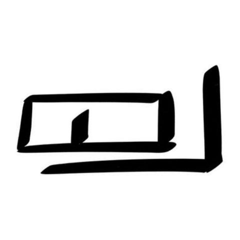
Line 6
Middle right · FI2 p.42
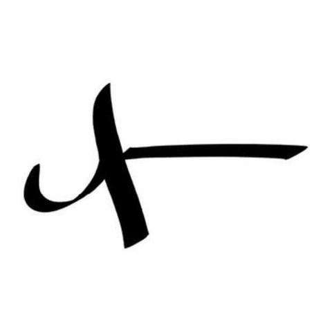
Line 7
Lower middle · FI2 p.42
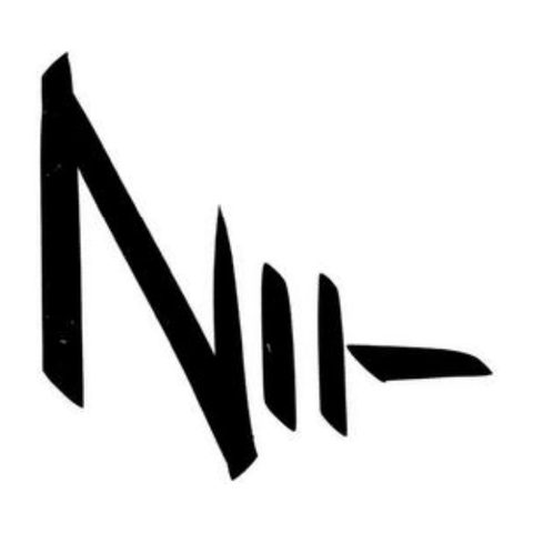
Line 8
Bottom left · FI2 p.42
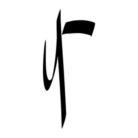
Line 9
Bottom right · FI2 p.42
When you practise
Read once
- Pick one line from the cards above, or draw one of your own freely, with no scene in mind.
- Pick a theme: one of his four, or whatever comes to mind.
- Pick a format from the book: 4:1, 2.35:1, 1.85:1, 2:1 or 1:1, wide or tall.
- Write one line: what should this frame make you feel?
- Lay the line into the frame first as one stroke. Stretch or squeeze it to fit, as he does with the squirrel line.
- Circle its turning points.
- Make the two thumbnails on it: value masses, and lines of tension.
- Let the subject follow the line. Keep the raw energy of the stroke.
Format: · wide / tall
This frame should feel:
The turn is where:
CheckHe states no check and prints no solutions. Use the session check: shrink it and flip it; does it still read as your intent, and can you still see the line in it? For how a line becomes a scene, look back at his car chase and platoon in exercise 2.
Free-line prompts
One line, one theme, one format. Line first, subject second.
Keep asking: what scene could ride this line?
Group structure, blob-first
Reduce a group of characters to blobs, give the group one overall shape and a second rhythm inside it, make one figure dominant, then reshape the group for a new format.
Mateu-Mestre · FI2 pp.26–31 · figs 2.1–2.32
What he shows
One structure per group (p.26). Until now he has used two elements at most. Now he combines many, starting with characters only. He says a panel will more often take thinking and re-thinking, doing and re-doing, than flow straight out. The challenge is to arrange several characters so they are expressive, clear and compelling on a solid underlying structure, which he marks with orange arrows.
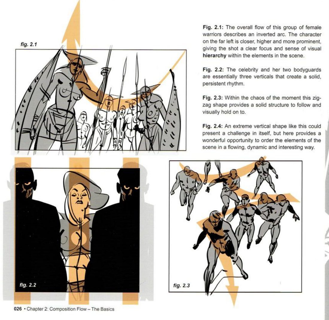
His captions: the arc’s closest, highest figure gives the shot a clear focus and a sense of hierarchy. The three verticals make a solid, persistent rhythm. The zig-zag gives the chaos something solid to follow and hold on to.
Silhouettes and double structure (p.28). Backlit silhouettes show how the basic shapes combine as expression. They still need a choreography with a coordinated flow, or breaking points where needed.
Mateu-Mestre · FI2 p.28“Sometimes the narrative requires that visual flow be interrupted and changed into a different rhythm”
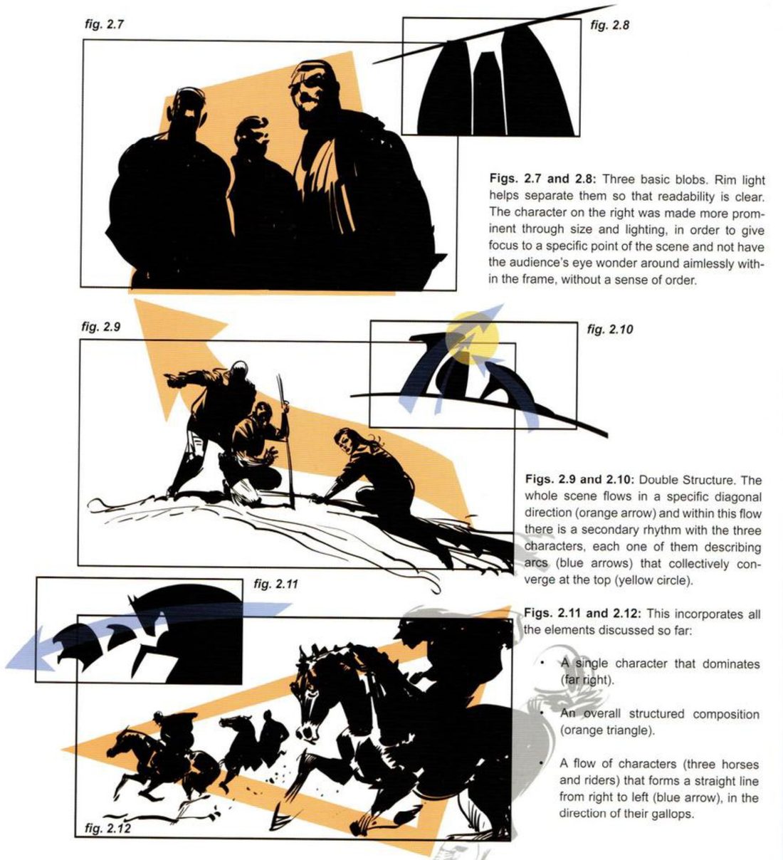
His captions: rim light separates the three blobs so they read clearly. The right-hand man is made more prominent by size and light, so the eye doesn’t wander round the frame without a sense of order. In the climbers, the whole scene flows on one diagonal, and inside it each figure makes an arc; the arcs meet at the top. The horsemen combine it all: one dominant figure, an overall triangle, and a line of riders in the direction of their gallop.
Mateu-Mestre · FI2 p.29“99% of the time simplification is great.”
Aside: keep the rough (p.27). In the middle of this chapter he describes a working habit. Try alternatives after a first pass, but keep every version so you can go back. On his graphic novel Trail of Steel: 1441 A.D. he first did a quick layout pass for each page in black-and-white masses, checking panel by panel and as full double-page spreads, before cleaning up. Often, after finishing, he saw that some freshness had gone. Then he removed the finished drawing, brought back the sketch, and added only the details needed to get the message across.
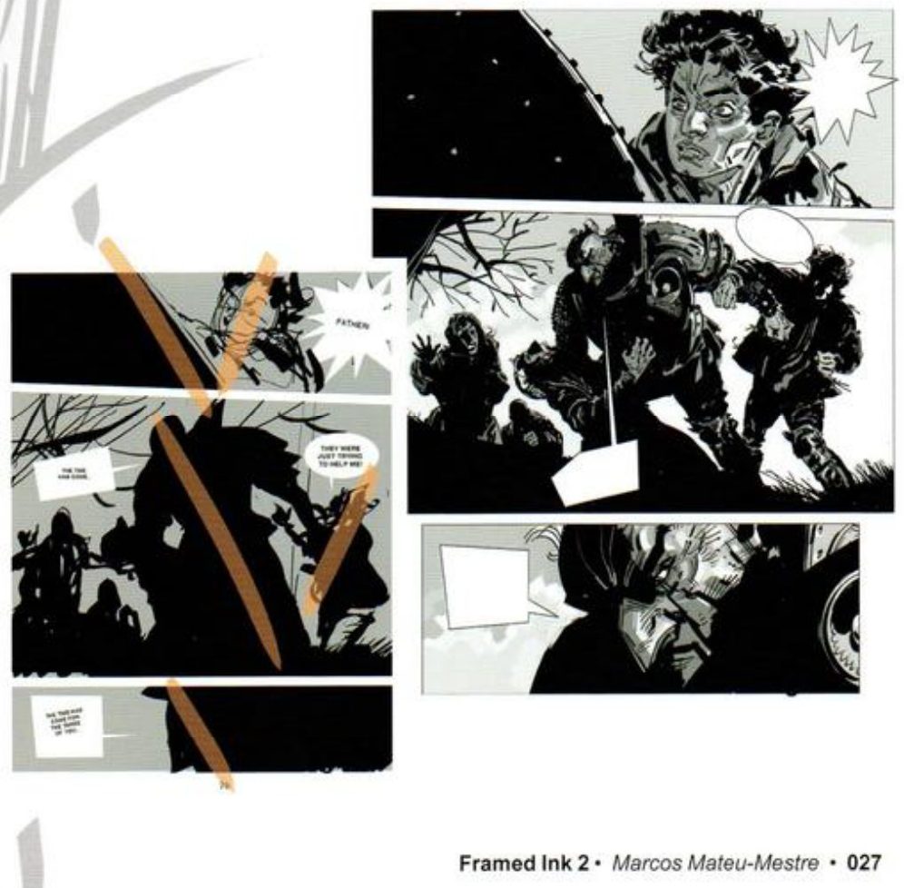
His version: open after you’ve done yours
One theme, two flows (p.29). He presents these two as similar in composition, theme and format, differing mainly in dynamics and flow.
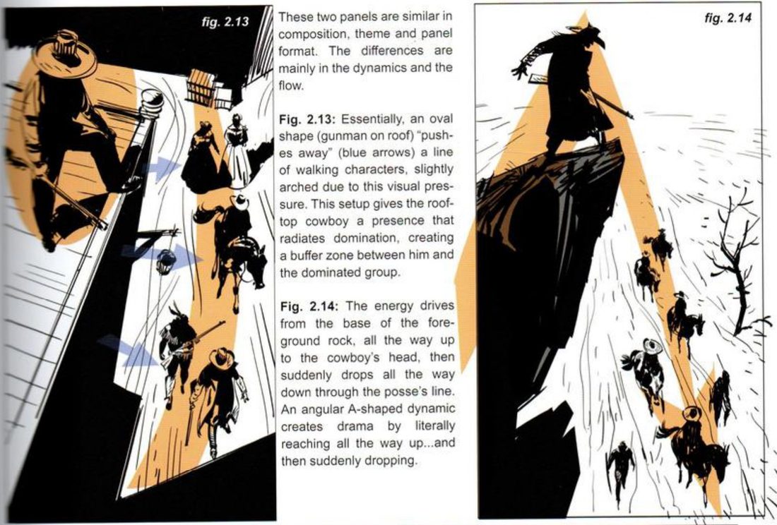
His captions: the oval pushes the walkers away so their line arches slightly, giving the gunman domination and a buffer zone. The A drives the energy up to the cowboy’s head, then drops it suddenly all the way down the posse, for drama.
Same group, 4:1 both ways (p.30).
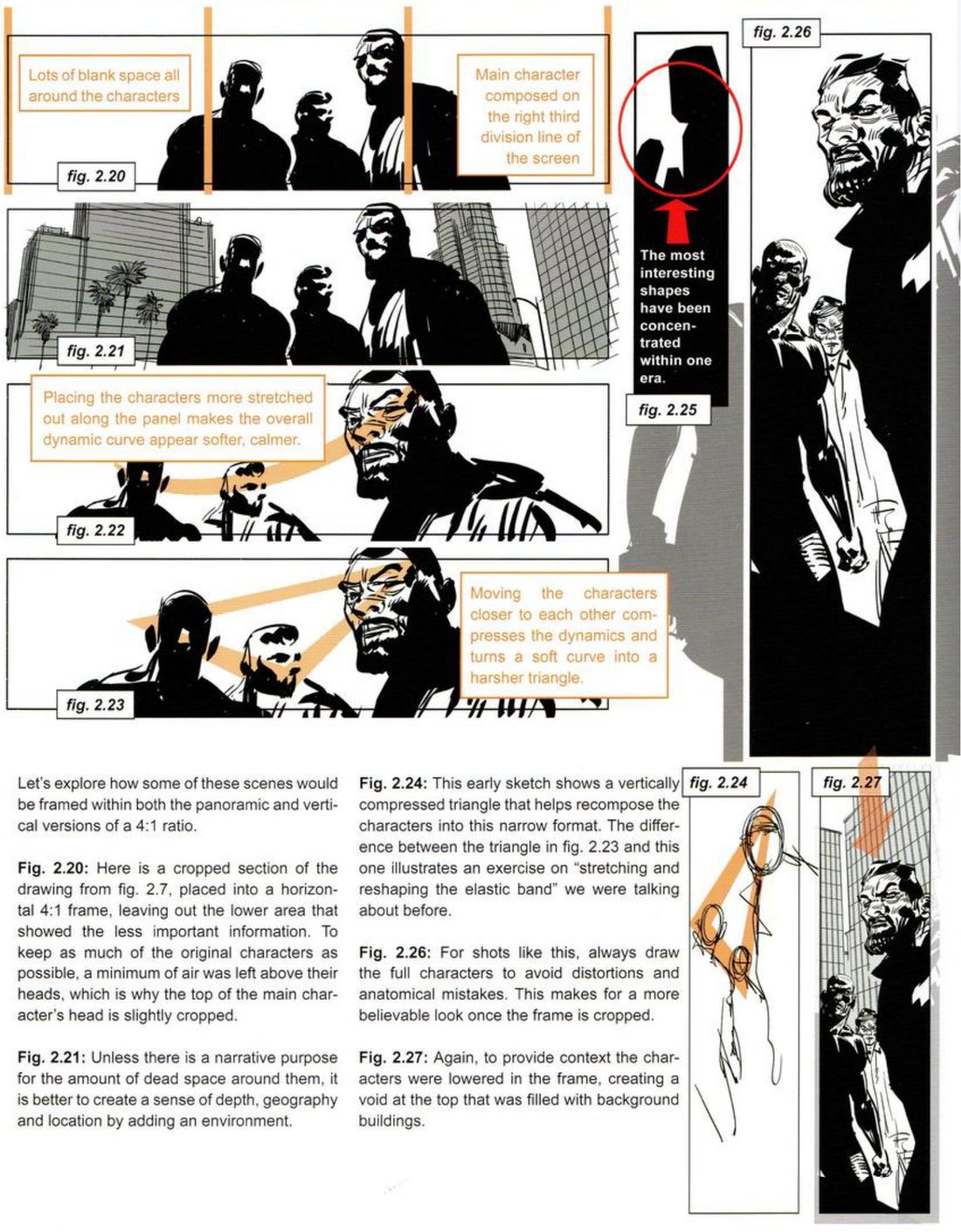
His notes: the crop leaves lots of blank space all round; unless dead space has a narrative purpose, add an environment for depth, geography and location. Spreading the figures makes the curve softer and calmer; moving them closer turns it into a harsher triangle. The vertical triangle is the elastic band stretched and reshaped. Always draw the full characters before cropping, to avoid distortion and anatomy mistakes.
The stranded trio (p.31).
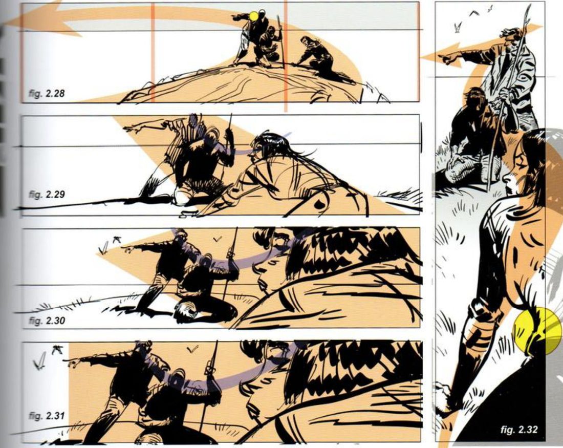
His captions: in the wide frame the empty space shows their isolation. He shrank the trio so the dead space becomes part of their story instead of a liability, and kept them big enough for body language to read. The energy runs from the foreground rocks to the castaways on a slight diagonal. Then the pointing finger sends it back left; the man’s shoulder is the turning point. For the tighter shots he moved and rotated the camera so the three nearly align, and closer still the shot becomes a block right on their expressions. In the vertical, showing part of the bending woman’s waist connects her shoulder and thigh and avoids confusion.
When you practise
Read once · the core
- Write one line: what is this group feeling, or doing to each other, right now?
- Pick a group of three or more characters, your own or any. His cowboys and soldiers are only demos.
- Block them as backlit silhouettes. Separate the blobs with a rim of light or a gap.
- Give the whole group one overall shape: an arc, verticals, a zig-zag, a triangle, an oval or an A. Draw it as one orange arrow or shape over the blobs.
- Add a second rhythm inside it: arcs, a line through the heads, or a line of figures moving one way.
- Make one figure dominant by size, light or position.
- Make the two thumbnails: value masses, and lines of tension.
Read once · then reshape (pick one)
- Two flows. In one tall frame, stage the same scene twice: once with one figure’s oval pushing the others away, once with an A that rises to a figure and drops through the rest.
- 4:1 strips. Put the group in a horizontal 4:1 four ways: cropped, with an environment added, spread out, and pushed close. Then do the vertical 4:1, drawing the full figures first.
- Isolation and closing in. One wide frame where empty space is part of the story, with a turning point in the flow. Then three tighter horizontals and one vertical.
- Open his version and compare.
CheckHis p.28 test: is there one clear focus, or does the eye wander round the frame with no sense of order? Do the blobs read as separate shapes (p.28)? For any empty space, his p.30 question: does it have a narrative purpose? If not, add an environment. For small figures (p.31): is the body language still readable? Then shrink and flip: does it still read as your intent? Compare with figs 2.13–2.32.
Group structure
Blobs, one overall shape, a rhythm inside it, one figure in charge.
Keep asking: where does the eye go first, and is there a sense of order?
Thirds, halves, fourths
Give each story element a fixed line or zone, keep it there across three formats, then test the result with his box-and-diagonal check and a backbone overlay.
Mateu-Mestre · FI2 pp.73–89 · figs 7.1–7.49 · core pp.73–77, variants pp.78–89
What he shows
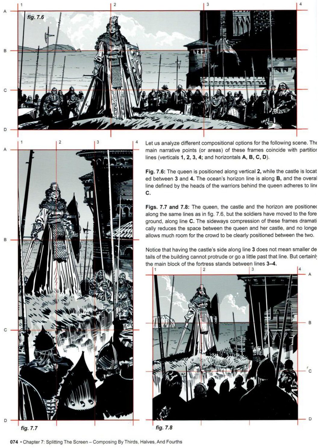
Points, lines, zones (p.73). After chapters of energy flow and tension lines, which he calls the organic approach, he turns to a more rational, methodical structure. Thirds give a balance that is clear and comfortable to the eye, without the self-consciousness of symmetry or the extremity of fourths. You can use the intersections, a run along a dividing line, the zones between the lines, or any mix.
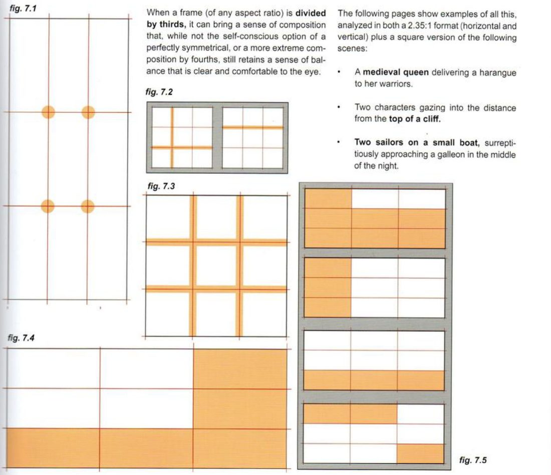
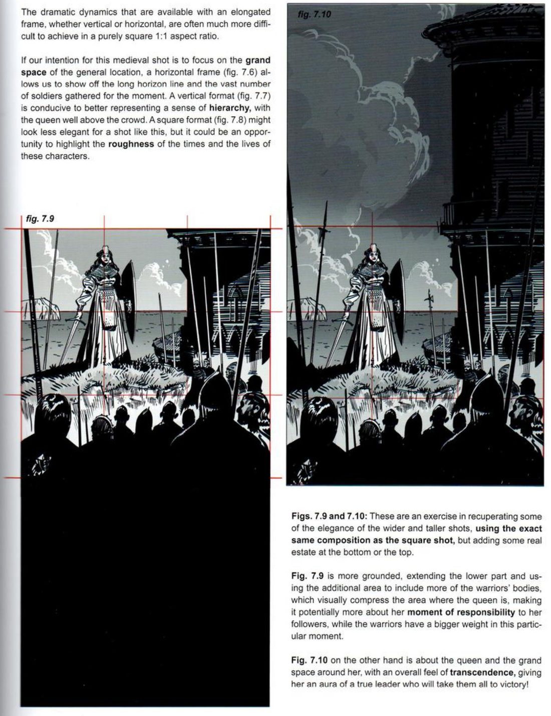
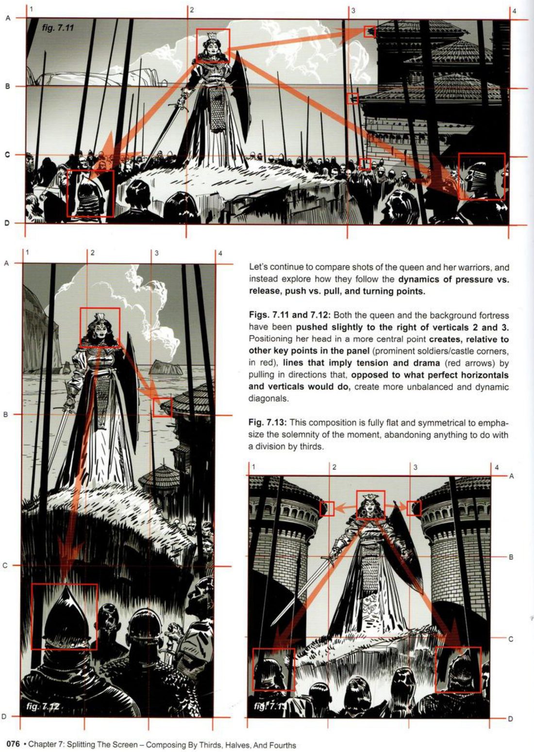
The queen (pp.74–77). His test scene is a medieval queen giving a speech to her warriors, in 2.35:1 horizontal, 2.35:1 vertical and a square. He labels the verticals 1–4 and the horizontals A–D; 1, 4, A and D are the frame edges. In the wide frame she stands on vertical 2, the castle sits between 3 and 4, the sea horizon is on B, and the warriors’ heads run along C. In the tall frame and the square he keeps her, the castle and the horizon on the same lines and moves the soldiers to the foreground on C. The sideways squeeze leaves little room between her and the castle. Small parts of the castle may poke past line 3, but its main block stays in 3–4.
Each format then gets an intent. Wide, for the grand space: the long horizon and the mass of soldiers. Tall, for hierarchy: the queen well above the crowd. Square, less elegant, but a chance to stress the roughness of the times. Then he extends the exact square composition. Adding space below brings in more of the warriors’ bodies and makes it about her moment of responsibility to her followers. Adding space above gives a feeling of transcendence.
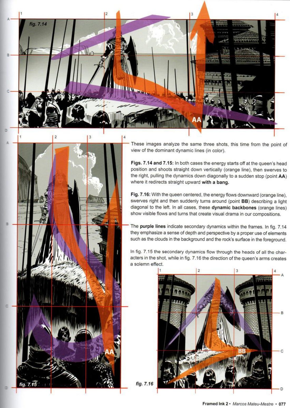
On p.76 he nudges the queen and the fortress slightly right of lines 2 and 3, boxes the key points in red (her head, prominent soldiers, castle corners) and draws lines between them. Her more central head makes lines that run as unbalanced diagonals, where perfect horizontals and verticals would sit still. For the square he drops thirds completely: flat and symmetrical, for solemnity. On p.77 he overlays the main dynamic in colour. The orange backbone starts at her head, drops straight down, swerves right, and stops suddenly at a point he labels AA, where it shoots upwards. Purple lines are the secondary dynamics: clouds and rock for depth, a line through all the heads, or the queen’s arms.
Mateu-Mestre · FI2 p.77“these dynamic backbones (orange lines) show visible flows and turns that create visual drama”
His version: open after you’ve done yours
When you practise
Read once · the core
- Write one line: what is this moment about? Then plan one intent word for each frame, like his grand space, hierarchy, roughness.
- Pick a scene with three or four story elements: a main figure, a big mass or building, a horizon, a secondary group. It needn’t be a queen.
- Draw thirds grids in three frames: 2.35:1 wide, 2.35:1 tall, and a square. Label the verticals 1–4 and the horizontals A–D.
- Give each element a line or zone and write it in the prompt below. Keep those assignments in all three frames, and accept what each format squeezes out.
- Thumbnail all three as value masses.
- Extend the square downwards, then upwards, keeping its composition. Give each extension an intent word.
- Box-and-diagonal check: nudge the main figure slightly off its line, box the key points, and draw lines from the figure to them.
- Overlay one orange backbone with its turn point labelled, and purple secondary lines. This is your lines-of-tension thumbnail.
- Open his version and compare.
Main figure: line · Big mass: zone
Horizon: line · Secondary group: line
Wide feels: · Tall feels: · Square feels:
Extended down: · Extended up:
CheckHis p.76 test: do the lines between your key points run as unbalanced, dynamic diagonals, or as flat horizontals and verticals? His p.77 test: does the backbone show a visible flow and a turn? His p.75 pairing: does each format suit its intent word? Then shrink and flip each frame: does it still read as your intent? Compare with figs 7.6–7.16.
Variants
Each variant is its own session. Run the core first; these change one thing about it.
Variant A · lines, then masses · cliff top · pp.78–79 · figs 7.17–7.25
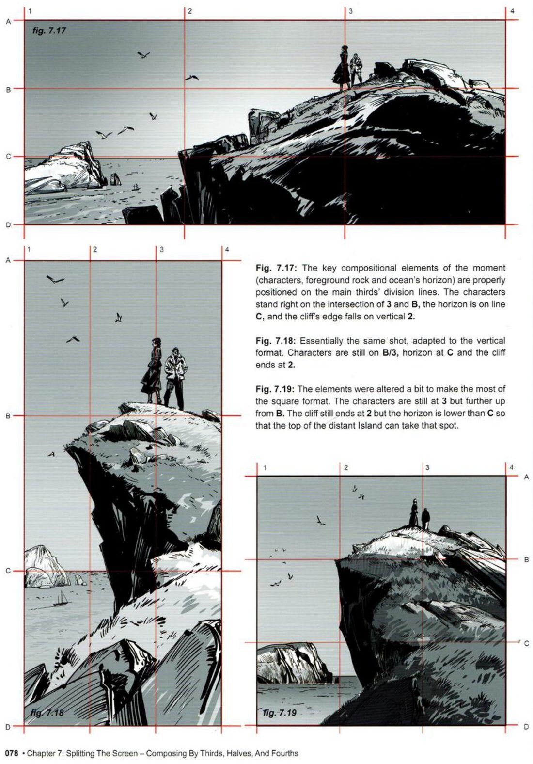
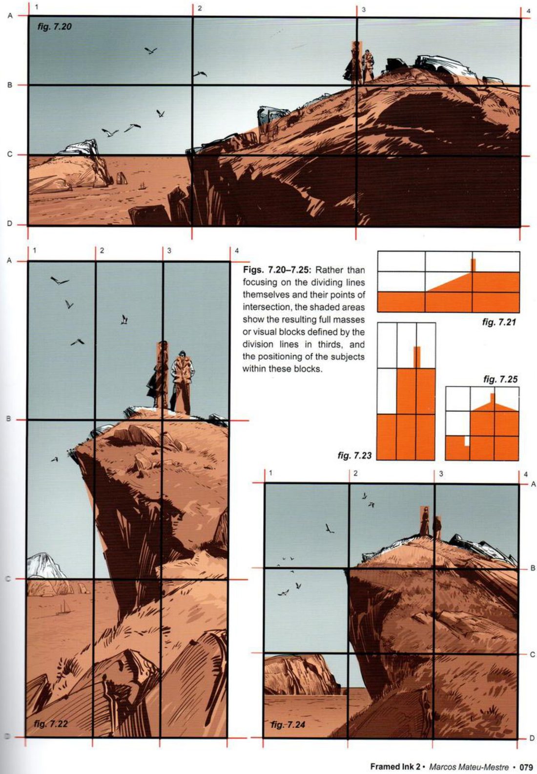
Two figures gaze out from a cliff top. In the wide and tall frames they stand on the intersection of 3 and B, the horizon is on C, and the cliff edge falls on 2. In the square he alters it a bit: the figures are still on 3 but higher than B, the cliff still ends at 2, and the horizon drops below C so the top of a distant island takes that line. Then he shows the same three frames as masses: the full blocks the thirds define, and where the subjects sit in them, down to flat orange block thumbnails.
- A landscape and small figures, three frames, fixed line assignments.
- Where the square needs it, swap one element onto a line, as his island does.
- Make a flat blocks-only thumbnail of each frame.
His version: open after you’ve done yours
Variant B · nail the structural line first · night galleon · pp.80–81 · figs 7.26–7.31
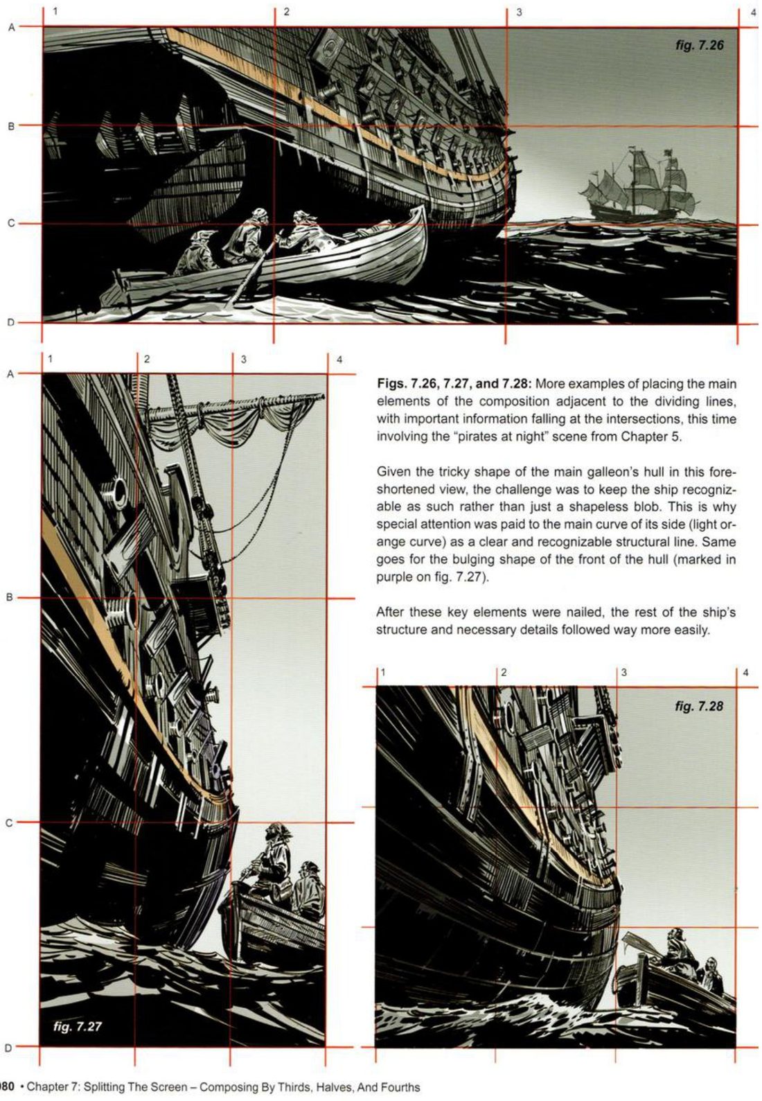
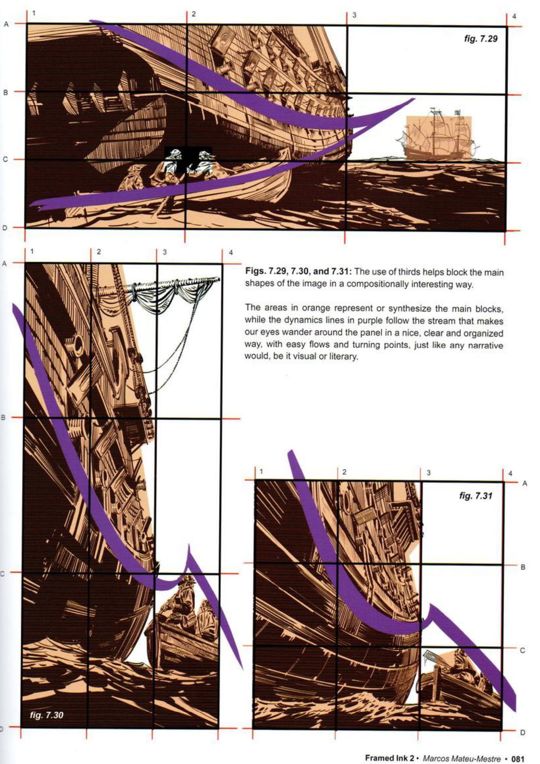
Sailors in a small boat creep up on a galleon at night, with main elements beside the dividing lines and key information at the intersections. The hull, seen foreshortened, risked reading as a shapeless blob. So he paid special attention to the main curve of its side and the bulge of the bow as clear structural lines. Once those were nailed, the rest of the ship and its details followed far more easily. On p.81 the same frames show orange main blocks and purple lines for the stream the eye follows, with flows and turning points.
- Pick a hard, foreshortened object: a ship, a vehicle, a building, a creature.
- In three frames on thirds, draw only the one or two lines that make it recognisable.
- Judge recognition, then add the structure and detail.
- Overlay orange blocks and a purple stream.
His version: open after you’ve done yours
CheckHis p.80 test: does the object read as itself, and not as a shapeless blob?
Variant C · halves for one special beat · pp.82–85 · figs 7.32–7.39
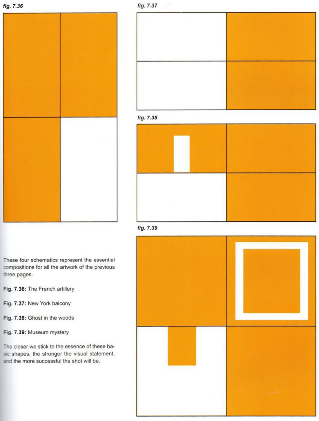
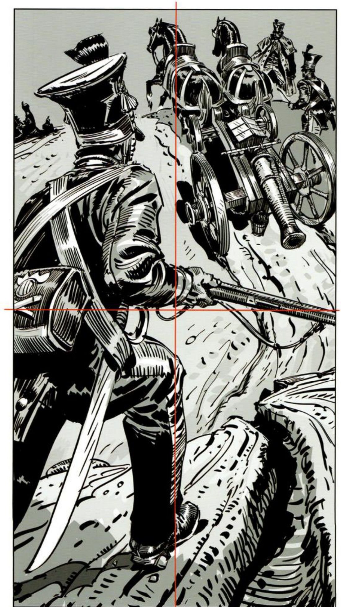
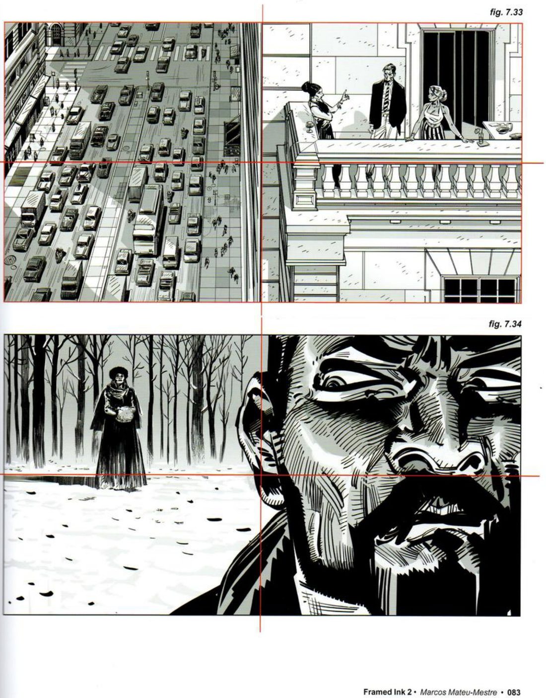
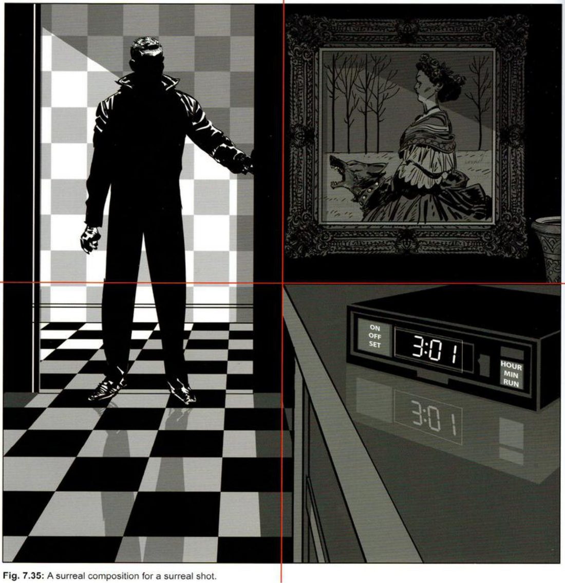
Splitting the panel in half, across or down, is unusual and so striking. It usually comes across as self-conscious and somewhat mechanical, so he recommends using that odd quality as a distinct style for one specific sequence. Switching visual device for a segment makes it more memorable: a flashback, or a moment that is uncomfortable or special for the character. His examples: artillery hauled through mud, a grave decision on a New York balcony, running into a ghost, and a square split into four for a cryptic night scene in a house full of strange objects. He says everything in that last one makes us wonder what happens next. On p.85 he reduces all four to flat orange schematics.
Mateu-Mestre · FI2 p.85“The closer we stick to the essence of these basic shapes”
He finishes the line: the stronger the statement, and the more successful the shot.
- Pick one beat from your own story that is strange, uncomfortable or special.
- Make the halves or quadrant schematic first, flat, in two values.
- Draw the panel, or panels, for that beat on it.
- Lay the schematic over the final and compare.
His version: open after you’ve done yours
CheckHis p.85 test: how close does your final stay to the schematic? The closer, the stronger.
Variant D · fourths against thirds · Aztecs · pp.86–87 · figs 7.40–7.45
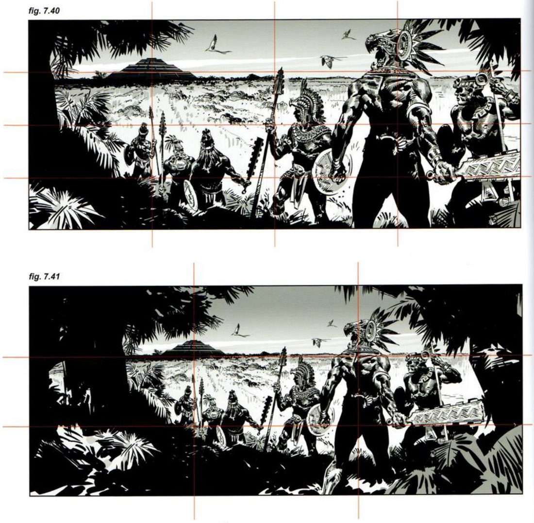
Dividing beyond thirds pushes the composition towards a more extreme look, which may be right, depending on the moment. In his Aztec shot, the pyramid on the left, the lead warrior’s head on the right and the horizon all sit on fourths. That puts the warrior and the pyramid further apart than thirds would, for a more spacious, epic feel and a more stretched line of tension. To move the same drawing onto thirds he needed a bigger camera field than the original. It lost the epic tension line, gained jungle, and became an establishing shot about the group and the place. Which one wins depends on what the story needs. On the same page, an avenue shot by fourths gets elegance: nothing distracting sits at the centre to compete with the woman, who also stands in a pool of light.
- Pick a scene with two key elements far apart.
- Thumbnail it on fourths.
- Get the same elements onto thirds by widening the camera field, as he does. Keep the drawing; change the frame.
- Compare the tension line between the two elements, and write one word for each version.
His version: open after you’ve done yours
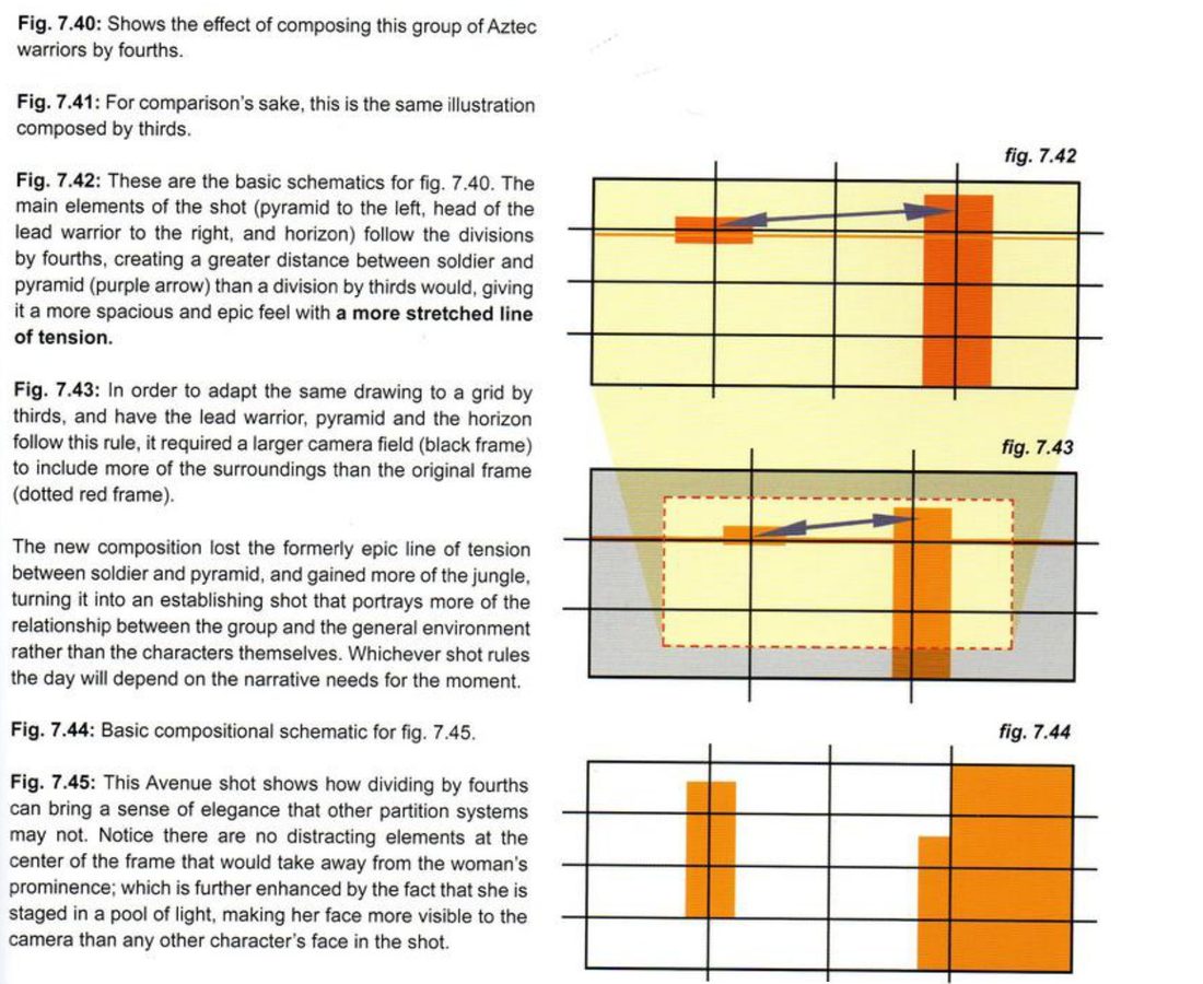
CheckHis p.87 measures: how long is the line of tension between the two key elements, and is the centre clear of anything that competes with the subject?
Variant E · two story spots · pp.88–89 · figs 7.46–7.49
In a tall frame on fourths, two police officers talk to a homeowner at the top of some steps, with the patrol car at the bottom. The three figures take up a small area among many elements, so he crops anything unnecessary. He keeps just enough of the surroundings: a corner of the house, some steps, a barely silhouetted garden, about half the gate, and enough of the car to know it’s a patrol car. The car favours screen right to balance the figures top left. In a square on fourths he starts from the main story point of the moment, a hut on stilts as a canoe passes, and puts the two story spots in opposite areas: hut top right, canoe bottom left.
- Write the main story point of the moment in one line.
- List the surroundings, asking how little of each you need.
- On a fourths grid, put the two story spots in opposite areas, and draw a block schematic with an arrow between them.
- Thumbnail it.
His version: open after you’ve done yours
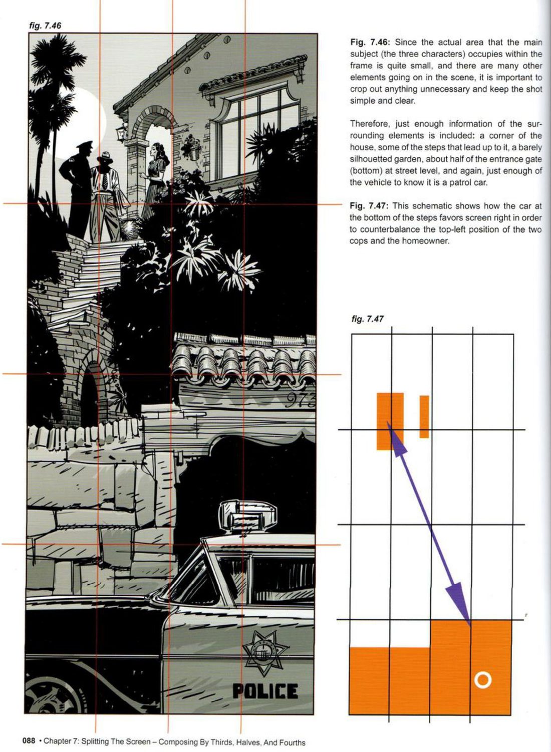
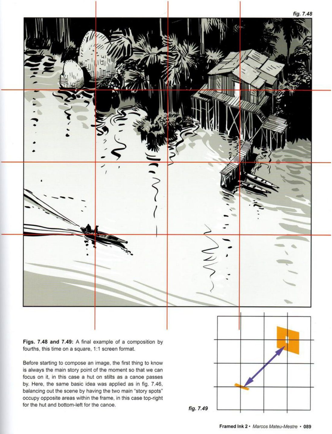
CheckHis p.88 test: is there just enough of each surrounding element to identify it, and nothing more?
Thirds, halves, fourths
Give each element a line, keep it across three frames, then box the points and draw the backbone.
Keep asking: what is the main story point of the moment? (p.89)