Lines, shapes and sizes
Three exercises in making a place or a group feel a certain way through the kind of line, the spread of sizes, and the pull between key points.
Mateu-Mestre · FI1 p.47“It’s a matter of establishing a line or shape language.”
Same place, two line languages
Frame one place twice, once favouring curves and once favouring straights and angles, and design two facades that tell you who lives there.
Mateu-Mestre · FI1 p.47 (Angular vs. curved), p.44 (Order vs. chaos), p.26 (Lines)
What he shows
The three line families (p.26). In his basic checklist, the emotional result of lines depends on their direction and arrangement. That counts for physical lines and for lines made by a row of aligned things. Curves feel subtle and peaceful. Diagonals sit at the other end: dynamic and aggressive. Straight lines read as assertive. He keeps these three apart here. Lines can also lead the eye: a branch, a long piece of graffiti, a row of clouds, or the imaginary line between characters’ heads.
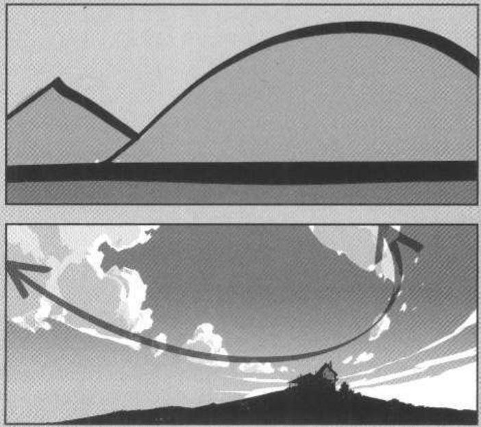
Mateu-Mestre · FI1 p.26“Straight lines will represent assertiveness while curves will be kinder and easier on the eye.”
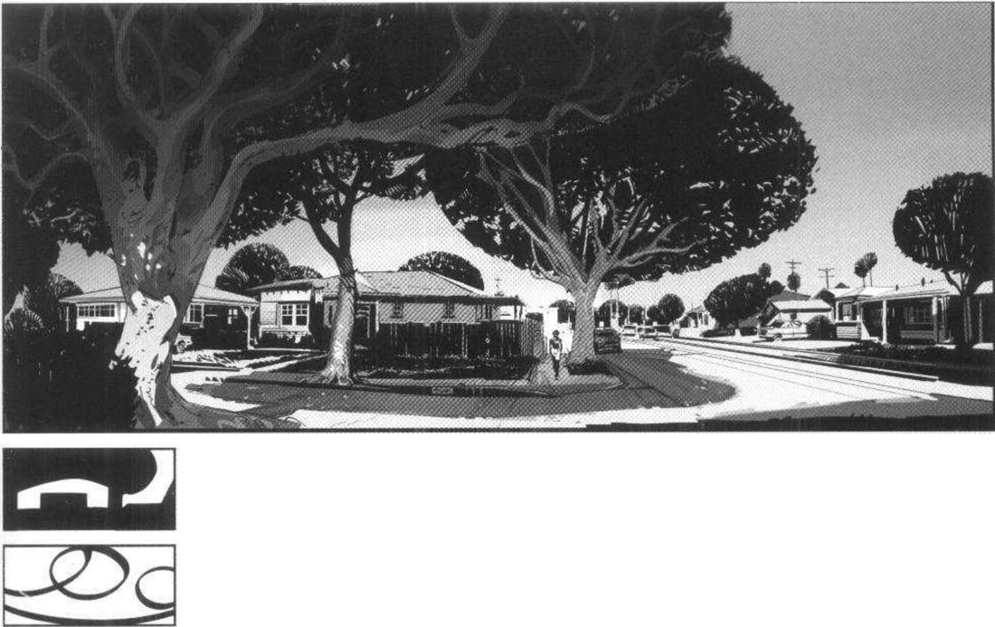
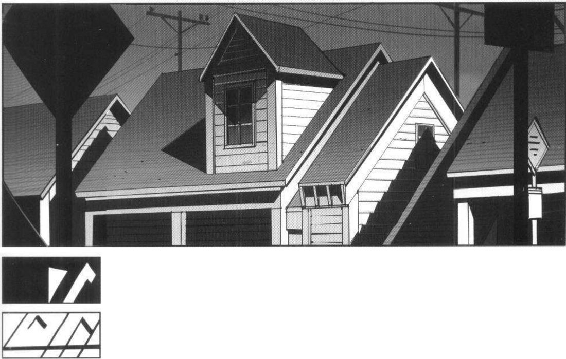
Framing by line type (p.47). He says you can choose a framing by which kind of line you want to favour: horizontals, verticals, diagonals. Curves usually make softer, friendlier places, unless they get too twisted. Opposing types in one shot, or across a story, give characters distinct worlds and signal coming conflict. His two images are one neighbourhood. Point the camera elsewhere, or just cross the street, and the theme flips from curves to straights and angles.
Mateu-Mestre · FI1 p.47“straight or angular lines will in general be perceived as stronger, drier, and harsher”
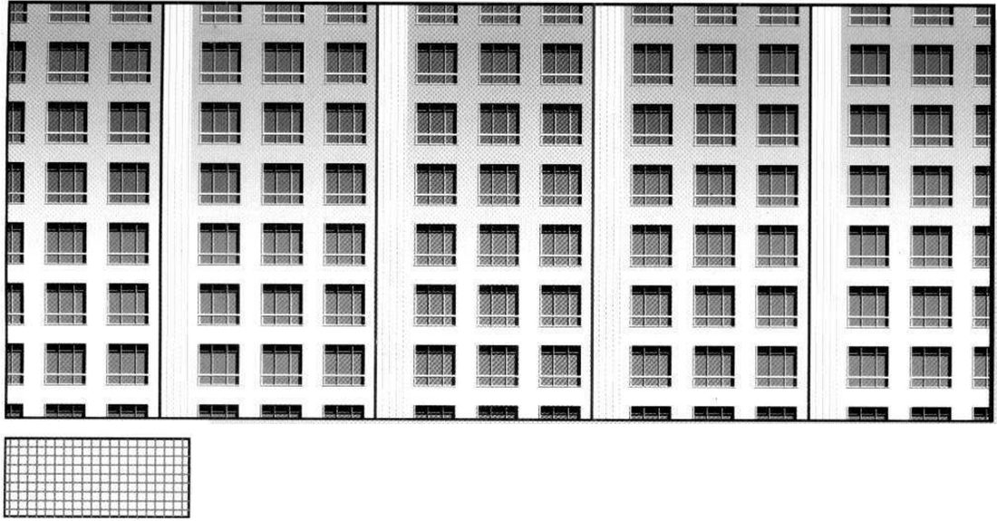
Order and chaos (p.44). An ordered grid can make a rigid, cold, overpowering beat where characters get lost, like a well-built maze. If the character chose to live or work there, the building’s adjectives apply to them too. A random, organic scatter of windows reads as improvised, disorganised and more human. Materials add to it: brick showing through uneven paint against hard metal and concrete. Either can become a leitmotif for a character.
His version: open after you’ve done yours
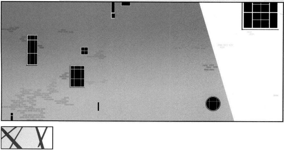
When you practise
Read once
- Write one line: what should this place make you feel, and whose world is it?
- Pick one real place: your street, a photo, or a Blender blockout.
- Frame 1: find the view where curves dominate.
- Frame 2: turn the camera or cross the street until straights and angles dominate.
- For each frame, make the line thumbnail and the value-mass thumbnail. The line thumbnail is the main result.
- On frame 2, note whether straights (assertive) or diagonals (dynamic, aggressive) lead. He separates them on p.26.
- Pick one character. Design two frontal facades for their home or workplace: one strict grid, one organic scatter. Choose materials to match.
- Under each facade, write the adjectives it hands to the character.
- Open his version and compare.
CheckHe states no check. Shrink and flip each frame and facade: does it still read as your one-line intent? Then compare with his p.47 and p.44.
Two line languages
One place: curves, then cross the street. One character: grid, then scatter.
Keep asking: which kind of line do I want to favour here?
Big/medium/small, and the one that’s different
Put one kind of element in three sizes at high and at low action, make one element special by contrast, and size a character up and down.
Mateu-Mestre · FI1 p.49 (Big, medium, small), p.45 (Complex vs. simple), p.46 (Big vs. small)
What he shows
Size is relative (p.46). Characters and objects sometimes need to look emotionally big or small. He corrects himself: bigger or smaller than others, because size only exists next to what surrounds it. He shows two sets of levers.
- Making big. The warrior is so close to camera that he doesn’t fit the shot. He has come through a door built for the hut’s owners, barely big enough for him. Everything else in the house is drawn to the house’s scale.
- Making small. Two strong-willed women look at the mercy of events. The taller one’s head barely reaches the middle of the frame. A huge shadow comes down on them diagonally from screen right, and a heavy window shape sits above their heads.
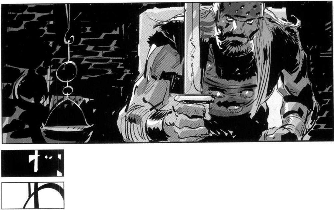
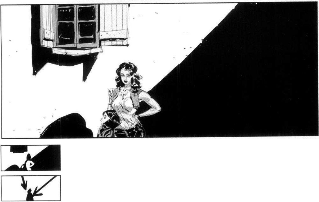
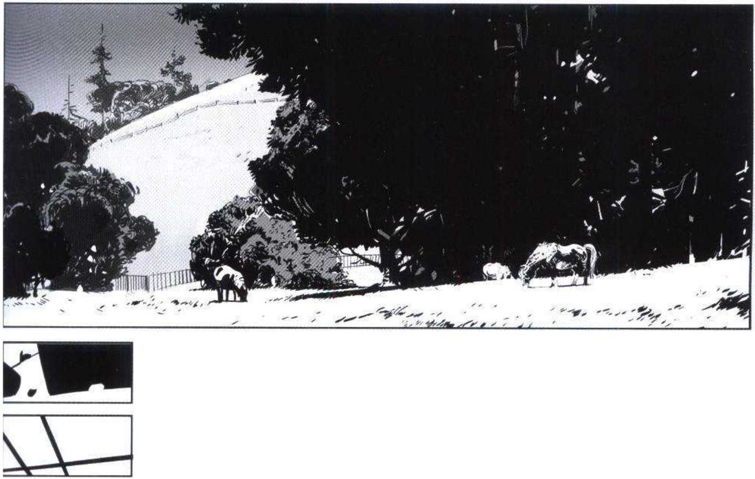
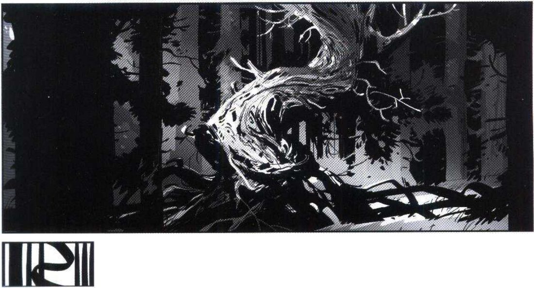
Three sizes (p.49). Pictures squash reality onto a flat surface. Sometimes flatness is wanted, for example as a flat leitmotif for a character or situation. In general he keeps a range of contrast so the image feels alive, deep and credible. His two images use the same kind of element in big, medium and small sizes, which gives movement whatever the level of action: high in one, very low in the other. The difference between them is the silhouettes.
Mateu-Mestre · FI1 p.49“One element that makes a difference between the two is the use of spikier silhouettes”
The one that’s different (p.45). Stories are mostly about characters passing from one state to another, and contrast between simple and complex is one way to show it. In his forest, all we have are trees, but one is clearly special and might stand for a turning point. He adds the reverse: a perfectly straight, imposing tree in a forest of twisted trunks would also stand out.
Mateu-Mestre · FI1 p.45“we can immediately identify one of them as special, magical, and somehow different”
His version: open after you’ve done yours
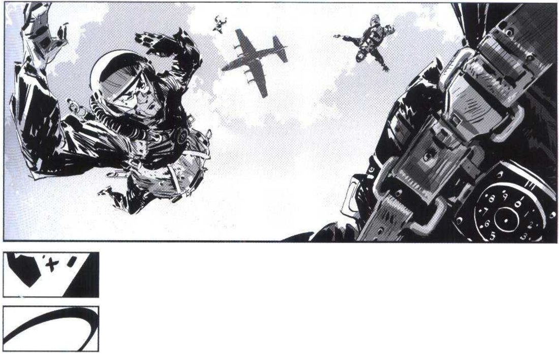
When you practise
Read once
- Write one line: what should each frame make you feel?
- Pick one kind of element: figures, trees, boats, birds, lanterns.
- High-action frame: show it big, medium and small, with spiky, open silhouettes.
- Low-action frame: the same kind of element, big, medium and small, with round, steady silhouettes.
- Make the value-mass and tension-line thumbnails for both.
- Draw a field of one repeated element. Make one of them special by contrast.
- Reverse it: the special one takes the field’s trait, and the field takes the special one’s.
- Take one character. Make them big with his warrior levers, then small with his levers from the women.
- Open his version and compare.
CheckHe states no check. The nearest is his p.45 line that we can immediately identify the special tree. So shrink and flip yours: does the special one jump out at once, in both directions? Shrink and flip the size frames too: does each still read as your intent? Then compare with p.49, p.45 and the levers on p.46.
Big, medium, small
Three sizes, high and low. One special, both ways. One character, big then small.
Keep asking: bigger or smaller than what?
Tension lines between key points
Join the key points of a shot with lines, and tune the tension by moving them nearer, further, higher or lower, or by moving the whole group as one.
Mateu-Mestre · FI2 pp.20–21 · figs 1.38–1.48
What he shows
The rubber band (p.20). As well as whole areas of pressure and release, there are invisible lines of tension between a shot’s key narrative points. He imagines an elastic band stretched to each point. Each time you stretch it somewhere new, you create a new point and a whole new set of interactions in the panel. He says this makes it easier to adapt to any format.
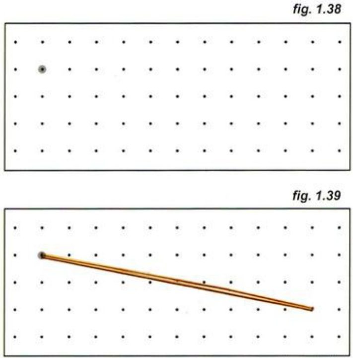
Mateu-Mestre · FI2 p.20“The further we stretch it, the more we can feel the tension build”
Subtext. How close or far the points sit builds the scene’s subtext: actions and reactions, balance and imbalance, compression and expansion, slack and tension up to breaking point. He calls that subtext the true story, how the characters feel, and the ink work the vehicle for it. A key point can be a face, or the window of a room where something is about to happen.
Two characters. Besides expression, their tension shows in where they sit: higher or lower, nearer or farther, bigger or smaller, and mixes of these. He adds a caveat. Two people yelling face to face have no stretch at all, yet the tension still comes through their faces, their menacing closeness, even their clothes.
Mateu-Mestre · FI2 p.20“the further we stretch the distance between these characters … the more the tension will increase”
The full rule adds that the closer they get to the sides of the frame, the more tension too. On p.21 he applies all this to a pair in four horizontal frames, then to groups in vertical frames.
His version: open after you’ve done yours
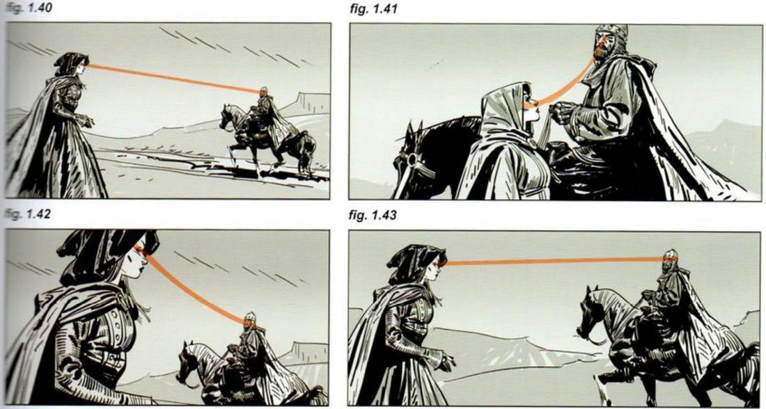
He captions figs 1.40–1.43 only as a group, as practical examples of relative position. He gives no caption for each one, so the effect of each placement is left for you to read.
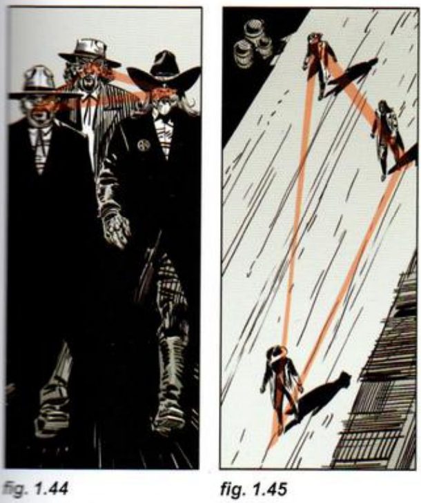
His captions: 1.44 is an even triangle that doesn’t stretch much. In 1.45 the band is stretched a lot, and the greater distances add drama.
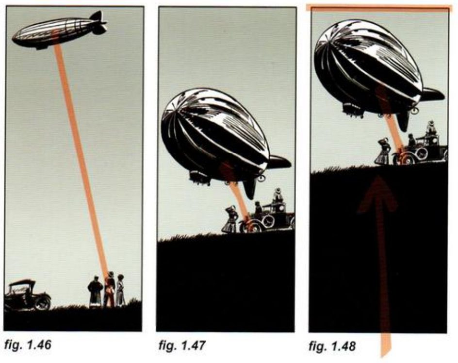
His captions: 1.46 is a vibrant, elegant diagonal. In 1.47 the zeppelin is lower and closer, so the image is heavier and more compact, with less stretch. In 1.48 the same shot is pushed upward as one unit, which puts pressure at the top, leaves a release area at the bottom, and adds drama.
When you practise
Read once
- Write one line: what is the relationship between these characters right now?
- Pick two characters. In one horizontal frame size, thumbnail four placements. Vary height, distance, size and how close they sit to the frame sides.
- In each, mark their eyes as dots and join them with a line.
- Under each, write which story beat that placement would suit.
- Pick three characters. In a vertical frame, thumbnail a compact, even triangle. Then stretch it, for example with a down shot.
- Pick two elements, such as a big object and a small crowd. In a vertical frame: first far apart on a long diagonal; then closer and lower; then push the whole close arrangement up the frame as one unit.
- Add the value-mass thumbnail to the one you’d use.
- Open his version and compare.
CheckHis general rule (p.20): the further apart the key points and the closer to the frame sides, the more the tension. Does your most tense placement have the longest stretch? If not, is it a face-to-face case, where he says the tension comes from faces and closeness instead? Then shrink and flip, and compare with figs 1.40–1.48.
Tension lines
Dot the key points, join them, stretch or slacken, then push the whole as one.
Keep asking: how far is the band stretched?