Picture decisions
This area trains deciding what a picture shows and what the viewer sees first. It has two practices, both built from his demos, and one worked example. Colour steps in his demos are left out; only the value, contrast and direction decisions are kept.
Krenz · Learning map 2 · 02:48:40“No goal, no most important focus: who are you actually trying to bring forward? Once you have that, whether it’s an illustration or a single character, you’ll find where the lead is. Clarify your goal.”
Present a design
Take a finished character design and choose how to show it: which features deserve showing, the view that reveals them, acting that suits the character, and lines that lead the eye there.
Krenz · Recombination lecture · 0:41:11–0:49:00
Design and presentation are two jobs
He has the bird-themed costume from Area 4 in a plain standing pose, labelled “content side”. Presenting it is a separate job, and he says it’s most of his own professional work: taking someone else’s finished design and finding what’s worth showing.
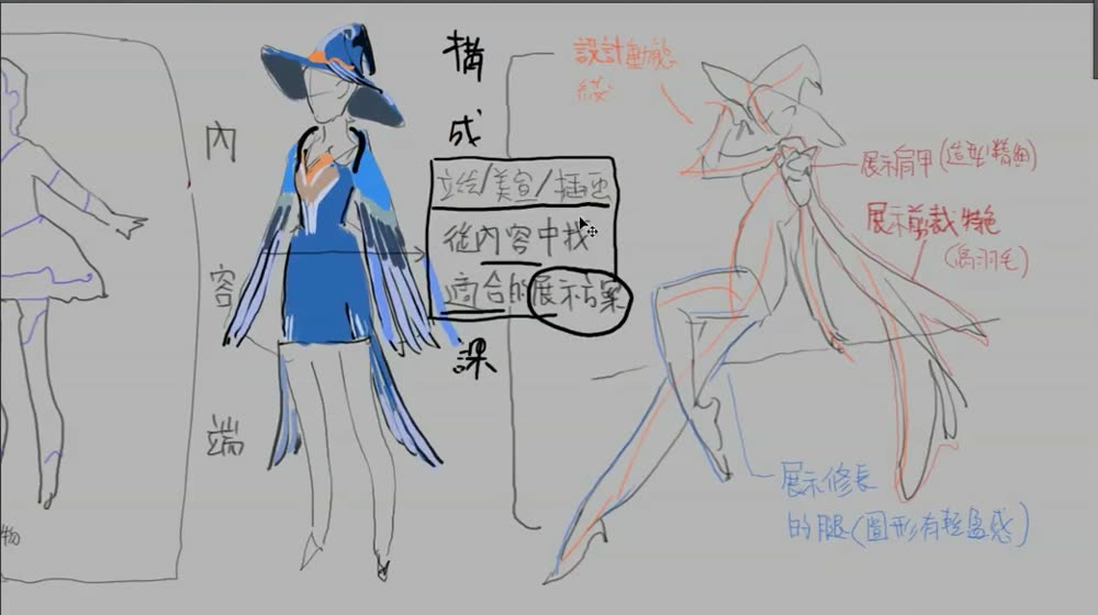
“At the content stage the pose doesn’t have to be beautiful. Making the pose beautiful is something you can do separately. … I work from a shape design someone else has already made, and in it I have to find which places can be used for display: the especially good-looking ones.”
Three decisions
1. The highlights, and the view that shows them. The shoulder armour is detailed and only on one shoulder, so it decides front or side. The feathered cape makes a flowing silhouette in the wind, which pushes toward a side view with movement.
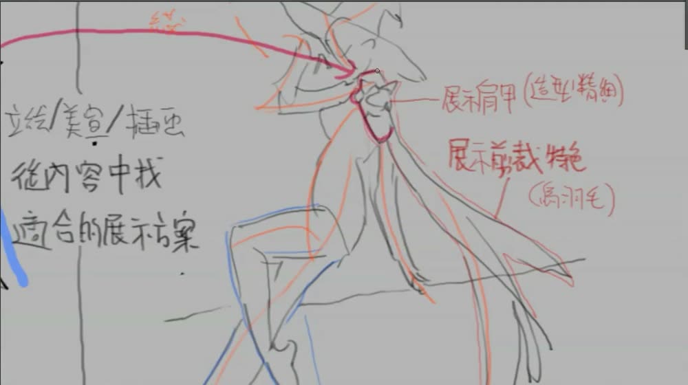
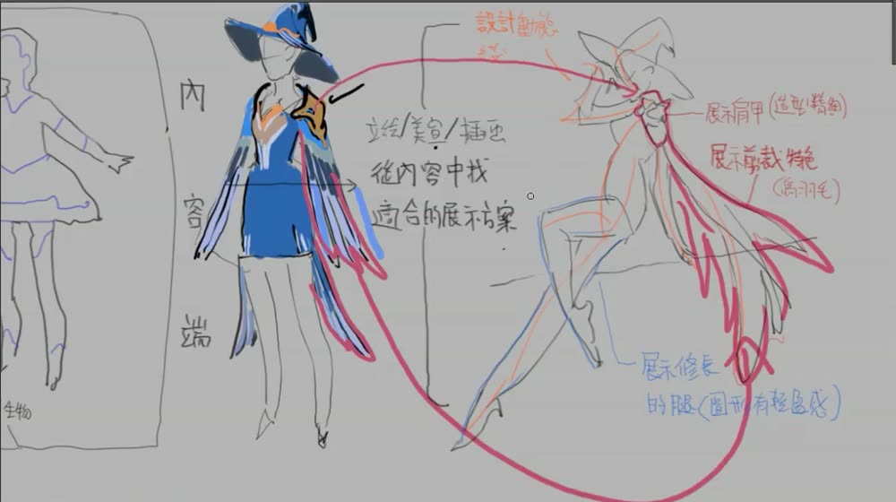
“It’s an asymmetric design. This shoulder armour looks good, so I have to choose between its front and its side, A or B, and pick one to show it. … [Try to show too much at once and] the body gets twisted too far. What you want to show ends up beyond the limit of the human body.”
2. Acting that suits the character. A steady warrior suits a stable, near-symmetrical stance. This character is agile, so he gives her long legs, a jump, and different actions for each foot.
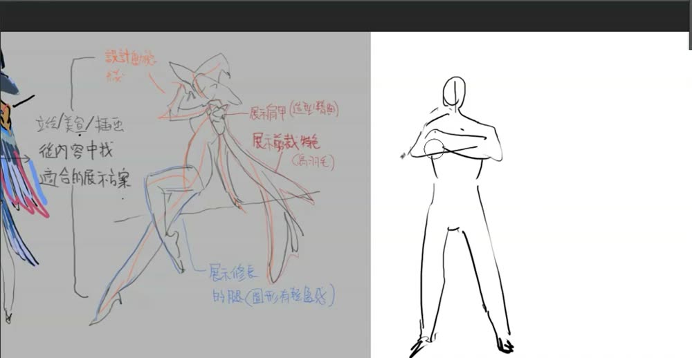
“What temperament do I want this character to convey? What kind of personality? … I also have to avoid both feet doing the same action. Identical feet are monotonous, so I find a way to vary them.”
3. Flow. He draws the directions of the arm, the cape, the body and the head. They converge on the shoulder piece. Then he hides the outline: the bare lines still pull the eye there.
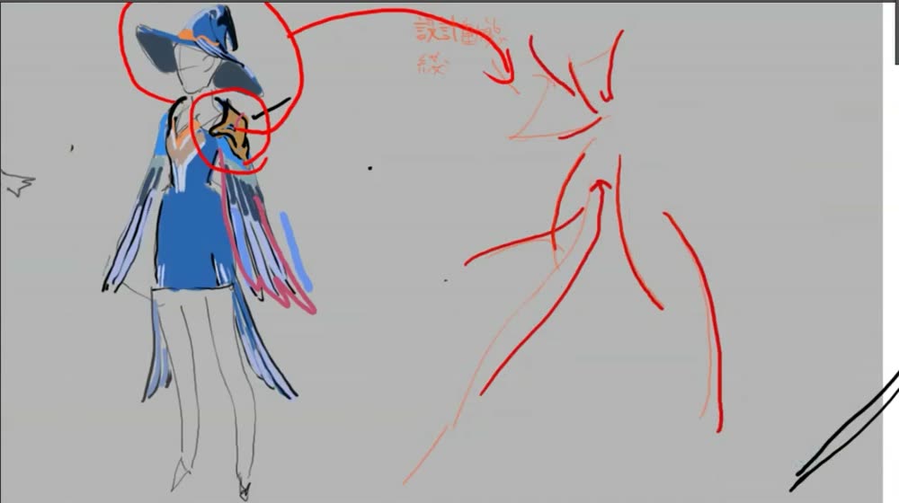
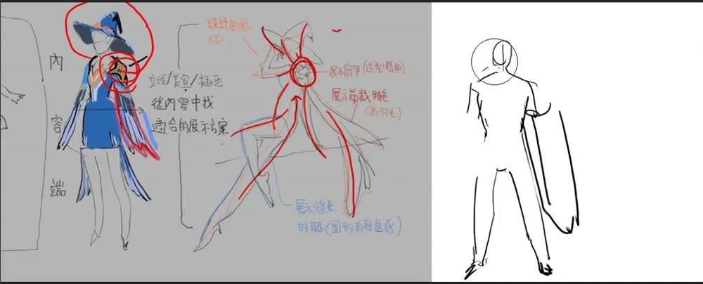
“If I turn off the outer contour and you look only at these lines, you’ll be drawn to the area where their directions converge. … Flow means designing a current, a tendency to move, so your eye follows it without noticing and flows to where the artist wants the reader to look.”
He’s clear it’s one option: “This isn’t necessarily the best plan. Another plan might suit better” (48:08).
When you practise
Use any finished character design: your own, or a game character sheet. Read once, then hold his question.
- List the design’s highlights worth showing.
- Pick the view that reveals the main one. One-sided features decide front or side.
- Pick acting that suits the character’s personality. Don’t give both limbs the same action.
- Draw the main direction lines and aim them at the highlight.
- Hide the outline. Do the lines alone still lead there?
CheckWith the outline off, the direction lines still pull the eye to the chosen point. And don’t show so much the pose goes beyond what a body can do (47:19, 43:51).
Present a design
Highlights → view that shows them → acting → flow → outline off.
Keep asking: how do I pose it to show its best parts?
Reading order and value plan
Decide what gets seen first, then arrange big light, mid and dark groups so it does. Then add lighting without breaking that plan.
Krenz · Learning map 2 · 1:10–1:14, 2:09–2:17, 2:27–2:39
“What a focus strategy mainly achieves is called changing the reading order. … So control the reading order, control who in your picture gets seen first. That’s what you should be thinking about.”
Darken most, light a little
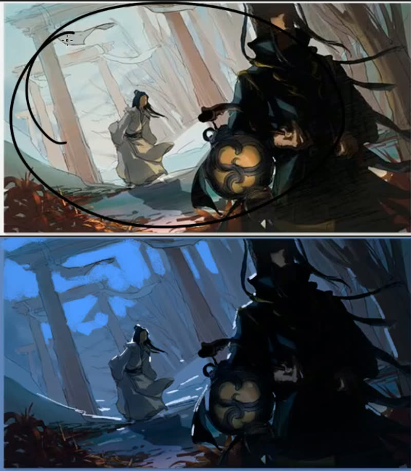
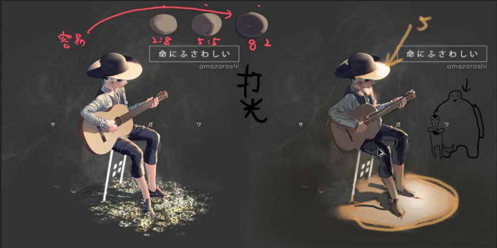
On a student’s scene he darkens nearly everything and leaves the strongest light on the figures. In black and white terms, the eye goes where white meets black.
On another picture, the leg’s rim light competes with the face. He dims it, and the eye goes to the face.
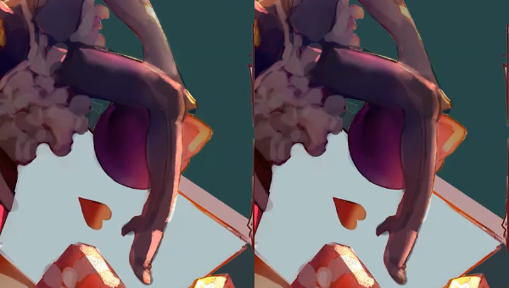
Krenz · 2:13:10“An easier, no, I shouldn’t say better, an easier way to operate. … Personally I like more dark and less light, because in a mostly dark area you carve out a little light and it stands out at once.”
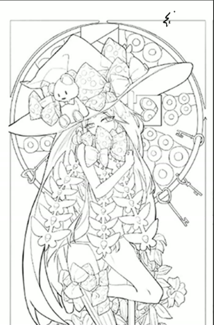
The witch: a value plan, a failure, two repairs
A busy line drawing: hat, bear, bows, a ring of tentacle circles, keys, flowers. Fun to draw, but stuck at the finishing stage. His goal is to reorganise the reading order.
The plan. A white face, a grey background, and black behind the figure to force out her grey outline. That makes the ring of circles look fragmented, so he lowers their contrast. Then he tries darkening the whole, and a second option with a bright window behind.
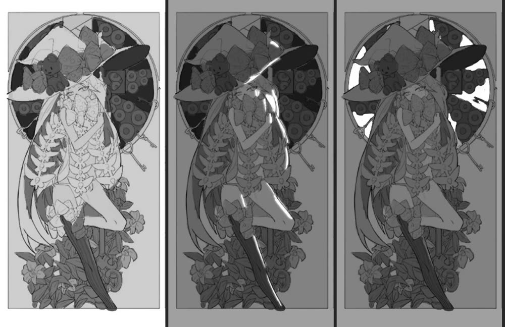
Krenz · 2:30:13“The character’s face is white. The background is all grey, and I use black behind to force out the grey contour in the middle. … Once I arrange black and white like this, you find these circles are a bit too fragmented.”
The failure. He paints strong light and shadow cutting across the hat, face and body. Now the first look goes to those patches, and the figure disappears.
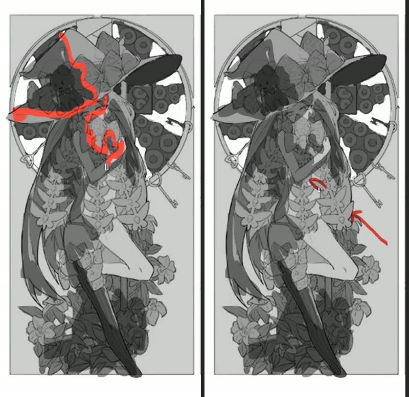
Krenz · 2:33:53“The black-white relationship I just arranged gets destroyed by the light and shadow. … Because these patches have too much contrast, the first look isn’t the big hat or the ornaments. … The person has disappeared.”
Two repairs, either one. Repair 1: keep the lighting but lower its contrast. Repair 2, if you want strong darks: keep them, but in a small area instead of splitting the picture half and half.
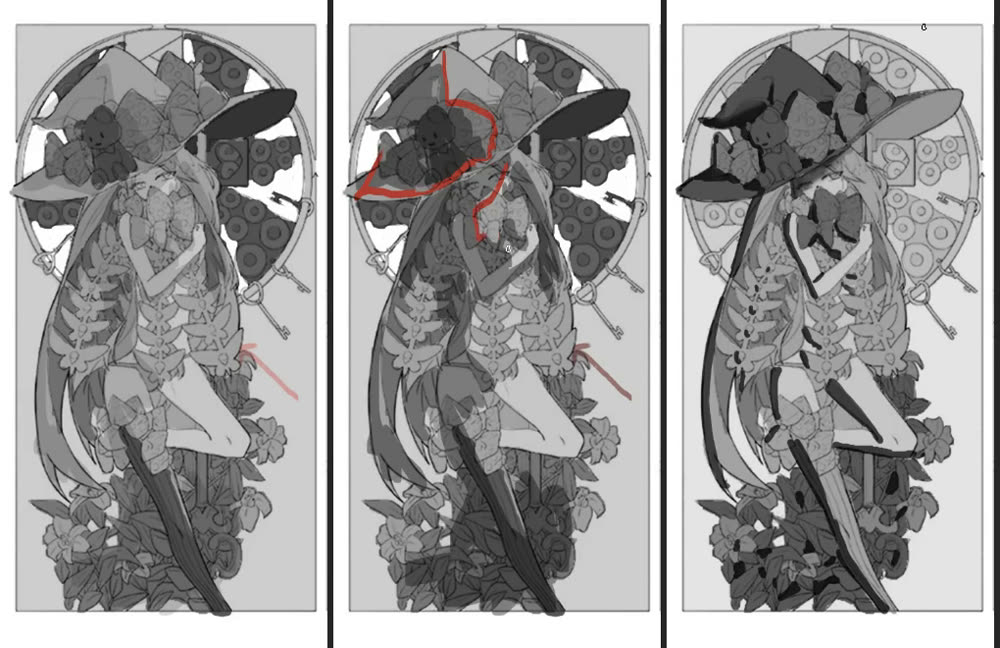
Krenz · 2:35:21“Usually we weaken the effect of the lighting. Don’t make the contrast that strong, just a little. … The first look still goes to the hat’s shape. … The picture isn’t controlled by the light and dark. I make sure the light and dark don’t steal the base appearance’s thunder.”
When you practise
Use one of your own line drawings, in greyscale. Read once, then hold his question.
- Decide who or what should be seen first.
- Block in big light, mid and dark groups so that thing has the strongest contrast. Mostly dark with a little light is the easier way.
- Lower the contrast on busy repeated things that compete.
- Add lighting.
- Look again. If the lighting broke the plan, lower its contrast, or keep strong darks to a small area.
CheckWhere does the first look land? If the light you meant to stand out doesn’t, the dark isn’t dark enough (2:34–2:35, 2:33:00).
Reading order and value plan
Choose the lead → big light/mid/dark → calm the busy bits → add light → look again.
Keep asking: who gets seen first?
Sparse and dense, rhythm
Krenz · Recombination lecture · 0:52:18–1:02:35 · his ballet promo piece
For reading, not a drill. His ballet design had few parts to extract, so he skipped straight to presentation and composition.
Three areas, then places reserved
He splits the rough into three areas: the central dancer, a giant face on the left, and a figure’s back on the right. With only three, the bottom feels empty, so he puts circles where small figures will go later.
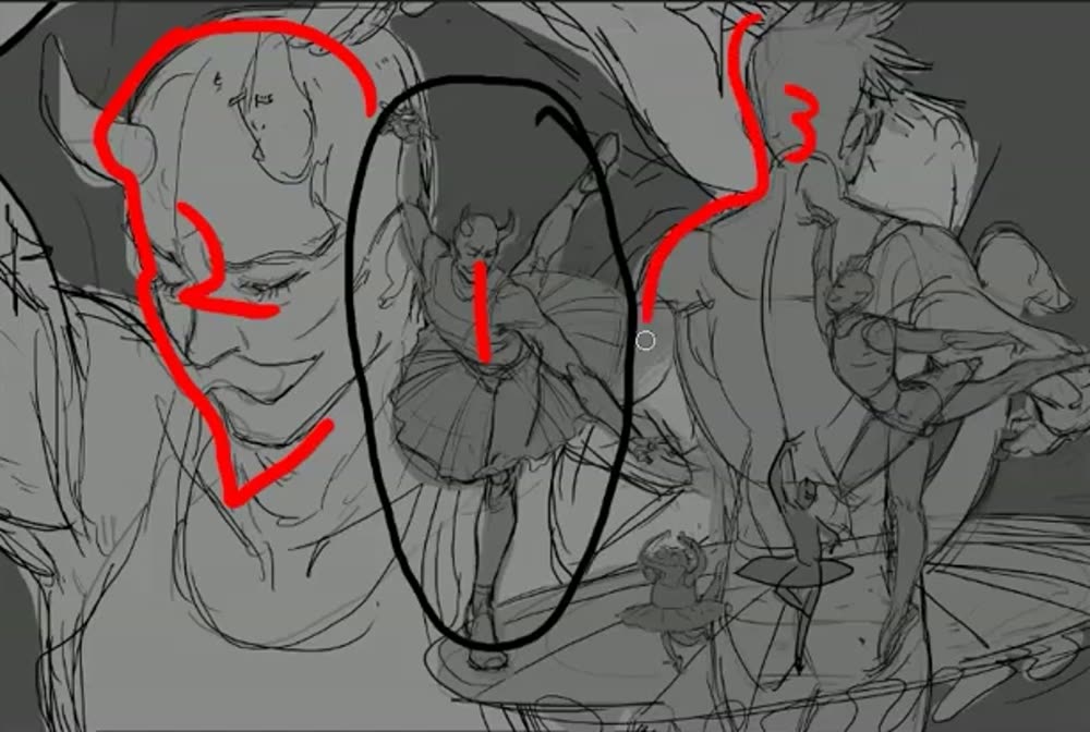
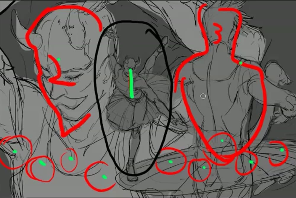
Krenz · 55:00“Below there are many small objects, but I have to watch that they’re not too strong and not overworked.”
Rhythm, and quiet behind busy
The small figures go up and down in an S, not along a straight line. Behind them, the skirt stays a broad, plain white shape. Where there’s nothing to compete, at the neck, he adds lots of small shapes.
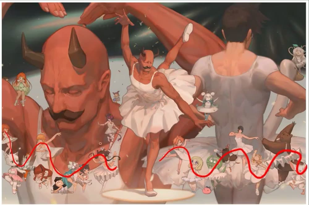
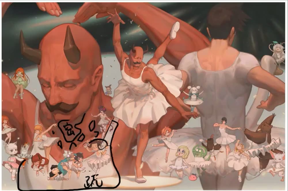
“If the assistants’ figures were all on one straight line it would look stiff. So I placed them following an S shape. … If I drew too much detail here, the front would start to get messy and the characters’ silhouettes wouldn’t come through. So where this is dense, I clear the background behind a little and keep it clean.”
Balance, circulation, and a cheap fix
The dancer is nearly symmetrical: an X plus a vertical. The head, skirt and back are each round, so the eye loops through them. An empty corner gets a stage-light beam instead of more objects.
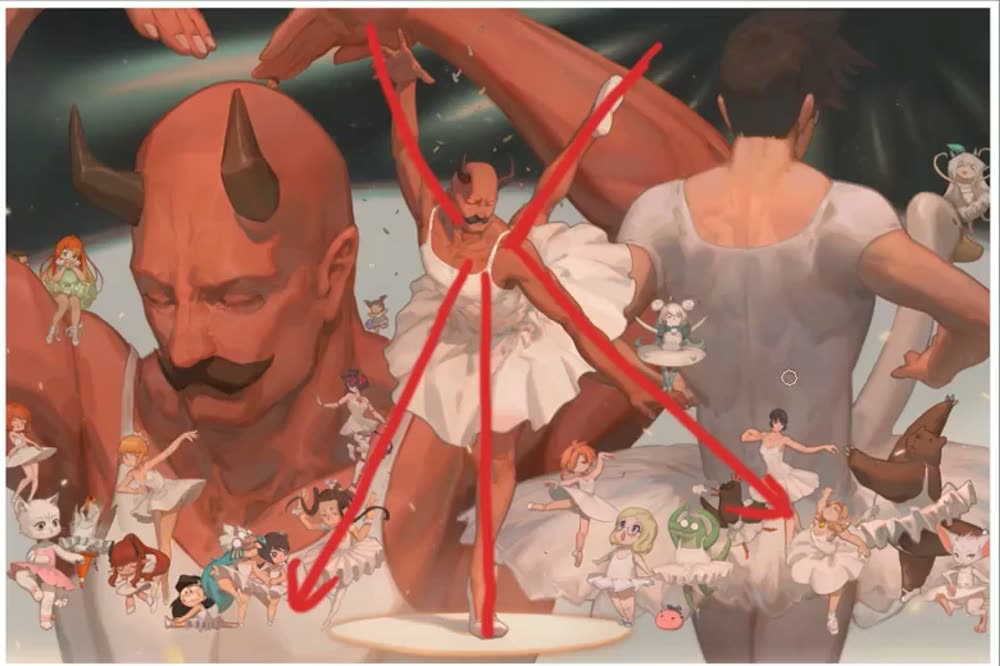
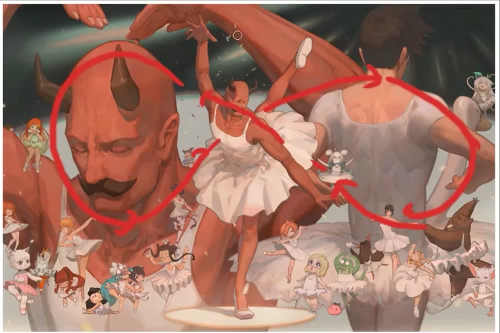
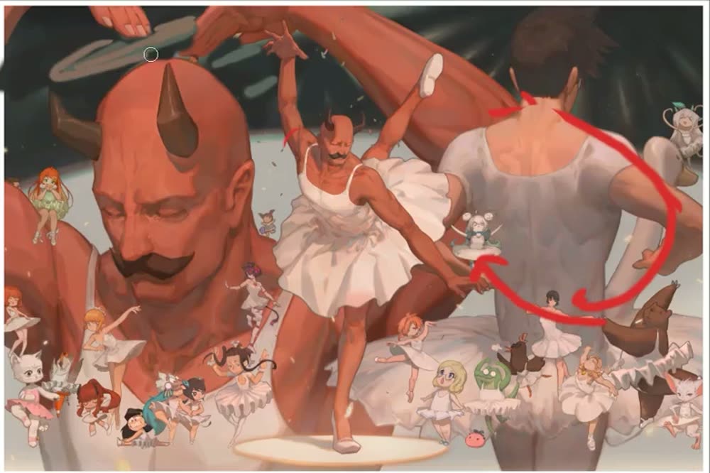
Krenz · 1:01:40“If I don’t add something here it’s a bit empty, but adding more stuff is a hassle. So I add a bright stage-light block, black and white interweaving, so it looks like there’s content and the picture isn’t so empty.”
ShowsDetail is judged against its neighbours. Busy needs quiet beside it. He doesn’t say whether the X and the loops were planned or noticed afterwards.